American Kennel Club
Launching a modern, flexible site that can grow with AKC’s impressive legacy.
Legacy Brands in the Millennial Age
The American Kennel Club was founded in 1884 with the objective of advancing the study, breeding, exhibiting, running and maintenance of purebred dogs. In their nearly 135 year history the AKC has amassed an impressive amount of content, products and services.
Their website must maintain the powerful job of managing 193 different dog breeds, over 40 categories of expert advice, more than 22,000 events from all over the U.S., multiple training and health services, an online store with hundreds of products, a marketplace where customers can search, find and interact with breeders, groomers and a growing number of services as well as their flagship service of registering and maintaining the history of thousands of dogs. All in all the AKC website is a workhorse managing thousands of pages of content.
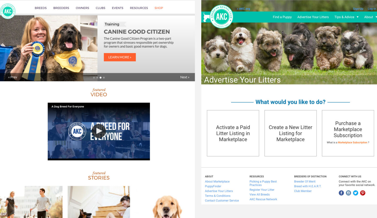
At the time, the existing website for AKC was really struggling to keep up with their needs. The content was not well organized, leaving important information buried and difficult to find. The backend was not set up to easily update or change content, which limits the efficiency of their rapidly growing editorial needs. There were load time issues and inconsistencies with the branding and navigation.
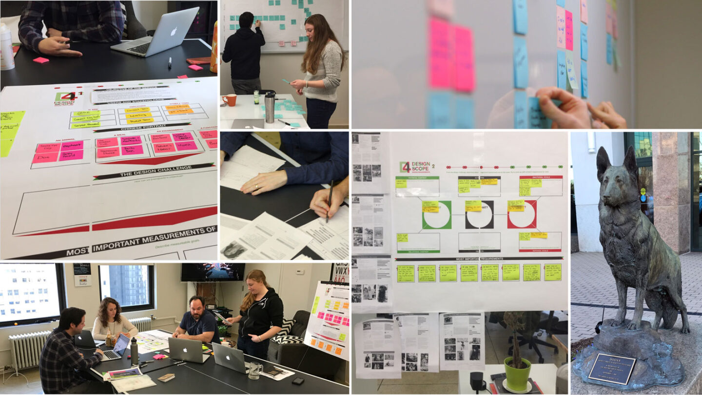
Understanding the needs of stakeholders and users
As it is in dog sports it’s important to start with the basics and build your understanding of what lies ahead. When ETR began working with AKC our first objective was to work with every stakeholder to gain a clear understanding of their mission, users, pain points and goals. ETR conducted over 17 rounds of interviews including board members, leadership, and ten departments within AKC and their team members.
The key areas where ETR would focus for over the next year of work included creative strategy, branding to be used in an entirely new site design, new sitemap and content organization, a new scalable Marketplace for users to manage on their own, and a complete overhaul of their backend and technology integrations.
Making AKC relevant to all dog lovers
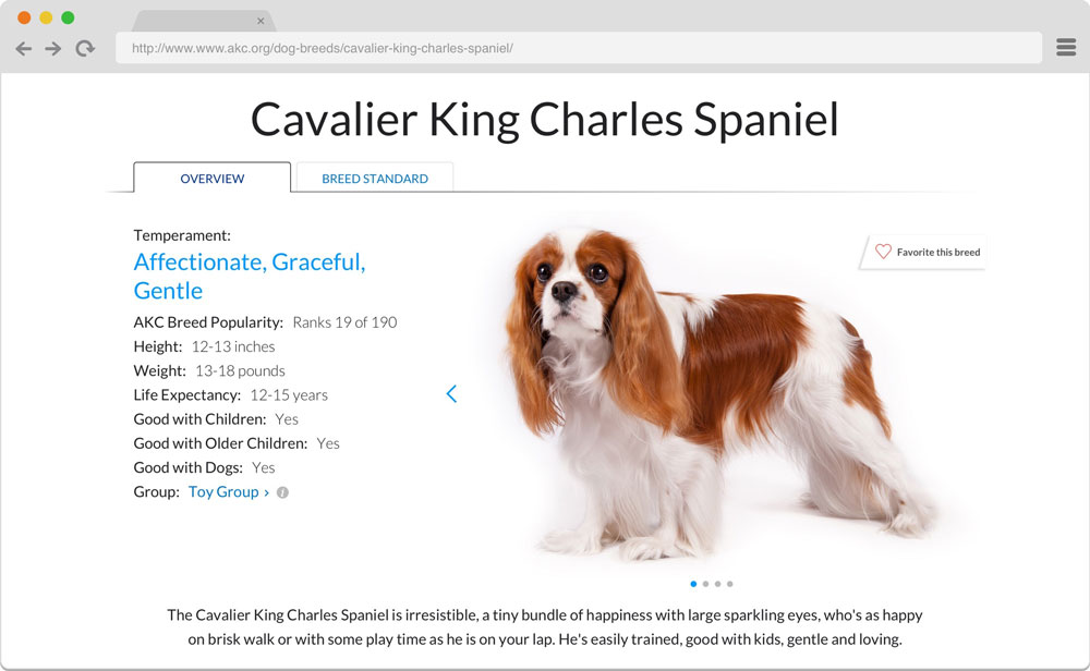
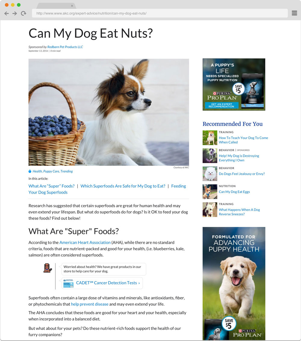
A well-informed creative strategy is the foundation for every project. It establishes the design and development requirements that drive the entire project. Armed with pages of information from our interviews ETR established eight design requirements that would inform the work ahead. These requirements included everything from rules around navigation, performance, usability, scalability and tone.
It was very important to AKC that the new brand helped evolve its current perception. Like many legacy brands it was battling the perception of being traditional, stodgy, out-of-date and exclusive. Many people thought AKC was only for owners of show dogs.
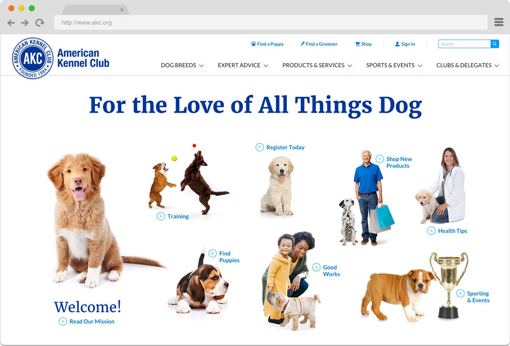
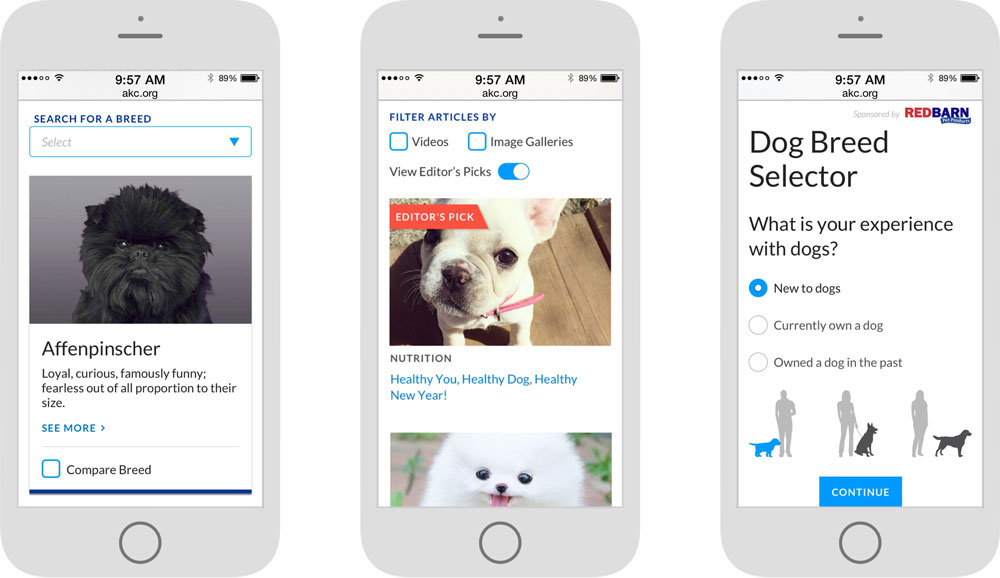
The new brand needed to showcase its real personality of being friendly, approachable, on-trend with today’s dog lover and a lover of all dogs. Using their brand blue as the base and keeping with their existing logo ETR established a new color palette that kept things bright with friendly pops of color and natural tones that reminded us of our furry best friends.
Testing navigation to learn what was intuitive
Ease of navigation and the ability to find content quickly was extremely important to AKC. They have several very different users that come to the site for different things and they didn’t want anything to feel buried or require too many steps to get to. A well organized and intuitive navigation was crucial. ETR ran several tree tests using Optimal Workshop to find out if users were able to find key content in the revised sitemap structure. We recruited participants by posting a Hello Bar invitation right on the AKC website.
Our first round of testing was an A/B test. We tested two variations of a revised sitemap structure, with one key difference — one version was organized with user type at the highest level and one version was organized with topic at the highest level.
The purpose of this test was to identify which option was easier for users to navigate. It turned out to be the version organized by topic. We suspect that users had a harder time self-identifying due to overlapping roles (e.g. Dog Owners and Dog Breeders).
In the next round of testing, we honed in on improving some key problem areas where users were getting confused. The testing allowed us to focus our attention on improving how content was labeled and grouped in those specific areas.
As measured by the tree testing results, we improved the overall task completion success rate by an average of 20% between the first and second rounds of testing. For some tasks, the task completion success rates improved by up to 49% from one test to another (from 30% to 79%). Ultimately, this tree testing led to a more intuitively organized navigation structure which improved users’ ability to find the information they need, when they need it.
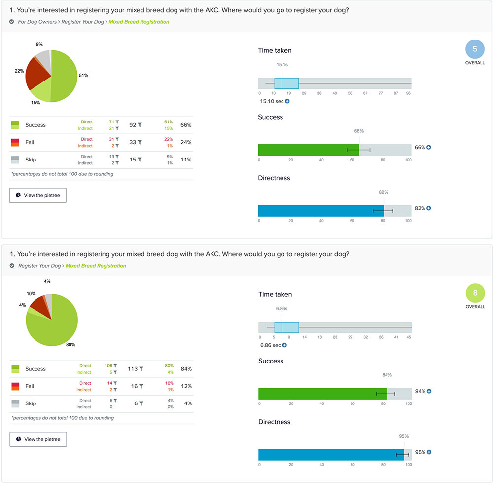
The tree testing work we did for AKC has been featured in the Nielsen Norman Group report, UX Metrics and ROI.
A scalable marketplace experience
Helping people find quality purebred puppies that come from registered puppy parents is one of the foundational services provided by AKC. They need a platform not only for breeders to advertise their litters but for interested buyers to search and find the right puppy for them.
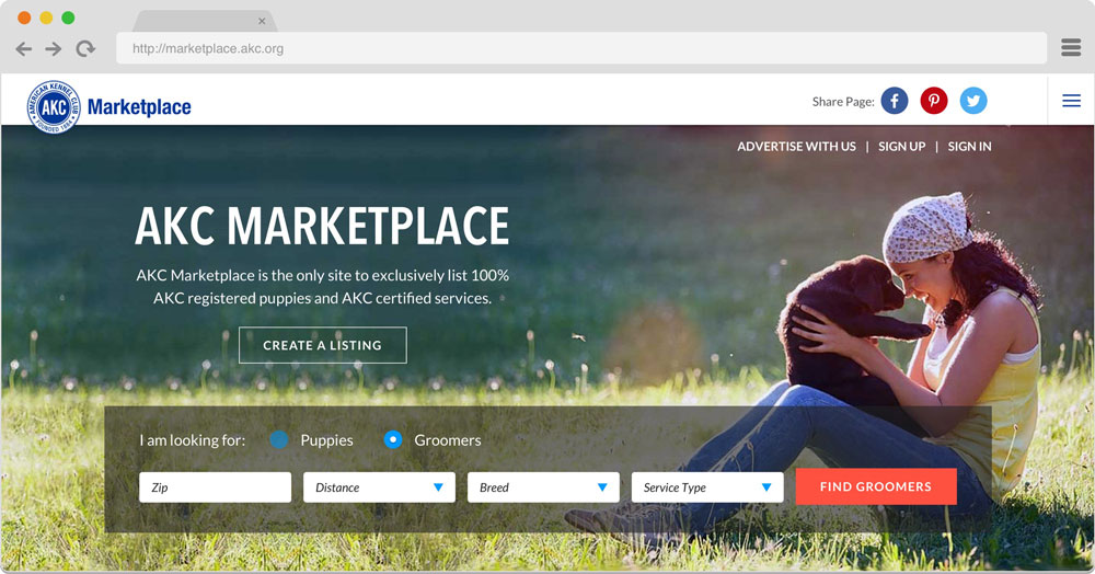
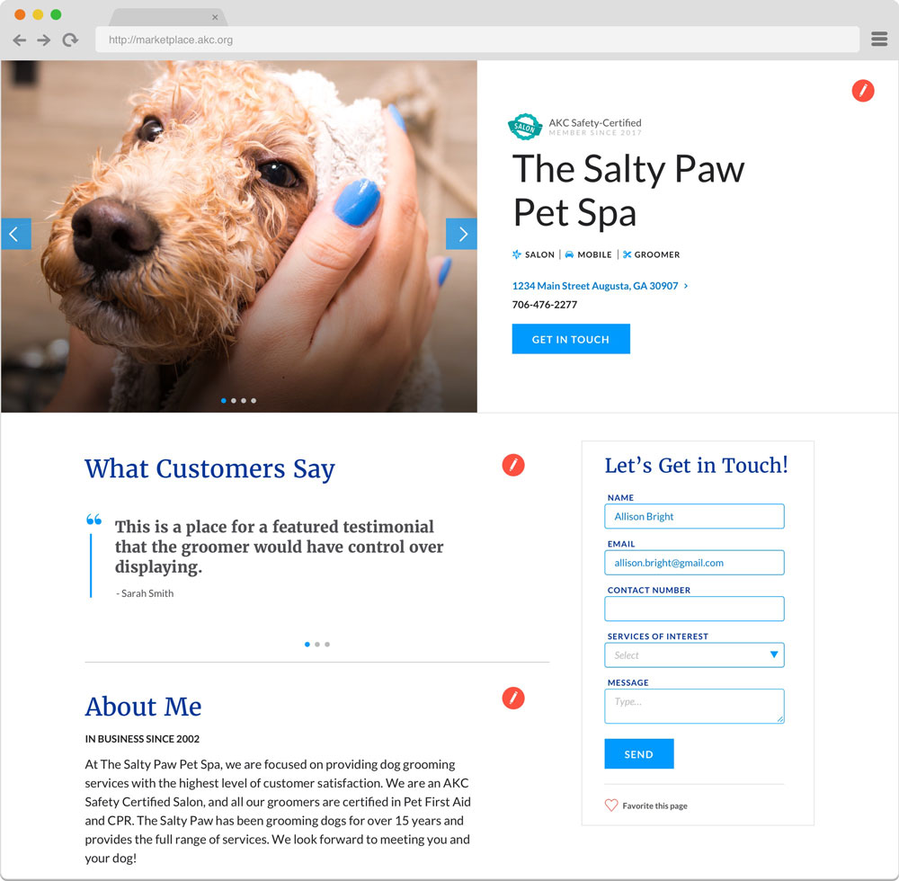
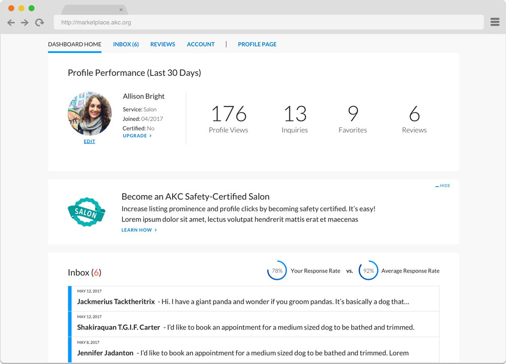
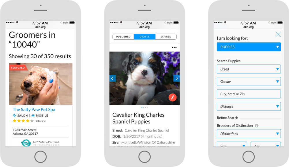
An interactive Marketplace is AKC’s vehicle for bringing seller and buyer together. The Marketplace allows breeders to create their own custom digital storefront where they can advertise their litters for sale, show information on the parents, pictures, certifications and communicate with interested buyers right on the platform.
Beyond the service of finding a puppy the Marketplace needed to be scalable to include services for Grooming and eventually Dog Walking, Veterinarians, and more. Each vertical would allow users to create their own custom page for finding and communicating with customers.
Migrating a massive amount of content
Creating a series of flexible, elegant page designs was a primary goal of our design effort. However, we were also responsible with incorporating AKC’s sizable amount of nearly 4,000 pages of legacy content to fit seamlessly into the new site. This involved an intensive and complicated content migration plan to ensure the myriad of content types fit within the new architecture.
To complicate matters, a network of external sites was used for transactions, registration, and event signups, all tied together via APIs for user authentication and maintaining their profile. This meant pages needed to react differently depending on the user or content being displayed on the site.
Creating interactive tools for readers
A series of interactive tools were also created to increase engagement for selected topics: Find Your Match, Compare Breeds, and the Dog Breeds interactive finder. All of which were devised as mini applications that could be accessed from several locations throughout the website.
Onward and Upward
We successfully launched AKC.org in 2018. Not only did we push an established brand forward visually and technologically, we also greatly improved the experience for AKC’s primary user types and successfully reorganized the content sitewide into a more intuitive structure.
The new AKC Marketplace product was launched simultaneously and offered the American Kennel Club a platform for building out a new side of their business.
Our work testing and optimizing AKC’s navigation has been used in a report from renowned User Experience experts Nielsen Norman Group
We’re thrilled that our partnership resulted in AKC launching a modern, flexible site that they can grow with into their next century.
Thinking about a project like this one?
Consider working with a digital agency partner. We ensure your website’s UX and content accurately represent your brand and meet your user’s needs.
We’d love to learn more about your needs and share our process on how we help organizations navigate digital initiatives just like this one.


More Success Stories
Tröegs Independent Brewing
ETR created a beautiful new site to launch alongside the national rollout of Tröegs’ new branding and packaging
Hill Laboratories
Bringing state-of-the-art equipment direct to consumer.

