Learnings From Delivering a Massive Design Project Solely on UXPin

In July of 2015, ExpandTheRoom kicked off a massive design project for a large, multinational travel IT company that provides a variety of products and services to airlines around the world. We collaborated with them to redesign their consumer-facing flight reservation system (what you would find at an airline’s homepage) and a similar booking system used by reservation agents working at an airline call center.
As a team, we made the decision early on to experiment with using a web-based design platform as the primary pipeline through which we would deliver design assets to the various project stakeholders. One of the main drivers for this decision was the fact that this project had many stakeholders across so many internal silos. Adding complexity was the fact that they’re also spread out geographically from across North America, the UK and India. To us, it seemed like the only way to keep so many people in so many locations in sync was to have one central location where everyone could find the most current work. Basically, we wanted to see how easy we could make it for our client partners to access the most up to date versions of everything — one URL that anyone could follow and find exactly what they needed…
There are so many web-based wireframe/mockup/prototyping tools that to list them all would take the remainder of this article. Plus, that list would literally be out of date the second I hit the publish button. Essentially, we’re talking about things like Balsamiq, Atomic, UXPin, InVision & Marvel.
We had previously used UXPin internally for wireframing, as well as some basic prototyping with fairly good results. As we looked closer at UXPin, we saw a number of features that we thought we could leverage throughout the life of this project to make it a really effective central hub for all of our design work. This is not to say that we ever thought UXPin would be the only tool we would use to create our design assets. Keaton Herzer, so hilariously addressed in his recent send-up article The Ideal Design Workflow, there is no one tool that can meet all of our design needs. There likely never will be. However, we recognized in UXPin not just the ability to get a lot of our design work done, but also the ability to play nicely with some of the other tools we’d be using.
Quick Ideation, Sharing, & Iteration
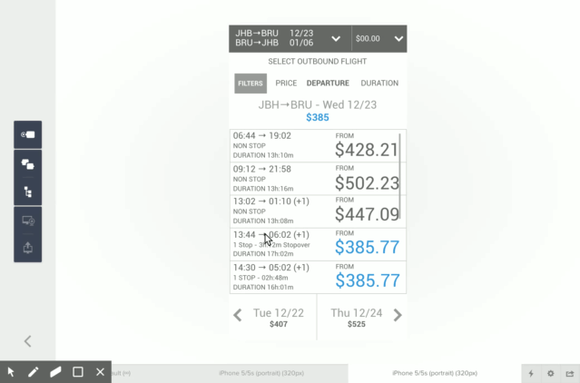
On the creating front, the layer-based drawing and text editing tools in the UXPin editor made pretty quick work of rapid ideation. We were able to try out and build upon all sorts of ideas without having to invest a lot of time. I could send a link to my team members in the office. They could give me live feedback. Updates that I made at my desk showed up almost instantly at theirs. We covered a lot of ground in a relatively short amount of time.
Click-Through Prototyping in No Time
UXPin also made it really easy to connect a series of screens for click-through prototypes that we could use to test interactive flows and overall architecture. Additionally, beyond just linking pages, UXPin allows for more advanced animations so we were also able to start looking at more complex interactions and micro animations, again with relative ease.
Bringing in Visual Design Comps from Sketch
The tool of choice for our visual designers at ETR is (currently) Sketch. UXPin has a really nice Sketch plugin that allowed us to export from Sketch and import into UXPin while maintaining (for the most part) our Sketch layers. That was pretty nice and allowed the team to continue playing with animations and transitions at a higher level of fidelity and polish inside UXPin.
Bringing It All Together
For us, the big challenge of using UXPin was packaging it all up in a cohesive deliverable that was useful for a broad range of stakeholders including people in all levels of front and back end development, product definition, product QA and testing, business architects, systems architects, project managers and much of the corporate leadership of our client. We found a few features inside UXPin that helped us address this.
A Bit of Tab Hackery
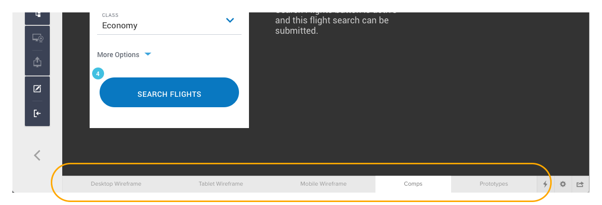
For one, we used the UXPin’s Adaptive Version feature, which essentially allows you to have multiple work canvases inside a tabbed navigation on any given page view. The most obvious use for this feature is if you want to show a desktop and mobile version of the same design without having to send a user to two separate pages to see them. We leveraged the Adaptive Version tabs to bundle all of the different assets for a given screen.
Stuff We Couldn’t Prototype in UXPin
In some cases we needed to demonstrate animated interactions or transitions that were either outside the limitations of UXPin or were just easier for us to mock up in Framer.js. No problem. UXPin makes it really easy to embed a video player linked to a video hosted on YouTube or Vimeo. We simply screen captured those animations and embedded the video in the Prototype tab in UXPin. This created an extra step, but it was nice to have the video of the animation there with the rest of the work.
Creating a Meta Navigation
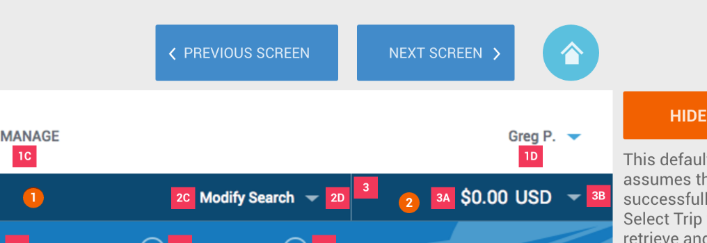
One nice thing we discovered was the ability to add a little interactivity and navigation into our deliverable structure. By adding Forward, Back and Home buttons we gave our client users a way to navigate what was often a pretty large set of screens. UXPin does provide a navigable Site Map in the presentation view, but it lives in a left-hand collapsible drawer that many of our users found hard to use. We wanted to provide a more surfaced and obvious way for people to quickly move around. We also reserved the Homepage of our projects for a linked table of contents. We found that our clients much preferred this to the UXPin navigation.
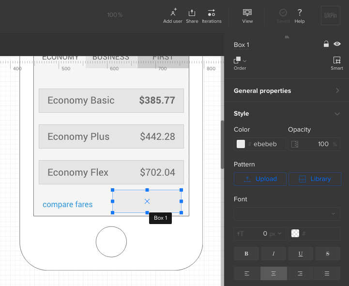
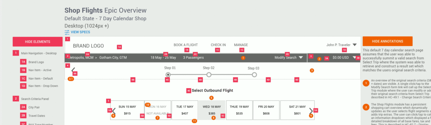
Layering on Information
Another nice touch we added was the ability to show and hide annotations and the corresponding markers which tend to litter up a screen comp. Sometimes, it’s nice to just get a clean view of the screen and not have to look at dozens of little numbered markers calling out annotations. In the past, this often meant including several versions of the same work — one clean, one with anatomical annotations, another with state and interaction annotations, another with specs and so on. However, in UXPin we could have one comp with several showable/hide-able annotation layers. Users could toggle on or off any of the annotations they wanted to see, or just see the work clean.
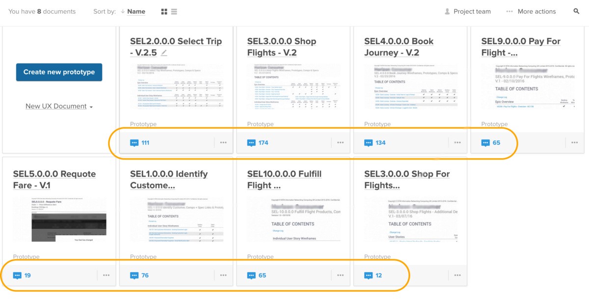
Capturing and Tracking Feedback
UXPin comes with a decent commenting system for people who are looking at work in the presentation view. Much like InVision, users can toggle into a “commenting” mode and drop comment markers on the page. This is nice, of course, because people can put a marker right on the thing they’re referring to. It removes a lot of ambiguity. Comments can easily become discussion threads as other people respond to an initial comment. Comments can be marked as resolved, and UXPin makes it easy to sift our resolved comments so that you can easily see what the open issues are. These features all worked really well for us. There were limitations to be sure. For one, you can’t export comments. Exporting would have been nice as we could have translated comments into tickets in something like Codebase or Basecamp. Then we could have more easily tracked open issues. As it was, we had to do a good bit of legwork to keep on top of who on our team was addressing which comments.
Final Thoughts
The short and sweet answer is that this worked out pretty well for us. There were some bumps along the way, but we got them solved, often with the help of the great support staff at UXPin. They are very responsive to support questions and quite receptive to feature and enhancement ideas.
As an organization, working this way made us think differently about our own workflow and, I think, has changed how we think about the role of wireframes, design comps and prototypes to communicate the intent behind our designs… But that is for another story.
Thanks for reading. I hope this was helpful to anyone thinking about how a web-based design platform might figure into your own workflow. If you have any questions about how we used UXPin (or any of our other go-to tools) please get in touch through our contact form.
More Insights

Six Design Trends You Will See in 2024
In the field of design, trends come and go. As technologies evolve and user preferences shift, design trends naturally progress and adapt. Keeping up with the latest trends helps brands stay current and resonate more with consumers as their preferences evolve. Last year, we highlighted dynamic color, personalization, and simplicity. In 2024, we envision designers


‘Tis the Season to Commit to Exceptional Experiences: UX Resolutions for 2024
With December upon us, our thoughts turn to resolutions—the ways we can be better in the year to come. For us as an agency, that means constantly raising the bar for ourselves, our clients, our communities, our industry, our families, and our friends. For our UX team, whose job it is to advocate for users,