
How to Create a UX Research Plan
You are launching a new website, your first big project as the VP of Marketing at a large corporation. Your new website launches—and it’s a flop. Organic traffic starts declining. Existing customers start leaving at a faster rate than you can bring in new ones. The bottom line is affected. The CEO has questions. What happened? How can you fix it? And is there anything you could have done to prevent this?
In our 20 years of digital design experience, we’ve seen that the most common reason for this scenario is a lack of a UX research plan. The good news is that you can recover from this or drastically reduce the risk of it happening to you if you invest in a UX research plan.
Our aim is to help you understand what user research is, why it is so important, and how you can plan and budget for it. We can promise you this—once you start getting real user insights, you’ll never want to skip user research again!
Chapter 1
What Is User Research and Why Is It Important?
What is user research?
In the context of website or application design, user research is the process of learning about the way people who use your website think and behave in the context of the real world and why. This arms you with the information you need to design a website that better serves your users and creates lift in key areas of engagement.
As you might expect, user research involves — gasp!—talking to people. There is no substitute. The good news is that this doesn’t have to be difficult. And user research can easily be done remotely, which is more important now than ever considering COVID-19.
Why is user research important for web design? Why do it?
People make all kinds of excuses for not doing user research but the bottom line is that user research is important for website design because websites are used by people and people are unique and complex. That makes unvalidated assumptions about customers particularly dangerous.
Designing a website that actually meets verified user needs will make your customers feel seen and understood, like you just “get them.” A good user experience has been proven to positively impact your bottom line. A study done by Forrester found that for every $1 invested in UX, a business will see a return of between $2 and $100—that’s a 100% to greater than 9000% return on your investment.
In another example, Jared Spool proved the value of user research when research led his team to change a button on a form, resulting in a major e-commerce retailer earning $300 million more dollars in revenue the first year after the design change.
There are other benefits to designing a good user experience beyond revenue gains, too—like a reduction in support calls, a reduction in wasted development time, and an increase in customer satisfaction.
What is the risk of not creating a UX research plan?
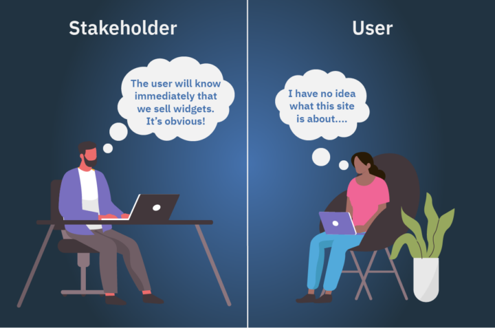
The risk you take by not creating a user research plan is that your project will fail to achieve the goals you have set out for it—or worse yet, perform much worse than a prior iteration. The risks are compounded the larger and more complex your website is because there are more assumptions that could go without validation on these efforts. One Forrester study found that 70% of digital projects fail due to a lack of user acceptance.
You can avoid adding your project to that list by planning for and prioritizing some level of user research and usability testing as part of the design process. No client of ours has ever regretted investing in a user research plan—there is always a new insight or a deeper understanding to be gained that benefits the organization even beyond the website project.
Okay, you’re convinced. Now, what exactly do you research?
You have a budget to think about, so it’s important to know the right stuff to research. Don’t waste your time asking a lot of questions that aren’t relevant to your design project. Clearly defining your research questions is a critical step in the user research process, which we’ll discuss later on. Erika Hall, a recognized expert in User Experience Design (UX), describes the four areas of context that are important to understand about your users before embarking on a new design project in her book, Just Enough Research.
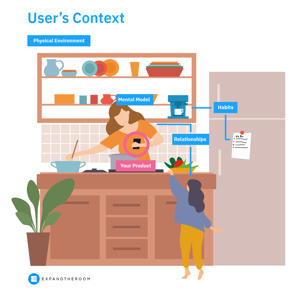
- Physical environment
When you consider the user’s physical environment, you can design to optimize use for certain physical scenarios. For example, if you’re designing a food-related website that includes recipes—are people reading the instructions while cooking? While grocery shopping? Do they print them out? Are they viewing them on an iPad? Are their hands covered in flour after Step 4? You can imagine how the answers to all of these questions start to influence design and functionality decisions. - Mental model
Your mental model is the way you think about how to do things. It’s your understanding of the way things work. It’s hard to change someone’s mental model so it’s important to understand where your users are coming from and how they get things done today, so you can figure out where you fit in. Are your users comfortable with using voice commands? If an ingredient is not available, is a person more likely to substitute it or leave it out completely? How do people search for recipes—title of a dish or by ingredients on hand? - Habits
Habits are notoriously hard to change, but not impossible. What existing habits do users have that you can tap into? Is cooking a daily habit or is this new? Where does cooking currently fit into their weekly routine? What about grocery shopping? How do they plan meals today? How do they usually find recipes online? - Relationships
It’s helpful to remember that people do not exist in isolation. We all navigate complex social relationships in our day-to-day life. How many people is the person cooking for? Is the person who does the cooking the same one who finds the recipe? How about grocery shopping, who’s responsible for that?
What user research methods should you use?
We typically recommend using a mix of different quantitative and qualitative methods to see patterns of behavior (the “whats”) and then to better understand and hypothesize reasons for these patterns (the “whys”).
These types of insights allow you to create a website that truly takes into account the needs of your target audience, increasing the odds that they will come back and perhaps even become brand evangelists. Conversely, if you don’t do user research, you miss something about your target audience that caused them to lose trust in your brand. And it can take a long time to earn someone’s trust back.
In our experience, these are the user research methods every marketer needs to have in their toolkit to help you better understand your audience.
- User interviews: To research how users think and feel. We recommend doing five 30-minute, one-on-one interviews for each priority user group
- Keyword research: To uncover user search intent, learn about how users think, what language they use to find your website and competitor websites
- Google Analytics or other traffic data: To learn about how users behave on your existing website
- Heatmaps, surveys, and polls: To learn about how users behave, think, and feel within the context of using your existing website
- Card sorting and tree testing: To learn about how users think about organizing different topics and get insight into the specific language they use
- Customer service/feedback records: To uncover user frustrations with the existing product or service
- Customer reviews on Google and elsewhere online: To learn about how users perceive an existing company or brand
- Usability/User testing: To learn about how users behave and think when using an existing product or when using early design prototypes; can be moderated or unmoderated (read about the usability testing we did for for an interactive touchscreen experience)
- Observational research: To observe how users behave and think in their natural environment (read about the on-location research we did before designing an cruise check-in application)
What is usability testing (aka user testing)?
Usability testing, often referred to as user testing, is the process of testing a person’s ability to complete a task on a website or other digital product. It’s a form of user research that’s about making sure the website actually delivers on meeting the user needs you identified in earlier research.
This method helps to ensure the website design allows the user to accomplish the tasks we identified as being top priorities through earlier user research. The focus here is on testing the website, not the user’s ability. It’s about making sure the product does what it’s supposed to do.
When we identify usability issues through testing, we’re able to make design adjustments to further reduce the risk of launching a new website that does not work for your users. If you create a website that doesn’t actually meet the needs of your customers, then you run the risk of losing existing customers and not attracting as many new ones. This process can be moderated or unmoderated and can be conducted in person or remotely.
- Unmoderated usability testing is when you prepare a usability test in advance and user testers complete it on their own time, independently, without being guided or observed.
- Good for navigation testing or information finding
- Good for A/B testing
- Moderated usability testing is when a researcher is present with the user (in-person or via Zoom, etc.) and guides them through the usability test, observing them complete the tasks and asking questions where appropriate to glean more insight into why users do what they do.
- Good for more complex functionality testing
- Good for messaging testing
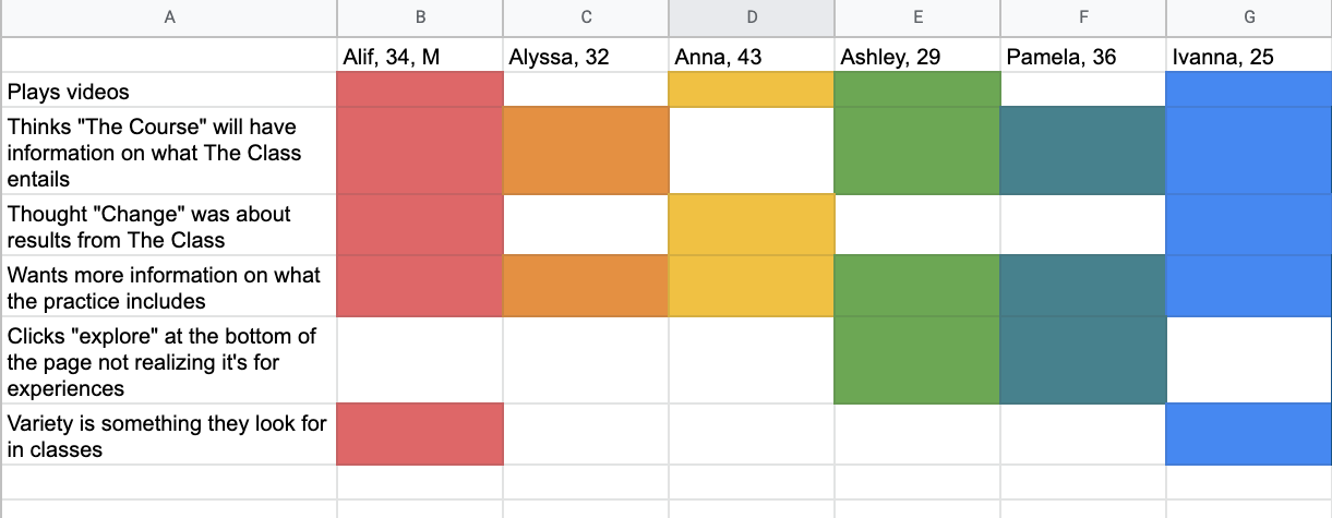
This method is particularly valuable further along in the design process, once you have a workable design prototype. Testing top tasks during the UX and Design phases of a website design project will help to identify any problem areas in the design so the team can iron them out prior to entering the development phase. Testing reduces the risk that a new website will go live that has a negative impact on the user experience. Usability testing can also be a great way to help you measure the success of your design project and further improve results.
Chapter 2
User Research Cost Considerations for Planning and Budgeting
It’s a myth that a ux research plan must be a tremendously costly and drawn-out effort in order to be effective. You don’t need a dedicated usability lab or to spend thousands of dollars on eye-tracking hardware to talk to your users. Users are more comfortable meeting virtually than ever, and new tools are popping up every day to help your research effort.
Getting started with user research is easier and more cost-effective than ever—good news, because it’s vital to building a successful product. Next, we’ll help you understand how much you should budget for your user research plan on your next project so that you can weigh these costs against the additional value that it will provide to your business. You’ll be happy to learn that you don’t need to spend a lot to get actionable insights.

The most important part of user research is making sure you are talking to people who truly fit your target audience—not just testing prototypes with your coworkers and friends for their opinions.
Recruiting users can be the most expensive part of the research process, depending on how many people you need and how specialized of an audience they are. The price comes down to two factors:
- The cost of incentives for the user participating in the research, and
- The tool you are using to recruit these users
Some tools, like UserTesting.com, build in the cost of recruiting to their platforms. However, you’ll have more control over your participants by recruiting yourself.
User incentives for participating in your study
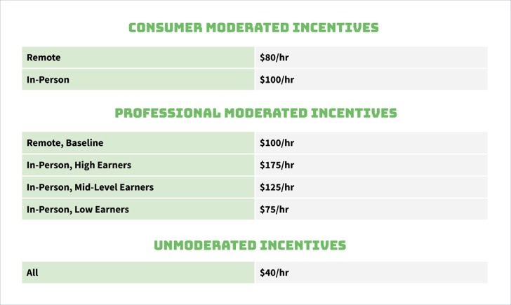
If you are recruiting participants yourself, it is important to consider incentives when pricing the project. An incentive is the compensation you provide a research participant for their time, and considering the immense value their insights will bring to your product, incentives shouldn’t be skimped on. The incentive is what attracts a user to want to participate in your study, so a higher incentive will result in a larger pool of higher quality candidates to choose from. Professionals in high earning fields will generally require a larger incentive than other consumers to be persuaded to participate. Depending on your product, you may be able to offer a non-monetary incentive participants will be interested in, like free or beta access to your product.
UserInterviews.com has a great breakdown of the appropriate incentives to pay participants based on the type of study:
User recruiting methods
Let’s breakdown the costs of a few recruiting methods out there and their pros and cons.
Tap into your existing user base
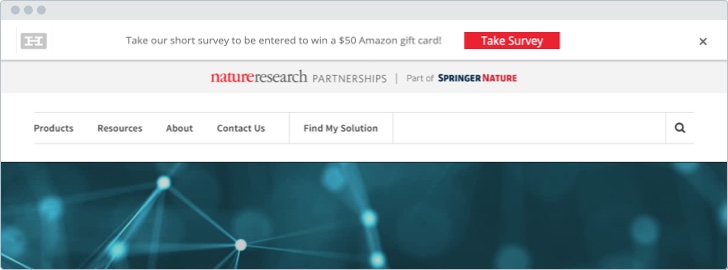
The best place to find research participants who are likely to use your product is through your product itself. Do you have an email list you could send a blast to about an upcoming study opportunity? Or, you could use a popup or banner on your website advertising your incentive for participating like we did for American Kennel Club.
Recruiting Cost: Free + the cost of participant incentives
Pros: Actual product users; no recruiting tool fees
Cons: Time-consuming to recruit; need to configure scheduling and incentive payments yourself
Use a stand-alone recruiting tool
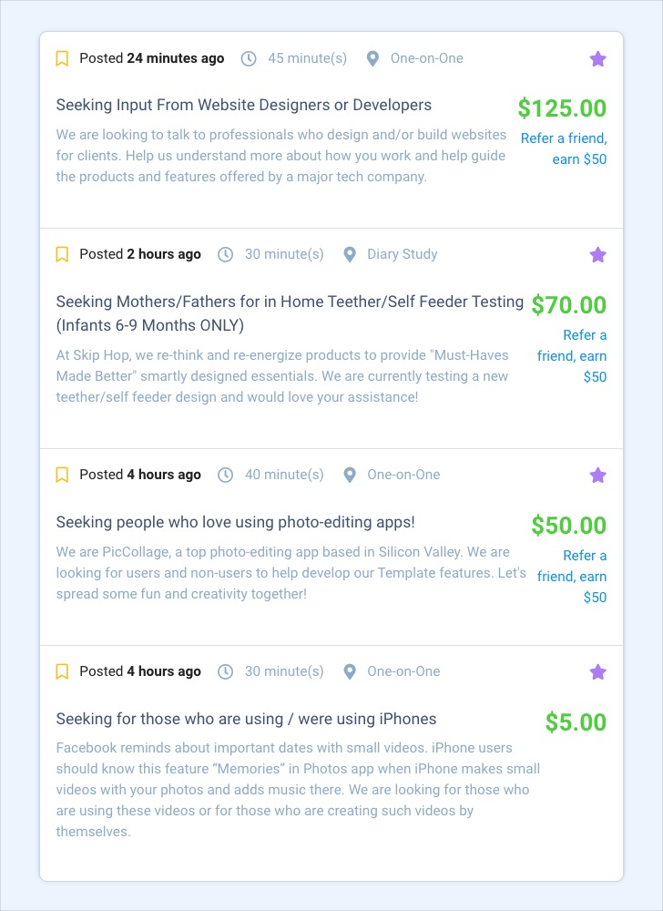
Many recruiting tools exist to connect participants of all demographics and backgrounds to researchers wanting to talk to them. We prefer this option when it’s not possible to recruit a product’s user base directly. We’ve found that the participant pool is pretty diverse, and you can use a combination of demographic filters and screener questions to find participants pretty close to your target audience, even if they’re niche. Two of our favorite recruiting tools are UserInterviews.com and Respondent.io. Normally these types of services charge a fee on top of the incentives you’ll pay directly to the participants.
Recruiting Cost: Service charge + the cost of participant incentives. For example, Respondent.io charges a 50% service charge based on the cost of the incentive, so if you paid an interview participant $100 the total cost would be $150 for that interview. There’s no additional platform or project fees as of writing.
Pros: Large database of high quality participants; helps to handle scheduling and payment
Cons: Potential that someone isn’t who they say they are; audience not actual users of your product; pricier
Use a research tool with a recruiting option
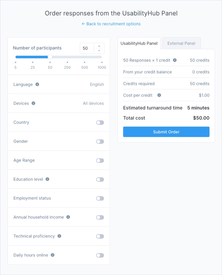
If you choose to go the route of using a research tool like UsabilityHub.com or UserTesting.com to help conduct your research, often they include an option to tap into their user base to run the tests. While this option might work if you’re looking for the opinion of a broad target audience, we’ve found that this option doesn’t give you enough precision if you want to recruit for demographics beyond the basics like age and gender. The price varies greatly depending on the type of research the tool offers. We’ll discuss their costs in the next section.
Recruiting Cost: Varies, but generally in the $1 to $6 range
Pros: All-in-one access to both testing tool and recruiting; easy to set up
Cons: Limited database of participants; hard to target specific user types
Buy digital ads

When we need a lot of participants for quantitative research such as a survey, we sometimes turn to digital ads. Platforms like Facebook, Reddit, and other social media can offer an inexpensive way to access users of a certain demographic with specific targeting options. If you want to survey pet owners, it’s as easy as selecting this as an interest for the audience or finding a subreddit they’d frequent. In addition to paying for the ad, you still need to think of an incentive to entice ad viewers to click — we’ve done giveaway drawings for survey participants.
Recruiting Cost: Ad cost varies depending on complexity of audience and participants needed, budget $100-200 for the ad + cost of participant incentive
Pros: Low cost; access to a large audience; advanced targeting capabilities
Cons: Time to set up ad account and create and target the ad
Find them out in the world, online or off

This last recruiting method is sometimes known as “guerilla research” — going out into the wild to find your participants in their natural habitats and politely and professionally approaching them with a quick prototype or a survey. Offline, this could involve going to a location where users frequent — for our client HeliNY we talked to passengers at the helicopter launch pad and to hotel concierges recommending the product. For New York Road Runners we studied people using the product in the RUNCENTER space. Online, this might involve finding people to talk to on forums or groups for the topic of your product — just be wary of the community’s rules and don’t be spammy.
Recruiting Cost: Free + the cost of any incentives
Pros: Quick; inexpensive
Cons: You may not find the people you need
How does insourcing or outsourcing impact your user research costs?
Let’s say you’re conducting a medium-sized research effort for your product’s upcoming redesign that consists of:
- 10 user interviews at 30 minutes each (we find that it can be hard to see commonalities with less than 10)
- Usability testing of the current product (same rule of 10+ here)
- Tree testing of the site’s current navigation (we recommend a sample size of no less than 50)
- On-site survey
Outsourcing your UX research plan to an experienced partner like ExpandTheRoom
The cost of outsourcing the user research effort described above to an experienced partner like ETR will depend on your unique needs and complexities, but using a lean approach, it can be as inexpensive as $15,000 for a solid base-level study. By working with a partner like ETR, you’ll gain the benefit of an experienced team of professionals who will take care of setup and uncovering insights, so the difference should be well worth it.
Any of the research methods can end up being standalone as well. For example, you may not need an entire research package but instead just want to make sure usability testing is incorporated into the development of a new product feature, in which case the pricing can run you somewhere around $3,000-$4,000 per iteration. The research efforts discussed above are just some examples of a myriad of techniques to use when conducting user research that can be scaled and repeated throughout the design process.
Pros: Expert research team to set up studies and analyze results; saves a lot of time; surfaces actionable insights; often delivers the highest ROI
Cons: More expensive than doing it yourself; requires time and effort to onboard partner
DIY cost for a UX research plan
Here is a breakdown of sample costs for a DIY effort if using some of the methods for recruiting and testing discussed above. The time estimates assume your researcher is experienced with these methods — expect to add 5-10 more hours to each method to account for a learning curve if not.
In order to conduct testing yourself, you’ll often have to rely on user research tools and services, which add an additional cost. These tools can help save time by handling parts of the setup and running the research. Some of the services often part of a standard toolkit include UserTesting. We’ll include an estimate of these tools’ costs in our breakdown of the DIY cost.
If you value your internal team’s time at around $75/hour, then your total cost is $10,125.
Pros: Saves a bit of money up-front; opportunity to learn about and repeat processes yourself
Cons: Takes up more of your time; runs the risk of inactionable results if you aren’t experienced with recruiting and asking the right questions; more risk than working with a proven partner
Ultimately, if you have a team experienced in user research and need to save money up-front, the DIY approach might make the most sense. But if your budget allows, consider engaging with a team of expert researchers. The bottom line is that DIY testing may be cheaper, but without an experienced research team it will be difficult and time-consuming to recruit, set up the study correctly, interpret results, and make actionable next steps. There’s no substitute for an experienced team with a track record of results.
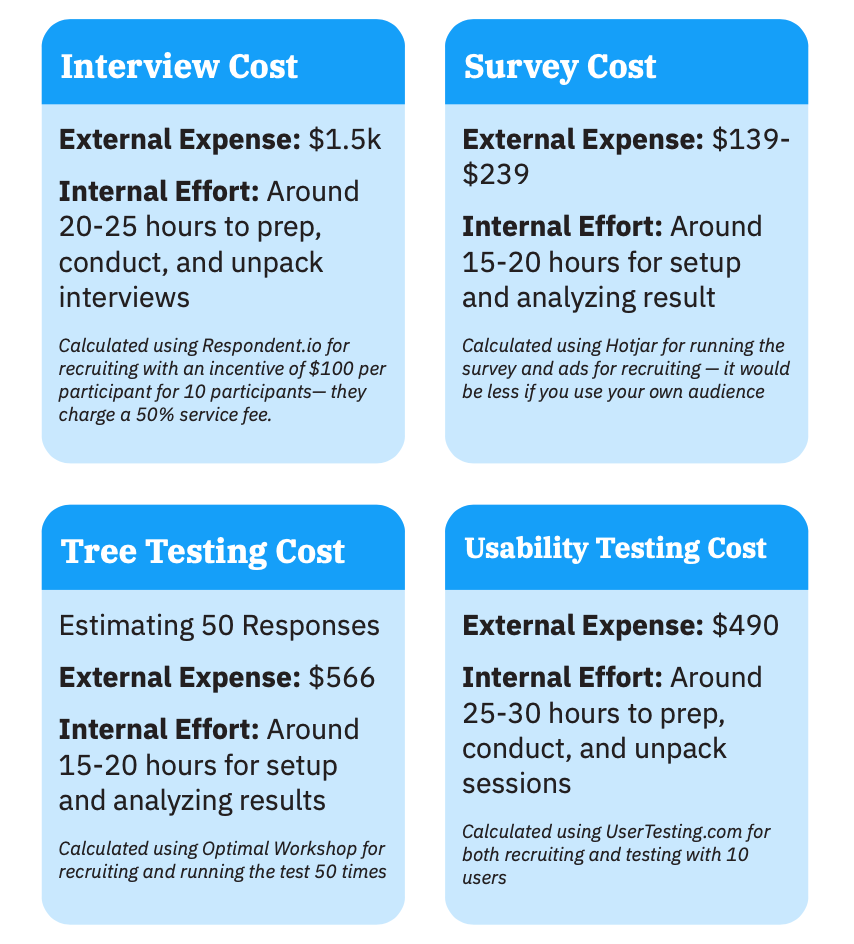
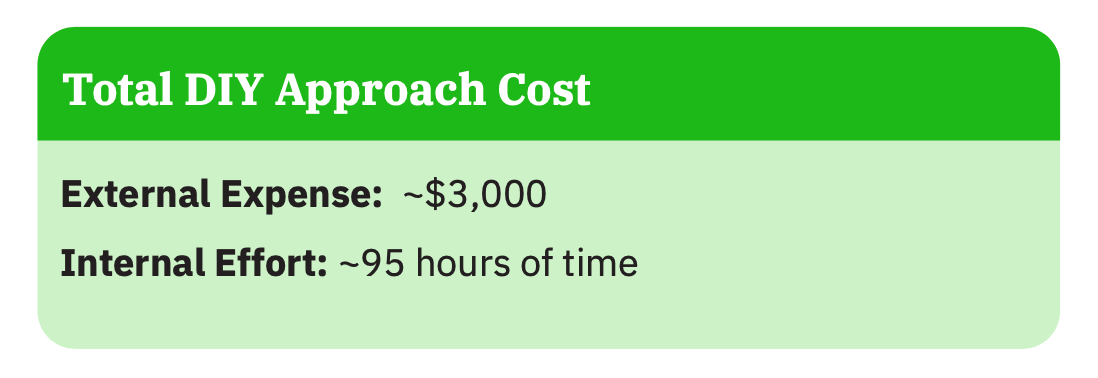
If, by way of example, you value your internal team’s time at around $75/hour, then your total cost is $10,125.
Pros: Saves a bit of money up-front; opportunity to learn about and repeat processes yourself
Cons: Takes up more of your time; runs the risk of results that are not actionable if you aren’t experienced with recruiting and asking the right questions; more risk than working with a proven partner
Ultimately, if you have a team experienced in user research and need to save money up-front, the DIY approach might make the most sense. But if your budget allows, consider engaging with a team of expert researchers. The bottom line is that DIY testing may be cheaper, but without an experienced research team it will be difficult and time-consuming to recruit, set up the study correctly, interpret results, and make actionable next steps. There’s no substitute for an experienced team with a track record of results.
Chapter 3
How to Write Effective Interview Questions for Your User Research

No matter the size and budget for your user research plan, interviews should play a major part in it. Talk to the people whose thoughts and opinions are most important to the end result — both stakeholders, who are crucial to understanding the goals and inner workings of a product, and end users, whose needs, goals, and values must be understood in order to make it effective. It is important to get into specifics about your product’s unique context as well.
How can you effectively come up with all of the questions you need to ask?
Enter the Research Questionnaire Canvas, a tool we use at ETR to brainstorm research questions to ask in interviews that ensures we’ll get the answers to what we need to know. This tool is adapted from the Service Design Toolkit. We make one of these for every person we interview, both stakeholders and end users.
Identify the knowns and unknowns
The first step in the canvas is to use the Knowns and Unknowns framework to assess what we know and don’t know about our specific product research topic. Essentially we’re asking ourselves to think like Socrates when he said “I know that I know nothing.” We’re challenging our preconceived knowledge and identifying what is left to learn.
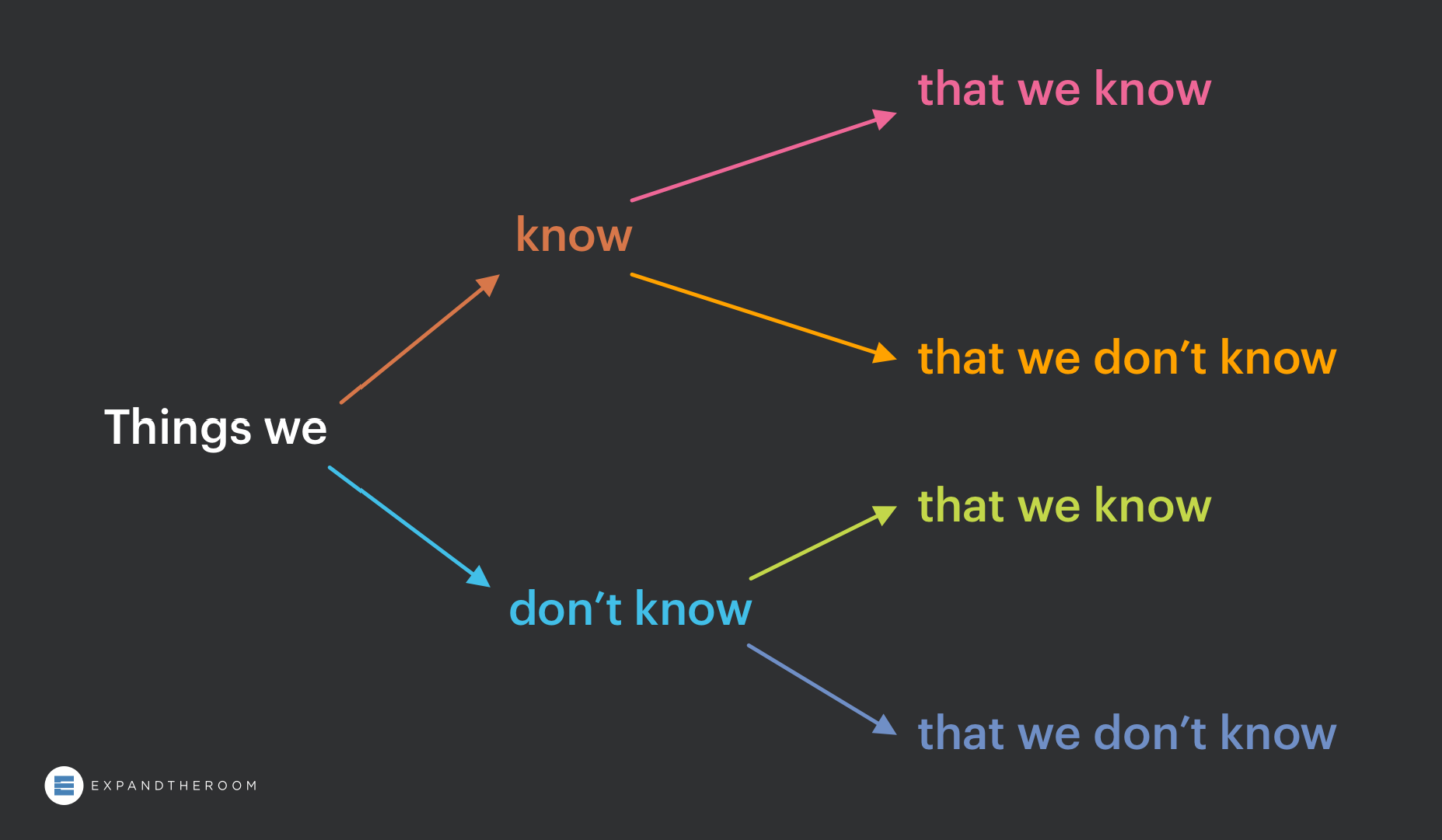
First, we write down all of the “known knowns” — things we know that we know. A piece of information written in this bucket is not meant to be checked off as something we don’t need to know anything more about, but rather a hypothesis we need to confirm in the interview. We do this to avoid moving forward on assumptions and to make sure all of our interviewees are on the same page as us.
Next, we look at known unknowns — things we know that we don’t know. What insights are missing in our knowledge base? What do we hope to learn from our interviews?
Of course there are also unknown unknowns and unknown knowns, but by definition we are not aware of them, so they’re not exactly parts of this framework we can write down. Hopefully, in time as the design process moves onward, these hidden unknowns will become apparent.
Frame questions through different lenses
Once we have written an exhaustive list of each of these categories — and really take the time to think of as many as possible — it is time to write the questions.
While some of what we just wrote down might have been in question format, they’re not yet written to be an appropriate question for our interviewees. Nebulous questions do not produce great insights. Asking, “what would make you want to buy and use this app every day?” might be the unknown you seek to answer, but asking it in this way will get a fuzzy answer.
Instead, let’s seek to answer this unknown by asking a number of questions that address the desired insight from a few different lenses. These lenses are facts, objectives, emotions, and ideas.
Lens 1 – Facts
Facts address the ‘who’, ‘what’, ‘when’, ‘where’, and ‘how’. If your unknown is ‘What would motivate someone to use a monthly clothing delivery service?’ You might break this down into questions that give you greater context of the user’s situation.
- “Where do you normally shop for clothes?”
- “Who, if anyone, helps you?”
- “When do you go shopping?”
- “How often do you normally buy new clothes?”, etcetera.
During this question brainstorming phase, try to focus on quantity and then groom later.
Lens 2 – Objectives
Objectives focus on the ‘why.’ With this section we’re trying to identify goals and motivations. The questions don’t literally need to begin with ‘why’, but they are less straightforward than the previous ‘facts’ category. Sticking with our unknown, ”What would motivate someone to use a monthly clothing delivery service?’ Some good objective based questions might be,
- ‘Think about the last place you bought clothes, why did you choose that particular store?”
- “Walk me through your shopping experience and how you decided what to buy.”
Asking for specific examples of an experience can make it easier for someone to provide details about their thought process.
Lens 3 – Emotions
The next category for framing questions is ’emotions’. Emotion-based questions are a powerful way to understand motivators and a user’s point-of-view. Two examples in this scenario might be,
- “How do you feel about the idea of someone else making style choices for you?”
- “When you realize it’s time to buy new clothes, how do you feel?”
Be sure to avoid leading questions, especially in this category. You want to avoid prescribing emotions to your interviewee in the question, for example, “Do you get excited when you receive a package in the mail?”
Lens 4 – Ideas
Lastly, there is the ‘ideas’ category. Often an interviewee who is familiar with the problem you’re trying to solve will have a few of their own ideas on what to do about it. Few people you talk to will be trained designers with enough knowledge of your business and problem space to come up with a great solution on the fly, but don’t discount the ideas they do have. Ideas from a stakeholder or end user provide insight into how they are thinking about the problem and what they wish could be solved. Considering the thinking behind these ideas can contribute to your eventual solution. An example ideas question could be,
- “If you could change one thing about your wardrobe, what would you change?”
Repeat and organize with the Research Questionnaire Canvas
Repeat this process with each known known and known unknown you wrote down previously and you should be left with an abundance for useful product research questions. The next step is to groom and organize these questions into an interview script and to conduct the interviews. Facilitating an effective interview from your questions is another skill entirely, so be sure to brush up on interview best practices as well.
Chapter 4
Continuously Test and Measure to Continuously Improve Results

After you’ve done your interviews, you’ll set out to produce your first prototype—a hypothesis of sorts for the experience that you believe will have the most impact on the project’s goals.
To help you gauge this impact and to get data-driven buy-in from stakeholders, it’s critical to define and measure against a set of design success metrics.
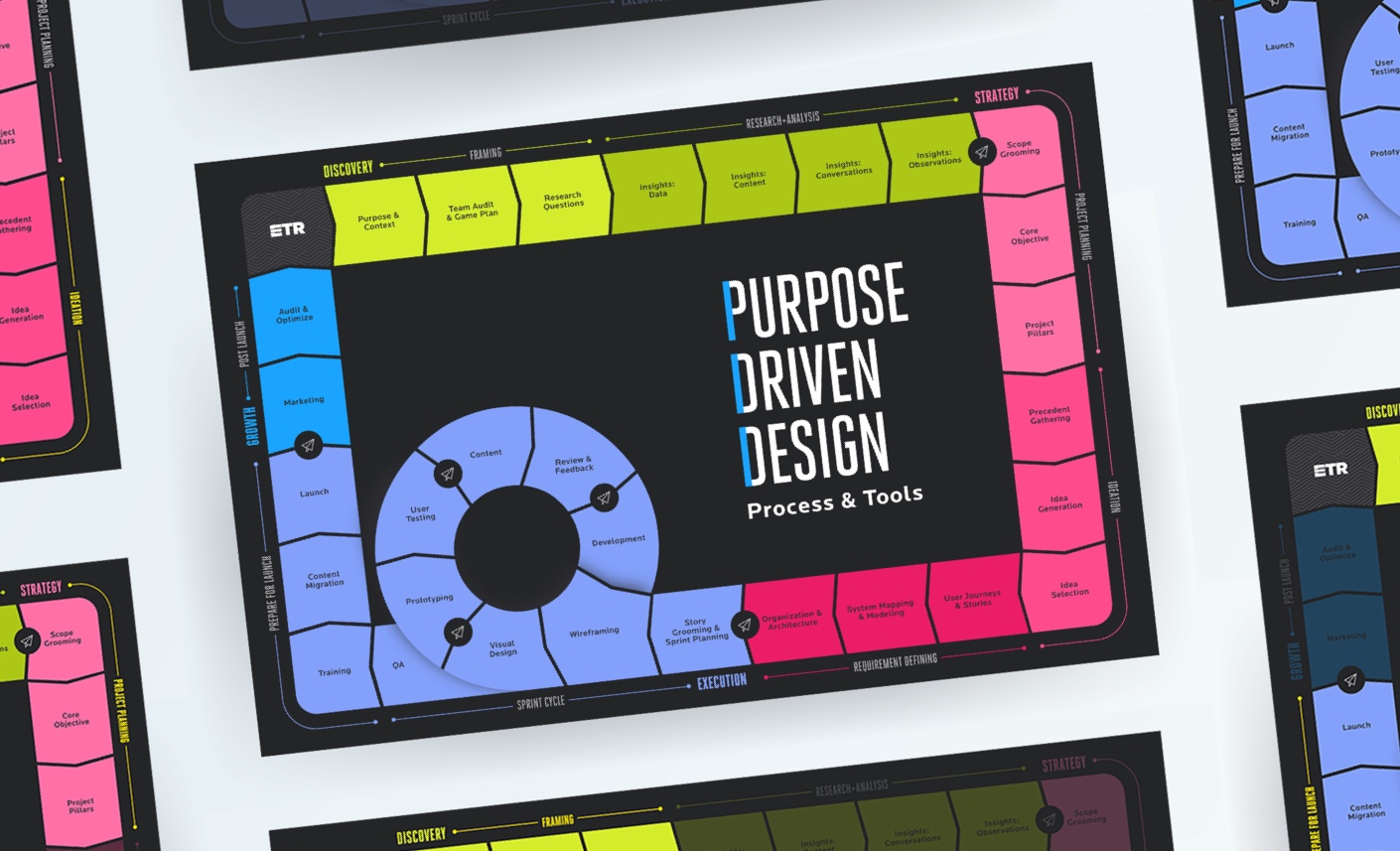
We have a phased approach to the design process called Purpose-Driven Design, and we incorporate design measurement throughout the entire process. Our work using UX metrics to measure improvement has been featured in the Nielsen Norman Group report, UX Metrics and ROI.
Define your metrics
Before you are able to start measuring design, you need to define the metrics, or data points, you will be tracking. To figure out what metrics to track, you need to ask yourself:
“What problem is our design trying to solve? What is the outcome we want to see?”
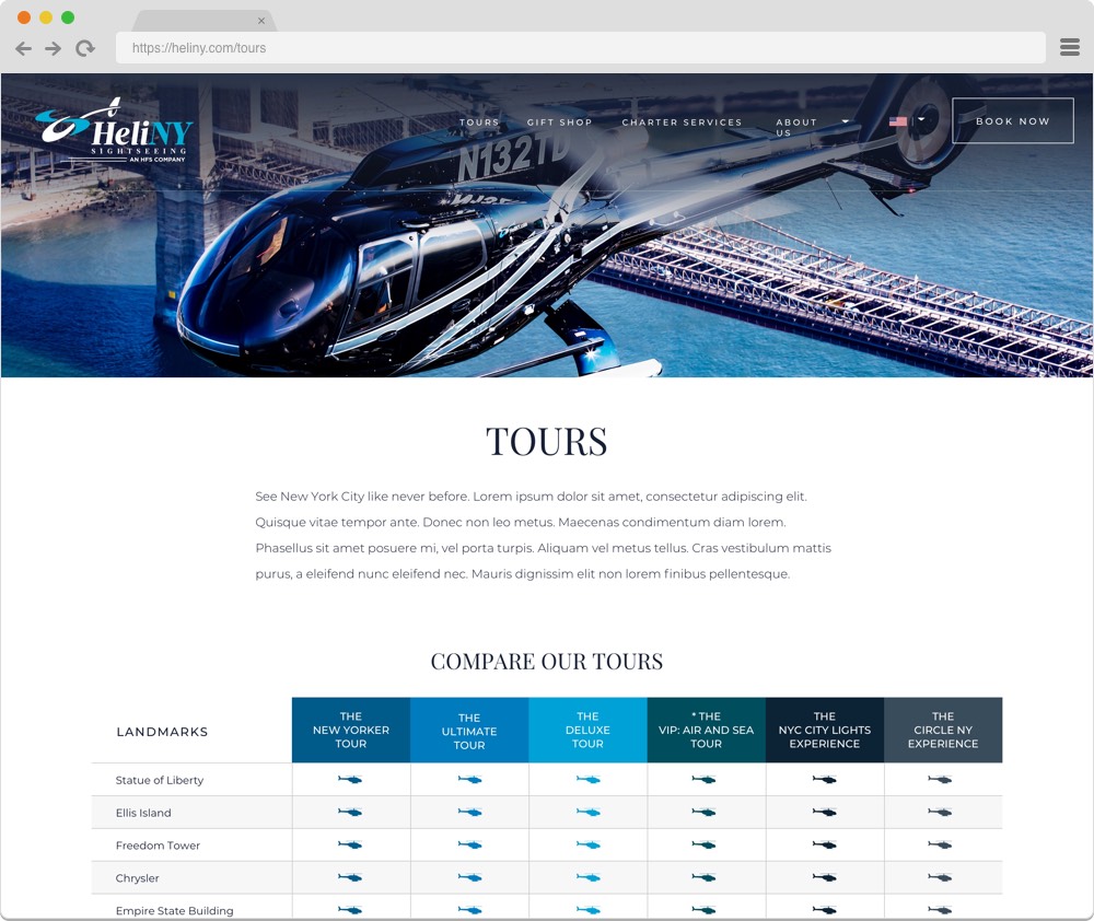
To give an example of this process we’ll use HeliNY, a helicopter tour company we partnered with. HeliNY offers award-winning sightseeing tours of the magnificent NYC skyline and charters in the NYC area, and they needed a new website. We started our process with stakeholder and user interviews to uncover the pain points in the existing website. We discovered that the booking process was considered difficult by customers. The tour information itself led to confusion and the booking form was difficult to fill out, leading to drop off. Additionally, HeliNY was concerned with the perception of their brand, and wanted the redesign to establish the brand as modern and luxurious. From these pain points, we devised different metrics to measure throughout the process: perceived ease of understanding of tour information, drop-off rate and perceived ease of use for the booking form, and brand word associations. We’ll continue to reference how this project exemplifies our measuring process throughout this article, and you can find the HeliNY case study on our website.
It is important to remember when choosing metrics to track that you shouldn’t craft your design solely to see a positive outcome on your metric. As Goodhart’s law states,
“When a measure becomes a target, it ceases to be a good measure”
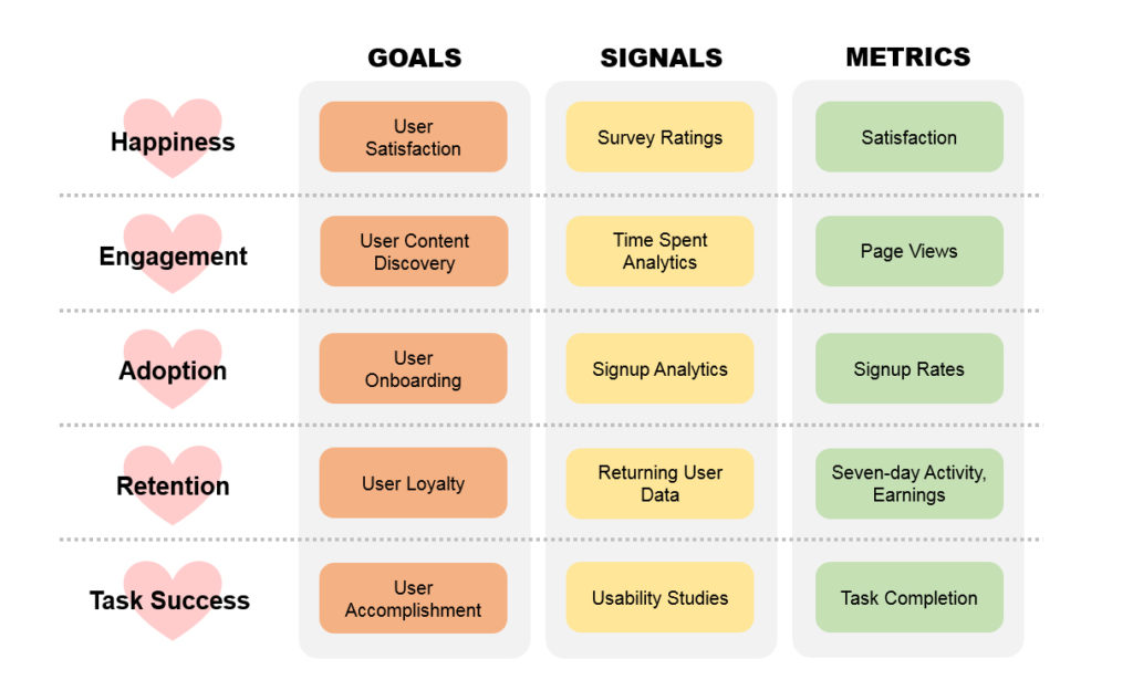
Use metrics as a yardstick and not a goal post. There are countless metrics you can choose to measure for a project and choosing the right ones depends entirely on your organization’s unique goals. At ETR, we work with our clients to develop these unique project metrics. Google’s HEART framework is a good place to start brainstorming what metrics make sense for you.
Choose a measurement method
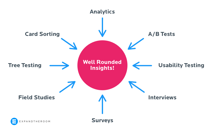
After establishing metrics to track, the next step is to decide how you want to measure. There are many methods for conducting user research and measuring design, as we’ve discussed. Let’s dive deeper into analytics, surveys, tree testing, and usability testing, which are particularly helpful when comparing before and after a change. The method you choose will largely depend on the type of metric you’re collecting, and at ETR we usually use a combination of these methods.
Analytics
Analytics is the easiest of these methods to dive into. As long as you have properly set up and goal-specific metrics being tracked in a tool like Google Analytics, Adobe Analytics, Hotjar, etc, you pretty much just have to sit back and wait for traffic to come in, provided you have enough visitors to get data representative of your audience in a reasonable amount of time. The challenge comes later with learning how to interpret the data in a meaningful way.
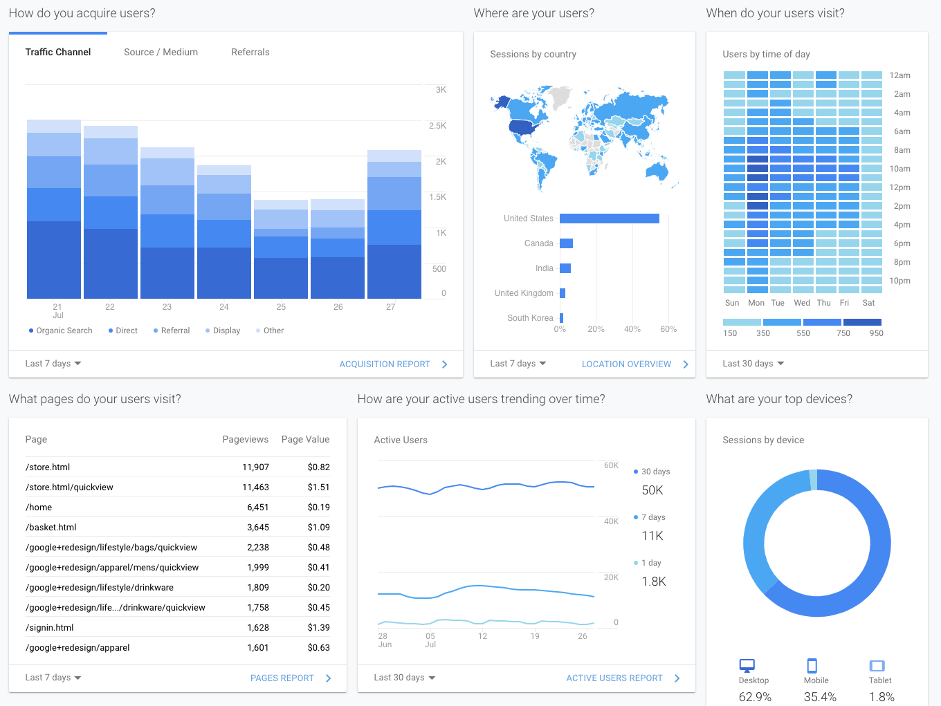
Choose analytics when you want to measure user interactions on your product, such as acquisition (where they’re coming from), what content leads to goal completions, and whether they’re using your product’s features.
Analytics can only take us so far — this method tells us who is visiting, what they’re interacting with, where they came from and where they’re going. What it can’t tell us is why they’re doing what they’re doing. Knowing why can help you further understand your users, their pain points, and how to make a better design moving forward. Because of this we recommend combining analytics with other methods to measure design from different angles, a process known as triangulation. The following three methods can be used in conjunction with analytics to help you triangulate your research.
Surveys
Surveys are deceptively easy. As Erika Hall states, “Surveys are the most dangerous research tool — misunderstood and misused.” But when done right, surveys can be a valuable way to collect data on the perceptions of website visitors, especially when tools like Hotjar make installing on-site micro-surveys a cinch.
Choose surveys when you want to measure a user’s perceptions of a product, such as feelings toward a brand, how easy they think a task was, or whether they’re finding the information they need.
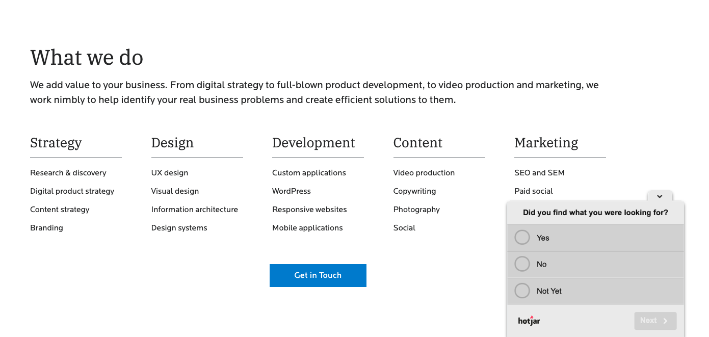
With surveys, we are beginning to interact with our users more directly to get at the why. Surveys are good at measuring perceptions because they are subjective while analytics offer objective numbers. If you ask a user to rate how easy a task was, they will give you their perception of the ease, not an objective measure. This can be both useful and not depending on what you are after. The fact that what people say and what people do often don’t match up makes surveys a bad source for objective product feedback, ie “Would you use this feature?” On the other hand, tracking how users feel about your brand over time such as with an NPS survey or brand perception survey can provide valuable insights. Adding an open-ended response field such as “Why did you give this response?” can help us understand user motivations, but don’t expect the same detailed answer you can get in a live interview or usability test.
Tree testing
Tree testing is a method we use specifically for testing navigation. Participants are presented with a text-based version of a website or product’s navigation and asked where they would go to find certain information. Tree testing helps us to determine if the labels and structure we have set up — the information architecture — makes sense to our target audience. We use Optimal Workshop for conducting our tests and analyzing the results.
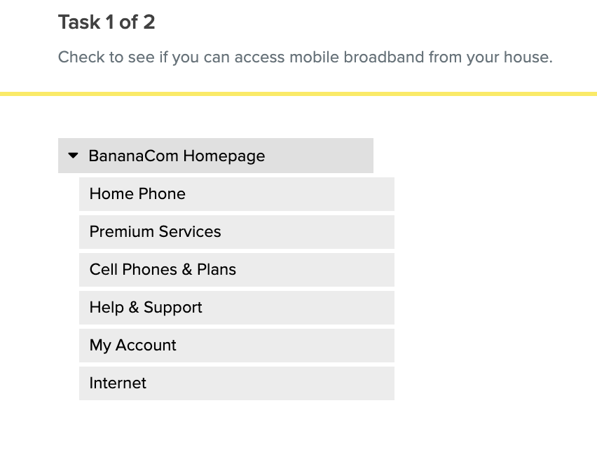
Choose tree testing when you want to measure how usable your navigation is — do people know where to look for information, and how long does it take them to find it? A bloated navigation causes a bad user experience. If users can’t find what they’re looking for quickly, they’ll leave. Tree testing helps you figure out the paths your users take to find information, identify points of confusion, and work to make those paths more direct.
Just as with surveys, try to leave a space for open-ended feedback, such as with a final question, “Was anything confusing to you about this navigation?”
Usability testing
Usability testing is the most involved of the four methods, but can also produce the most insightful results. This method involves recruiting participants from your target audience to complete tasks using your product while you monitor their process. From here you will be able to see not only if they are successful using your designs but also identify the problems they run into or the unique ways they use the product you may not have expected.
Choose usability testing when you want to measure how successfully users can complete a task, how long it takes to complete a task, and what kinds of errors they make. Usability testing is the best way to understand “why” your users make the decisions they do and what’s tripping them up. In a moderated usability testing session you can observe people using your design in real time and ask questions when something unexpected happens.
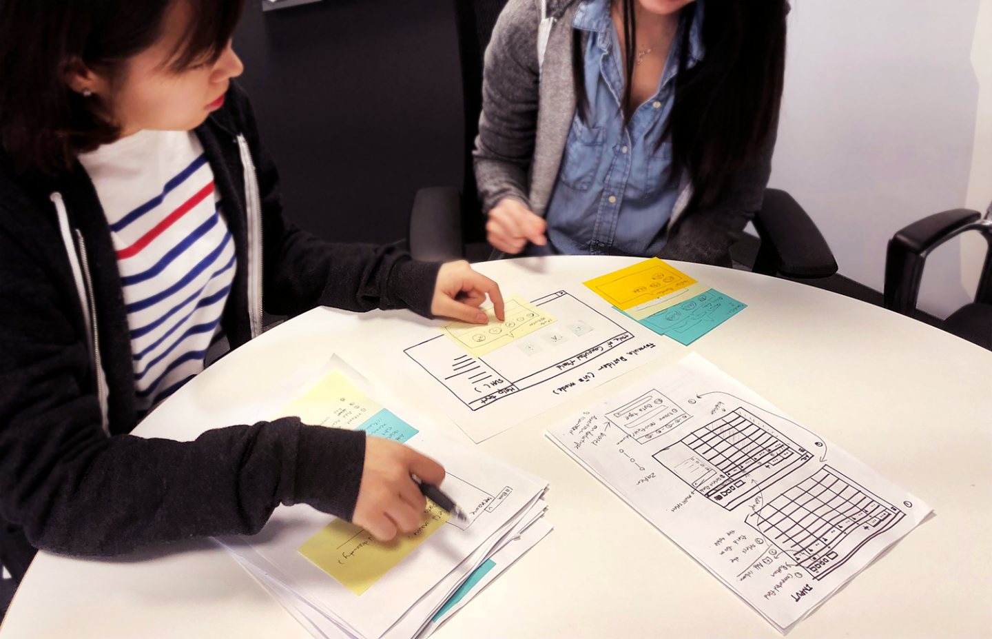
When measuring design with the other methods mentioned above you will often come across metrics that are hard to explain, such as “Why are our users spending so much time on this page?” Usability testing can help to answer those questions by offering a firsthand observation of how users use your product. This is why triangulation can be a powerful way to measure your designs from different angles — different methods reveal different types of data, offering both questions and answers when paired together.
For our HeliNY project, we determined the best method for measuring our metrics would be a combination of on-page surveys to understand if users could find the information they were looking for as well as their perceptions of the brand, and analytics to monitor drop-off rates on the booking form.
Measure throughout the project
After you know what metrics you’ll track and what methods to use, you can decide when to measure. Measuring at different stages of a project achieves different goals.
Measure a benchmark
If you want to know what kind of impact you’ve had at the end of a design project, first you need to know where you stand today. At the beginning of a project, it’s very valuable to measure a baseline of your defined metrics. If you don’t have an existing product, you could measure your competitors instead and set their metrics as a goal to beat.
Measuring design at the beginning of a project also serves the dual purpose of helping you uncover usability issues in your existing product (or in a competitor’s) that your future designs can work to solve.
Once you have a baseline for your metrics, you will know exactly how much you need to improve to meet your goals. Many times even a slight improvement can be considered a success, but it is important to have a defined goal you can reach to determine what “success” means for your team.
Measure your progress
Throughout the design process there are opportunities to test and validate your design solutions. For example, at ETR we often tree test a product’s existing navigation (providing a benchmark) against our first round of navigation changes. By comparing these two while still in the design phase, we are able to see if our changes were more successful than the benchmark as well as keep iterating on our design based on the new data.
Measure your success
Finally, when a project is complete and your new design is out in the world, you can measure the impact you’ve had. By running a measurement test with the same questions/format as your benchmark and a sample size large enough to produce statistically significant results, you can easily calculate the change between the two and produce a data-backed report of your success.
If the numbers aren’t as positive as you hoped, you didn’t fail. Having data on where you started and what your changes did is incredibly valuable — now is your chance to keep iterating, learn from what didn’t work, and keep improving. It’s better to know your product can be improved and keep working than to bury your head in the sand and ignore the data.
Try digging deeper into the data with segmenting to glean insights not found at the surface level. In what ways do users who complete a goal act differently on your site than those who don’t? Do users from a particular group make choices differently than others? How does taking a particular path affect the choices a user makes? These are just some examples of how to dive deeper into the data you collect.

For HeliNY, we saw significant improvements in our metrics after the redesign. By measuring and reporting this improvement, everyone felt they had a better understanding of the impact the project had had. We had a sense of achievement that we had improved the user experience of the site and achieved the project goals — with the numbers to prove it. Our goal is to perform this kind of measurement and analysis on every project we work on, and we always learn something unexpected and insightful from experimenting with real users. This is a core principle of our Purpose-Driven Design framework.
Tie design metrics back to business goals
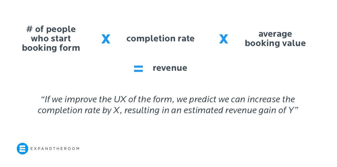
The metrics tracked for design success may not always be the ones that resonate with executive teams. If you’re wary of ‘time on task’ as a metric that will be well received or understood in presentations, it is possible to ‘translate’ design-focused metrics to business goals.
For example, let’s say HeliNY had a booking form completion rate of 40% in the benchmark measurement, and after our UX work, the new completion rate was 70%. If we know the average booking value and the number of potential customers who start the booking flow, it will be easy to calculate the additional revenue our improved UX will be able to bring in. You can also use this method for predictive ROI calculations to gain buy-in for your project — if you can estimate the effect you believe your UX changes will have and can back that estimate with real revenue gains you have a much stronger argument for why the work should be done. Nielsen Norman Group has a great article and full course on this topic.
Now is the time to plan for your next user research effort
If you are like most of our clients, the COVID-19 pandemic has only accelerated digital transformation efforts and highlighted new risks and opportunities.
We hope this guide serves you and your users well as you plan all the digital projects that will support your transformation.
If you’re setting out to do your user research on your own, we wish you great results. And if you’re looking for a partner to guide and work with you on your next project, we would love to hear from you.
More Insights
5 Ways We’re Using Artificial Intelligence as a Web Design Agency Right Now
We are testing the many tools powered by A.I. that have arrived recently in order to see how they could help improve our processes.

Taking Summer Vacation? Your Customer Experience Might Thank You For It
Sunscreen? Check. Beach read? Check. New perspective on your digital properties due to the neuroscientifically supported notion of perspective taking? Check! Wharton marketing professor and neuroscientist Michael Platt believes that many complex problems can be solved by utilizing frameworks that allow us to more effectively take the perspective of others. He writes: “… stimulating activities
