The Importance of Blue-Sky Ideas on Any Budget

In ETR’s Purpose-Driven Design we have a principle we often use to refer to our consistent track-record of launching great products on-time and on budget. That principle is Innovation = Aspiration/Feasibility.

What this principle means is that brand innovation based solely on creating trend-setting, cutting-edge, or industry-disrupting design is risky if the budget, resources, or content to actually execute them don’t exist. Clients can end up wasting a lot of valuable time and money on concepts and designs that never see the light of day, or worse, fail.
Interestingly, however, what we often see is a tendency for clients to over-index on feasibility and find that constraints can end up running the show. While some clients do seek “the next big thing,” we find many are inclined to skip the aspirational part because it might feel extraneous or like a waste of time. What we’ve found is that it is essential. In fact, we often find many aspirational “big ideas” are more accessible than you realize. Technology changes so fast, even we’ve found ourselves pleasantly surprised on many occasions how easy some formerly complex integrations have become.
At ETR we help our clients find that perfect balance between the equally important sides of the innovation equation by conducting budget appropriate blue-sky thinking sessions. These can be for one hour, one week, or longer depending on the need. We focus on the best and most realistic ideas for the project timeline and budget, but it takes a few steps to get there and a team that is willing to see past any perceived limitations.
There are a couple key reasons that might explain why feasibility concerns often get in the way – and we’ll discuss those below – but first let’s explore the role of aspiration. When it comes to aspiration, there are few better places to look than the fashion world.
What The Fashion Industry Teaches Us About Aspiration
The odds are you’ve never been to a fashion show, but you’ve surely seen pictures of models walking down a runway wearing creations that are exotic, bizarre, and essentially unwearable. You may have wondered: What is going on here? One of the more obvious explanations is that these are works of art. They are sculptural creations where the body is the canvas. They aren’t meant to be worn in a practical sense. A runway show is essentially an art exhibit.

However, the second and more important explanation is that they represent a moodboard. They are meant to provide an overall theme, tone, and atmosphere for what buyers can expect to see in actual clothing stores once the line becomes available. They show us the inspiration and muse behind the creations, where certain ideas came from, and what trends we might expect coming up. They are big, often impractical ideas meant to inform and inspire the more executable ones. They are aspirational.
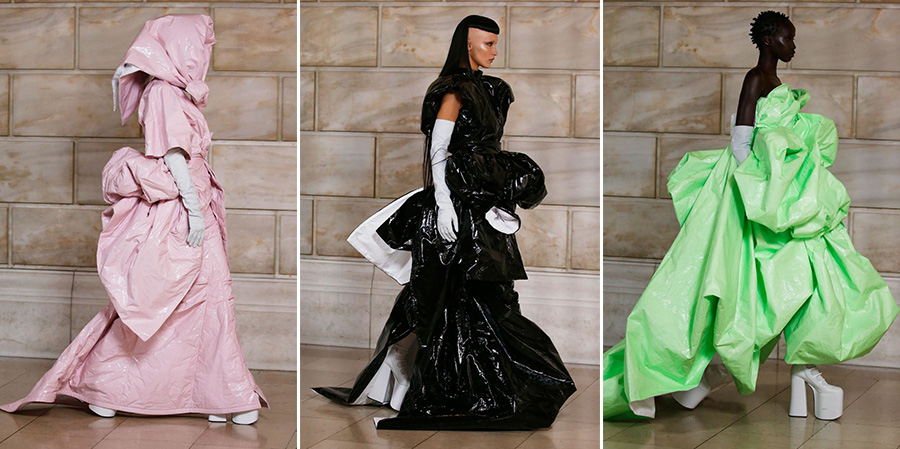
For example, the Marc Jacobs dresses from the Autumn/Winter 2022 fashion show pictured below are nothing if not flamboyant. But we won’t be seeing anything that looks like these exact dresses hanging on the rack at Nordstrom. That said, the forthcoming styles you can expect to see are dresses with exaggerated volume, high platforms, and vinyl material.

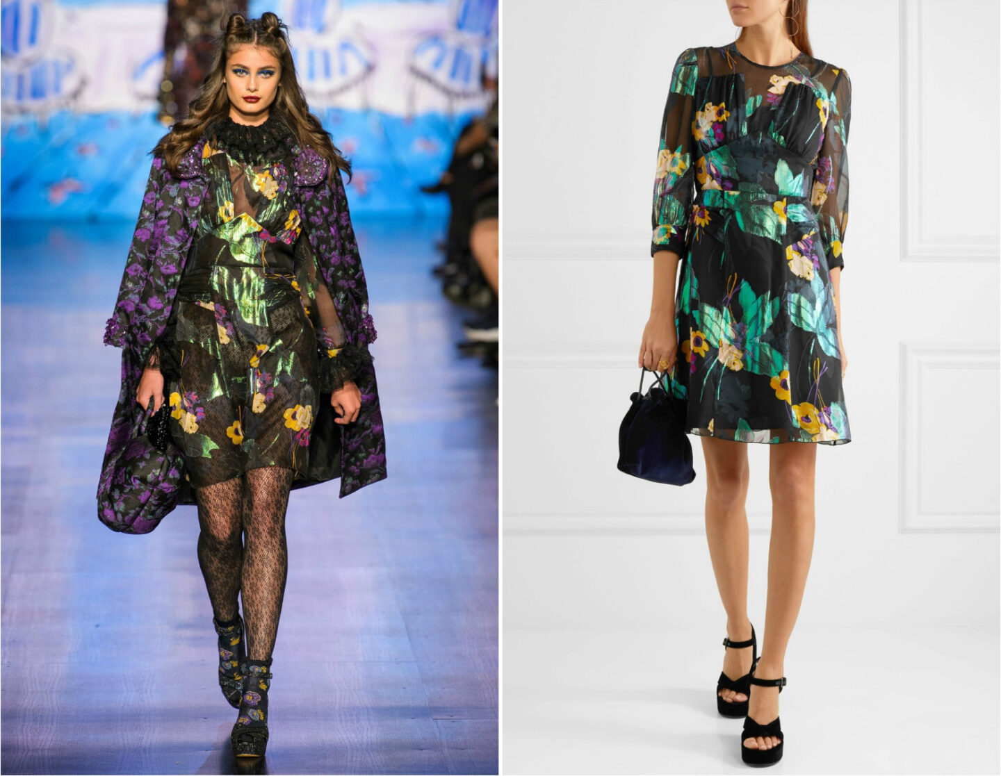
Fashion designers push their ideas to the extreme so they have a lot of material to draw from, figuratively speaking. The runway ideas are inspirational and aspirational. Then those ideas are distilled into the garments that are more attainable and appealing to the consumer market.

The Feasibility Trap
These fashion shows are grandiose examples of how aspirational thinking can be wild and fun, yet effective. It teaches us that you can throw big ideas out there and later distill them into workable concepts. So why is this step so easily skipped over? Let’s discuss feasibility and why it can be so limiting.
When it comes to the design and build of products, whether they are dresses or websites, feasibility is of critical importance. The answer to simple questions such as “do you regularly have access to high-quality images” can really make or break your design. However, as mentioned above, it can be a trap as well.
A while back I wrote an article about mental models and how they can get in the way of seeing new or different ways of accomplishing something. A mental model is your explanation and understanding of how something works, and they can be hard to rewrite. On one hand a mental model is very helpful. Once something is learned you can almost run on auto-pilot without having to actively process each step. They can keep you safe and help you when making choices. However, being comfortable and familiar with how things have always been done can also prohibit you from seeing any other way – even a better, more cost-efficient and time-saving way – to accomplish tasks. We often don’t push ourselves to think outside the box or to devise new systems. We are scared our customers won’t recognize us, or scared to tackle challenges we have always had. We assume this is just the way it is and it can’t be changed.

A second trap, which often comes from the honest intention of being efficient, is the failure to include all the right stakeholders in the room when it comes to planning and decision making for a new product, leaving valuable ideas, goals, and visions out of the conversation. Perhaps the client is fearful of wasting the CEO’s time or other high-level stakeholders, or believes they know what the product needs so it is decided to keep things lean. This reflects back to budget and time constraints. Meetings are expensive and we don’t have the time or means to disrupt the process we have in place today so we don’t rock the boat with a bunch of impossible ideas.
A Simple Way Out
One of the best ways to tackle the feasibility trap and push yourself out of your comfort zone is with a judgment-free, no-limits, blue-sky ideas brainstorming session. Blue-sky ideas refer to those that have no limitations. Oftentimes we are afraid to put our ideas out there because they are impossible,“stupid,” expensive, our boss is listening, they won’t move the needle, and so on. That is why it’s so important to create a moment where all of those roadblocks are removed. What would you want to do with your website or product if there were no budget constraints, no time constraints, and unlimited resources? There are no bad ideas here or wrong answers. It’s an opportunity to brainstorm and think big.
This is such an important part of the creative process because it can get you out of your rut, force you to stop thinking practically, and ignore the limitations. Like a fashion show, it’s important to push yourself to explore ideas that may seem out of reach or impossible or even ridiculous but can crucially help discover and inspire versions of those ideas that you can execute today. It’s also important to remember that good ideas come from anywhere. This is a time to hear from everyone from the CEO to the intern.
And fortunately for us in the web development industry, we can go from runway to reality much faster than many businesses that are dependent on physical materials, factories, or a bricks-and-mortar supply chain.
THE BLUE-SKY PROCESS
How do you have a blue-sky brainstorm session?
- Gather all the important stakeholders in a room and just start brainstorming – without limits or judgment – all of the amazing ideas, visions, and functionalities you would love to have with your product. An animation of your product or 3D visualizations, daily video content, a user dashboard with personalized stats, custom photography, interactive polls, gamification, a talking cat robot, etc. You can do this by just throwing out ideas or grabbing screenshots from websites that are doing similar things that you would love to incorporate into your brand in a similar way. Here we can be aspirational.
- Capture all of those ideas on a spreadsheet or word document. We also love to use Miro because it’s like a big whiteboard with sticky notes that you can create digitally and move around. You can also save your screenshots right in the Miro board.
- Try to categorize your ideas. Maybe you can bucket them by things that require content, or special functionality, or user data. Another way to organize is by product area. Perhaps by homepage ideas or those for product pages.
- Consider the impact of each idea. Would a customizable dashboard be extremely useful to your users based on their needs? Are animations important to the understanding and adoption of the brand or more of a nice-to-have in order to stand out? Will an interactive map better engage your audience or will the content just get lost?
- Consider the effort. You might be surprised how many things can be accomplished with plug-ins or a little extra time researching stock-photography, while some items may be a larger development or content lift. An effort/impact matrix is a great exercise for organizing your ideas and figuring out where to focus your efforts. The sweet-spot is those ideas with big impact and low effort.
- Here is the big feasibility moment. Begin thinking how you can work towards these goals. What would it take? Will more budget for assets and content be needed? More time for development? Can these items be put into phases? Maybe phase 1 is the basics with some simple UX and UI improvements, and phase 2 can accommodate some of the more out-of-the-box ideas.
- Lastly, and maybe most importantly, start thinking about what elements of these great ideas you can reasonably implement today. Forcing yourself to think big may actually have sparked an idea or realization of something that is feasible now. These are the immediate innovations where you have balanced aspiration against feasibility. Low effort and high impact. Perhaps you can’t have custom photography, but there might be good stock photos that can help you closely accomplish that blue-sky idea until you can afford custom photography later. Maybe a simple dashboard with basic interactions would not be that out-of-scope and then you can actually test how users are interacting with it. Maybe that cool gamification idea can be accomplished with a simple off-the-shelf plug-in.
Lessons Learned
Avoiding a blue-sky session because you assume you have no time and money for anything fancy and new could result in you missing out on those unique and special moments that will define your brand. You may have a new website that functions well and checks all the utility boxes, but it could miss an opportunity to evolve your brand and create valuable emotional connections with your customers.
We recently worked on a project that shared this experience. It was a tight timeline so all eyes were set on hitting the launch date successfully. We didn’t feel we had a lot of time to push the envelope in terms of content production and functionality so things were kept lean, adhering to the big challenges we needed to tackle like improved navigation, content structure, and taxonomy (which are all hugely important) as well as art direction evolution. A design and information architecture were created that was leaps and bounds above the current site, but it fell short of elevating some of the brand’s special sauce. While the features weren’t missing it didn’t fully capture some of the visionary ideas held by the CEO.
The team regrouped and committed to a blue-sky session to further tease out what these visions could look like and different ways they could be applied to the site. There were several ideas that fell into the high impact/high effort area, so we knew those had to be put on hold. But, surprisingly, there were several ideas that fell into the high impact/low effort quadrant that we could implement within our original timeline and budget that resulted in a completely redesigned homepage. It was much of the same content and features we had before, but reimagined in more impactful ways that better hit the goals. The results were stunning. With a little extra time spent on aspirational thinking we were able to put together an entirely new look.
The most valuable take-away here is that it’s never a bad idea to take a moment to think big and have a fashion show of ideas. The blue-sky process can be scaled to fit in any timeline or budget. Have fun exploring a host of different fabrics and patterns and see what happens.
More Insights
Six Design Trends You Will See in 2024
In the field of design, trends come and go. As technologies evolve and user preferences shift, design trends naturally progress and adapt. Keeping up with the latest trends helps brands stay current and resonate more with consumers as their preferences evolve. Last year, we highlighted dynamic color, personalization, and simplicity. In 2024, we envision designers
‘Tis the Season to Commit to Exceptional Experiences: UX Resolutions for 2024
With December upon us, our thoughts turn to resolutions—the ways we can be better in the year to come. For us as an agency, that means constantly raising the bar for ourselves, our clients, our communities, our industry, our families, and our friends. For our UX team, whose job it is to advocate for users,

