Explaining Our Eight Principles of Purpose-Driven Design

In many ways, process is the currency on which designers trade. The ability to tell the story of how you arrived at a particular design solution is every bit as important as anyone’s design deliverable itself. The ability to articulate how we’re going to turn a potential client’s great idea into a functional, valuable product or service is every bit as critical as wowing them with a Keynote deck full of hot-looking designs.
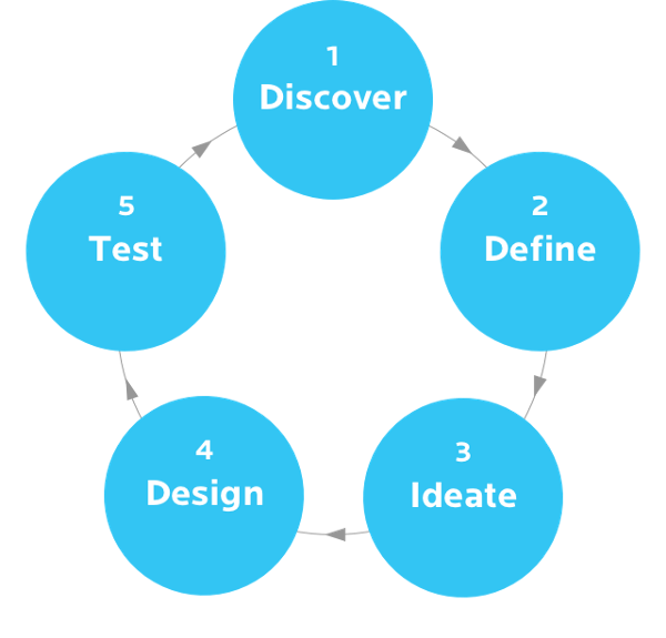
The helpful thing about the user-centered, iterative design process is that it’s a known quantity. If you look at the Our Process section of enough design agency websites what you’ll likely see is some variant of the following:

Start by gathering insights about the problem at hand.
Define the goal and scope of the project.
Ideate like hell. Prototype the best ideas quickly.
Test those prototypes.
Gather learnings from those tests.
Rinse and repeat.
That it’s such a known quantity is also what makes the user-centered, iterative design process so tricky. That is, it can be tough to differentiate yourself as a designer through your process, but not for lack of trying. I see design articles all the time with titles like Personas Are Garbage or Don’t Waste Your Time With Empathy Maps or Stakeholder Interviews Are For Suckers. The headlines are provocative to be sure, but, they all point to the same general idea: don’t fixate on design deliverables that might not be right for a given project just because your process mandates it. Instead, focus on the desired outcome of a given design phase and use the best tools in your arsenal to get there.
At ETR, we’ve spent a lot of time thinking about how we might add some kind of secret sauce to our own process. We discovered that we could, but it had very little to do with what design deliverables we chose to embrace or throw overboard. At the end of the day, we believe that designers differentiate themselves through their principles more than their process. A process describes how you do something while a set of principles describes why you do something. Our process is rooted in a set of eight design principles, and the whole thing is rolled up into a framework we call Purpose-Driven Design.
The Eight Principles
1. Real Value Is Discovered

Getting beyond what a client has stated as their problem and unearthing a hidden root-cause is one of the high points for any designer. That’s a moment when we can have an unexpectedly valuable impact on their organization.
That moment only comes after gaining a deep understanding of their business, customers, competitors, goals and aspirations.
This principle drives our discovery process and serves as the yardstick to let us know when a design problem has been properly framed and contextualized.
Our friend @danielmall introduced us to the idea of creating a Project Manifesto. It’s one or two sentences that articulates who the client is, who they serve, where they’ve been and where they’re going. It’s an incredibly difficult thought exercise. But when you can generate a Project Manifesto that a client agrees accurately captures them and their business, you will surely have what you need to deliver real value to a project.
2. Usefulness Depends On Empathy

People care more about their problems than our solutions. Design decisions must be rooted in solving real problems suffered by actual users, or they’re not useful.
@ashmaurya from LEANSTACK wrote an excellent article on this idea: Love the Problem, Not Your Solution. While Ash frames this through the lens of entrepreneurship, I think there’s a lot that designers can learn from his main point about the pitfalls of “Innovator’s Bias”, a crippling pre-disposition for some great idea that you just can’t let go.
It’s easy for designers to get seduced by a fantastic design solution while overlooking the fact that it might be a solution in search of a problem. This principle serves as a gut check and forces us to ask whether or not our design solutions are genuinely in the service of what we know about end users and stakeholders.
3. Collaboration Requires Learning

It’s impossible to collaborate meaningfully without an eagerness to learn from other people. One of the hardest things to do in any professional setting is to acknowledge when you don’t know the answer to something. We permit ourselves to collaborate from the perspective of receiving knowledge and insight from our team in equal measure to the knowledge and insight we give back. This extends beyond our internal team to include our partners from the client side of a project. In this way, we’re able to navigate new and increasingly complex design challenges collectively and honestly.
4. The Road To Obvious Is Rigor

John Maeda, who literally wrote the book on simplicity, once asked: How simple can you make it? How complex must it be? We’re continually looking for the place where the answers to these two questions meet.
This is the principle that we repeat most often at ETR. It usually happens just after that slap-to-the-forehead moment when one of us pulls focus on a laughably simple, elegant design after days of wrestling with a problem. We always wonder aloud, “Wasn’t there an easier way to get here?” Achieving true simplicity is a lot like solving a riddle — the answer is obvious only after you’ve worked it out. This principle reminds us that there’s no shortcut to simplicity in design.
5. You Can’t Guess Your Way To Credibility

We believe an unverified fact is just an opinion. Facts, not opinions, are the foundation of credible designs. We strive to leverage data where ever we can in our process to verify or refute our assumptions . This helps ensure that the things we design and build behave precisely how users expect them to.
Validating our work can come through rigorous user testing, or just by documenting an established best practice. The important thing for us is to eliminate assumptions whenever we can.
6. Design For Context, Not Device

This principle speaks to our position on the evolving topic of mobile design. We believe the physical conditions beyond the edges of a screen have every bit as much to do with how we design as the size and dimensions of that screen. What are users wearing? How’s the light? Are they sitting, standing or running? Maybe their hands are covered in paint or cookie dough.
By unhitching ourselves to the device du jour, and considering the full context around an experience, we believe we can remain flexible for whatever the future brings.
7. Innovation = Aspiration ÷ Feasibility

This principle reminds us that you can’t innovate on what you can’t realistically build. Good designers are always searching for creative ways to break new ground. Looking to the blue sky is a big part of why many of us chose this profession. However, we have to temper our aspirations with reality. That might be budget or time constraints, a client’s resistance to change, or technological limitations.
For us, feasibility has to do with collaborating early with developers to gain alignment and find efficiencies, allowing us to focus on the most potent opportunities for innovation.
8. Keep It Human, Stupid

Amanda O’Grady’s brilliant article, Stop Sprinkling Emotion, Start Creating Magic and Meaning was a big source of inspiration when we wrote this principle.
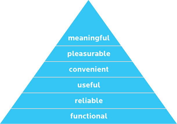
We’ve all likely seen some version of the UX Pyramid of Needs which describes an evolving hierarchy of design attributes. At the base there is functional. Next, is reliable. Then it’s useful, followed by convenient. From there it elevates to pleasurable. Finally, at the top where we all strive to be, is meaningful.

It’s a handy visual aid, but there’s something quite misleading about that pyramid metaphor. It implies that each attribute is somehow layered onto the preceding to create an instance of human delight — like when Bob Ross dabs on those final highlights, and you’re suddenly looking at a photo-realistic painting of trees.
We believe that if we want to have a chance at creating a meaningful connection with users, human emotion must be woven into what we design from the very start. For us, this means making users feel known and understood at every touchpoint along an interaction that matters to them.
There’s So Much More To Say…
Defining your own set of guiding design principles is an arduous task. It’s difficulty is amplified ten-fold for an organization. The most important thing we learned while creating ours is that it absolutely has to be true to who you are, or it won’t work.
We love to talk about process and principles, and we have a lot to say about it. We’ll be following up with more about how these principles guide our work through all phases of our design process and how we came up with them in the first place. In the meantime, we’d love to hear from you: what does your process look like, and what are the principles that guide it?
Thanks for reading.
More Insights
Six Design Trends You Will See in 2024
In the field of design, trends come and go. As technologies evolve and user preferences shift, design trends naturally progress and adapt. Keeping up with the latest trends helps brands stay current and resonate more with consumers as their preferences evolve. Last year, we highlighted dynamic color, personalization, and simplicity. In 2024, we envision designers

‘Tis the Season to Commit to Exceptional Experiences: UX Resolutions for 2024
With December upon us, our thoughts turn to resolutions—the ways we can be better in the year to come. For us as an agency, that means constantly raising the bar for ourselves, our clients, our communities, our industry, our families, and our friends. For our UX team, whose job it is to advocate for users,


