Six Design Trends You Will See in 2024

In the field of design, trends come and go. As technologies evolve and user preferences shift, design trends naturally progress and adapt. Keeping up with the latest trends helps brands stay current and resonate more with consumers as their preferences evolve.
Last year, we highlighted dynamic color, personalization, and simplicity. In 2024, we envision designers embracing innovations like AI, accessibility, and hybrid styles to redefine how users interact with digital products. Some industry thinkers have labeled 2024 “late-stage UX,” a period marked by automation, commoditization, financialization, and other factors. We’re noting some of these trends in the design realm. It’s an interesting time, because as AI makes design more accessible, it opens up potential for more innovation and different kinds of design problem solving.
With these macro shifts in mind, let’s dive into six trends shaping the design landscape in the coming year.
AI
Not surprisingly, our designers and researchers chose AI as the most significant trend of our present moment. New advancements in AI tools are creating efficiencies and opening up new avenues in the field of design. Designers now have access to powerful tools like Chat GPT’s new DALL·E integration to create images on-the-fly, or 3M’s Visual Attention Software, which predicts where users will interact with websites. (If you want to learn more about how we’re using AI as an agency, we’ve written a piece summarizing what we’re doing.)
We’re also seeing brands roll out standout examples of AI experiences for users. Roleplay on Duolingo Max is an AI-driven chat that allows language-learners to practice conversations. Visualizer by Legends is a short story generator based on students’ responses to prompts. LinkedIn’s career actions offer users personalized suggestions to build their careers. We will undoubtedly see more adaptive interfaces that leverage AI to create personalized experiences by combining bespoke copy, images, animation, and more.
Inclusive and Accessible Design
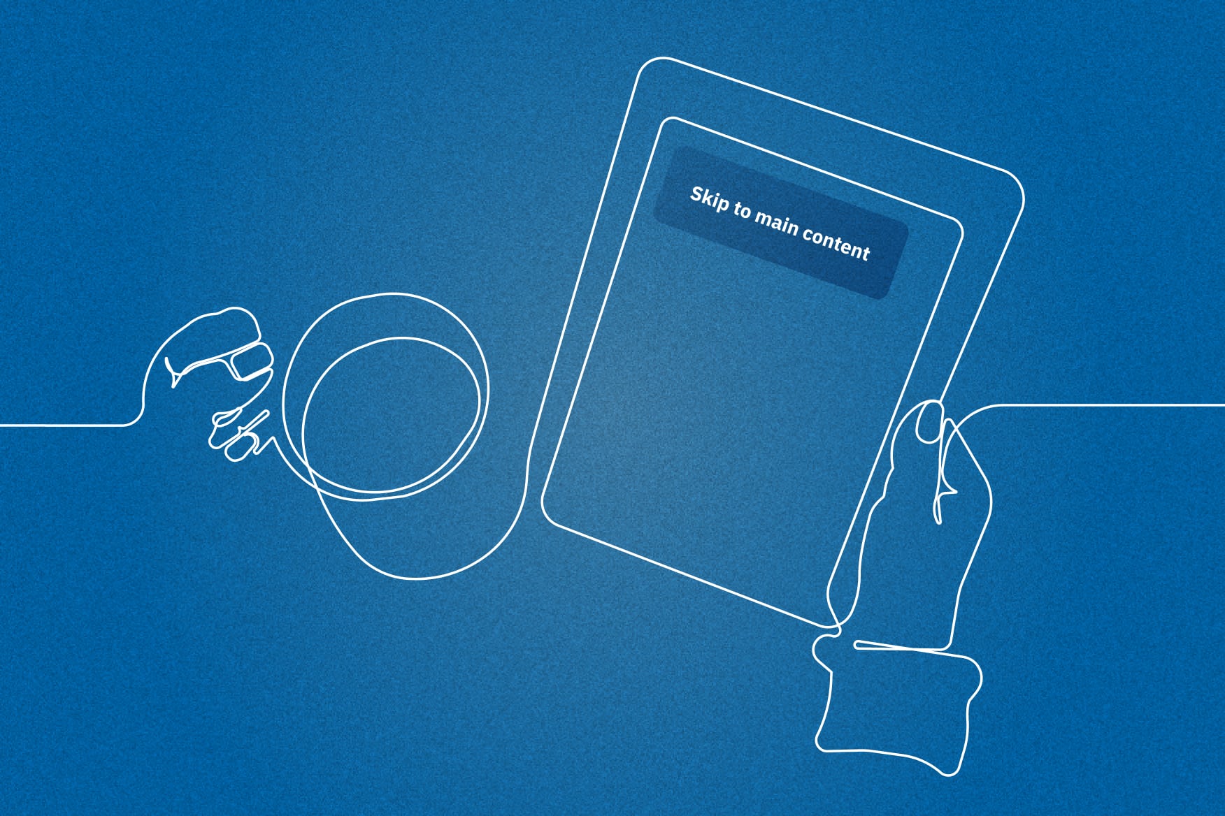
Web accessibility is the practice of designing and building websites that are usable by people of all abilities. The European Accessibility Act, which requires all websites to meet global accessibility standards, came into effect in 2019 and will be legally enforced in 2025. Examples of these standards are using alternate text for images for people who read content through screen readers and having sufficient color contrast. By following these standards, designers can make websites that give equal access to everyone, regardless of their abilities. While these improvements are designed to help users with specific disabilities, the evolution can elevate experiences for all users. For example, better contrast makes reading less fatiguing, and alt text can make content able to be indexed by search engines. If you’re interested in reading more about accessibility, we have also published posts on best practices, digital product accessibility, and a handbook full of valuable guidance and advice.
Animated graphics and micro-interactions
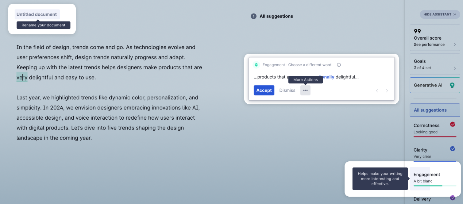
Micro-interactions are events triggered by user activity that signal a particular interaction was successful. Beyond just a confirmation when submitting a form, this could be small events on specific parts of a webpage. Through animations (which are often charming or surprising), these events help the user feel connected to the website as they navigate or progress through a task, series of tasks, or overall experience.
This year, we predict that websites that don’t use animation and micro-interactions well will seem lifeless and outdated.
Examples like Grammarly (shown above) showcase how micro-interactions create a frictionless and engaging user experience.
Evolved responsive design
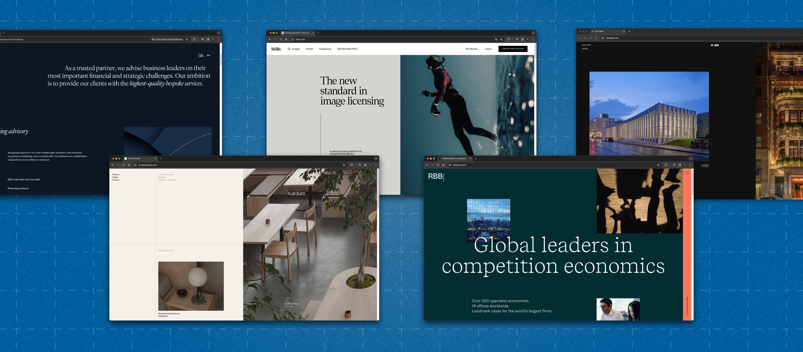
We’re witnessing a shift in web design from responsive design to unique cross-platform layouts. Companies now invest in creating consistent experiences across different screen sizes and devices, from phones to TVs to IoT devices. With this shift to more devices, we’re also tracking a related shift to revisiting the experience on larger screens after years of prioritizing mobile-first above all else. This change marks a departure from simplistic responsive design, introducing richer and more varied user experiences across different platforms. We’re seeing designers look back while looking forward by emphasizing the grid, typography, and white space.

Sustainability
As sustainability has become a global movement, brands and organizations aim to reduce their websites’ carbon footprint. We’re seeing major players like Google and Patagonia committing to carbon neutrality and e-commerce sites like Made Trade highlighting eco-conscious shopping choices. Sustainable design practices include reducing the amount and file size of images and videos and educating users to make sustainable choices as they use websites. When the internet accounts for an estimated 3–4% of global emissions, digital organizations have a unique opportunity to both conserve resources and influence their customers’ habits.
Hybrids
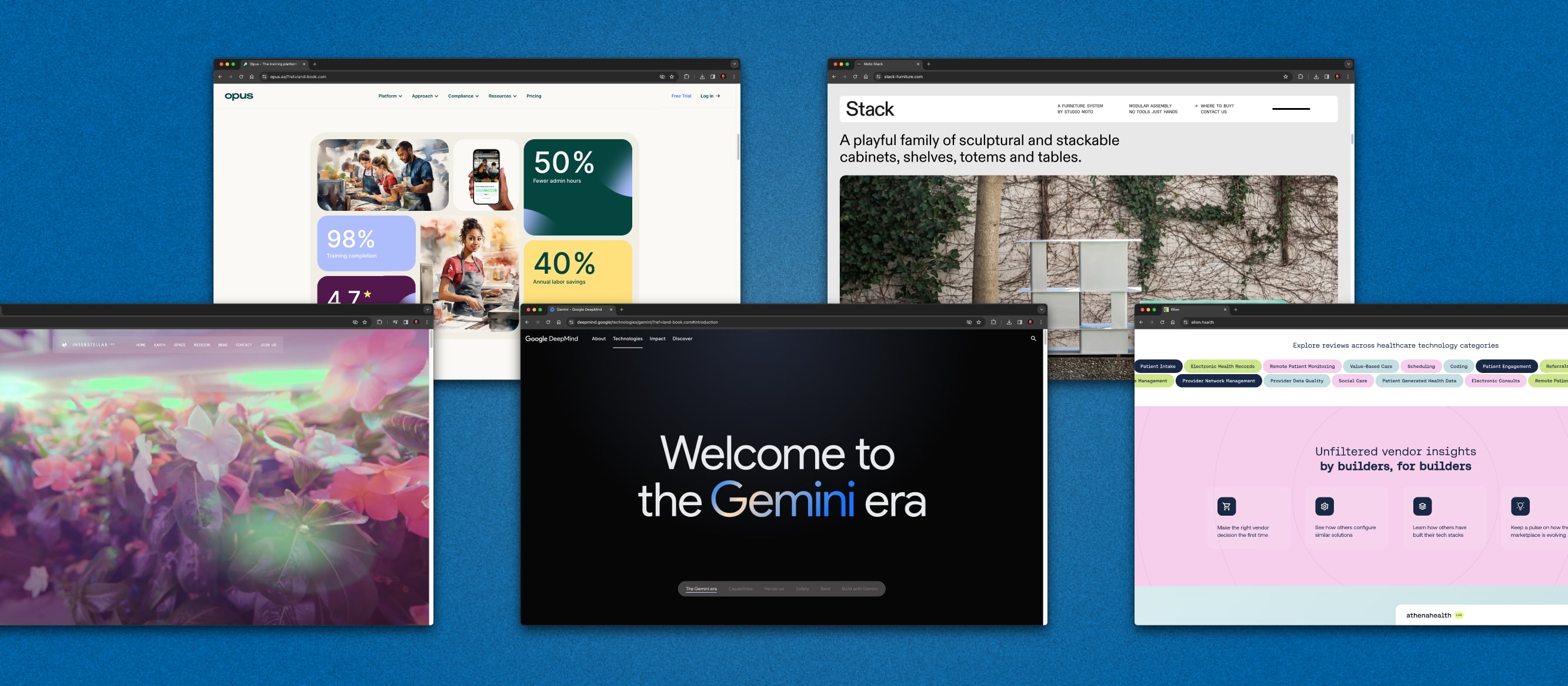
Another trend we are tracking this year is combining elements from other trends to create new visual styles. More of an approach than a singular style, this trend is exemplified by designs that seamlessly blend existing trends, like bento box layouts, dynamic island-inspired navigation menus, pastel gradients, stark minimalism, and cheeky neo-brutalism. This dynamic approach challenges users’ expectations by creating captivating new styles. Interestingly, it also seems that 3D designs are making a comeback after many years of flat design. As just one example, Shopify’s Polaris design system introduced 3D buttons, building off a trend some say started with Apple’s Big Sur icons in 2020.
That wraps up our recap of 2024 UI and UX trends. In summary, we’re seeing escalating technological innovation and the continued emphasis on social and environmental responsibility driving design innovation in 2024. By embracing these trends, organizations can create visually impressive products that resonate with their audience. Thanks for reading, and see you next year!
More Insights
‘Tis the Season to Commit to Exceptional Experiences: UX Resolutions for 2024
With December upon us, our thoughts turn to resolutions—the ways we can be better in the year to come. For us as an agency, that means constantly raising the bar for ourselves, our clients, our communities, our industry, our families, and our friends. For our UX team, whose job it is to advocate for users,
In Era of Artificial Intelligence, Empathic Design Matters More Than Ever
With the rapid expansion of new technologies like AI, we can see in human beings a fascinating desire for technology to do human things. We’ve moved far beyond assembly line robots putting rivets into car panels or picking items off a shelf. Where machines once took over rote and physically demanding tasks, we now have

