10 Design Trends You Will See in 2023

Innovation in design is driven by people’s preferences and what’s possible through the latest technology. User experience and user interface design are related practices that balance creating effective websites while piquing users’ interest by using the latest trends.
The internet is a vast place and new trends are evolving all the time. With our 20 years in the business, we always have an eye on where the web has been and where it’s going. As we look ahead to 2023, I’m delighted to share our UI designers’ and UX researchers’ predictions for which design trends will shape web design in the coming year.
Subtle gradients and airy backgrounds
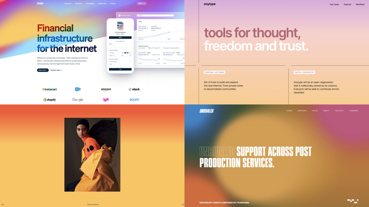
After years of clean web design using flat color, designers are now looking to create a more dynamic and captivating visual experience. We’ve recently seen websites that have a sophisticated approach to color. There seem to be two camps here, one favoring lush candy colors and one with more austere and monochrome color palettes. We’re tracking this trend across many verticals and brands, including ETR partner Stripe, whose website incorporates an ethereal, slowly moving gradient.
Animated graphics and micro-interactions
Micro-interactions are events triggered by user interaction that signal that the interaction was successful. Through surprising and delightful animation, these events help the user feel connected in a tactile, human way to the website.
As this trend continues to rise, we predict that sites that don’t use animation to provide feedback will seem lifeless and outdated.
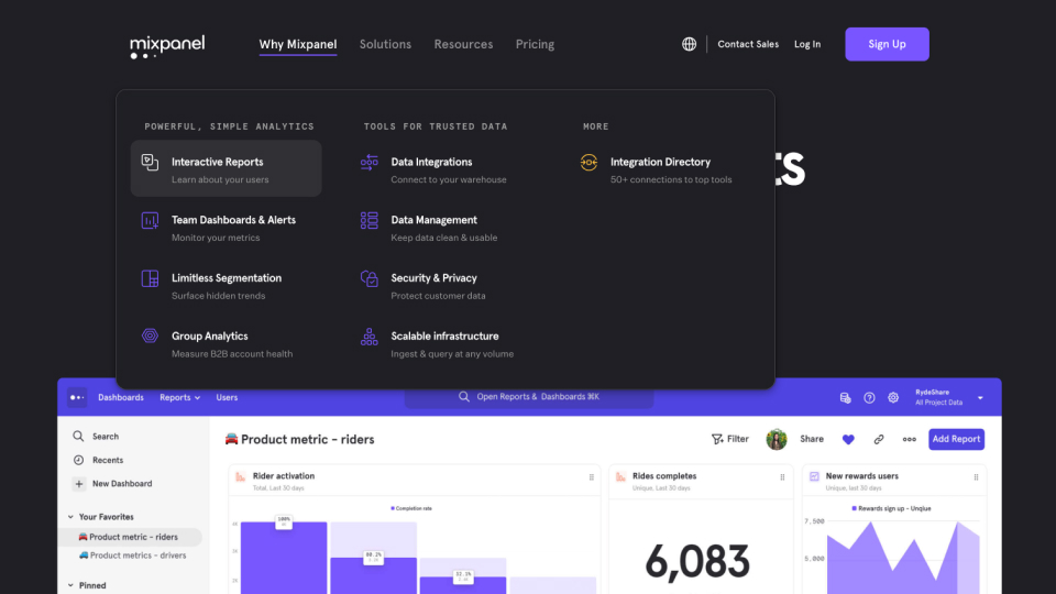
A great example of micro-interactions is Mixpanel, which employs subtle animations on interactive elements throughout its site. Here, we see colorful, animated charts and illustrations which imbue a sense of dynamic energy.
An evolution of personalized experiences
Over the past few years, as online experiences like shopping and streaming have become more tailored to user behavior and preferences, we’ve seen websites become personalized for each user. From show recommendations on Netflix to customized product recommendations on Instagram or Amazon, users have come to expect convenience and personalization.
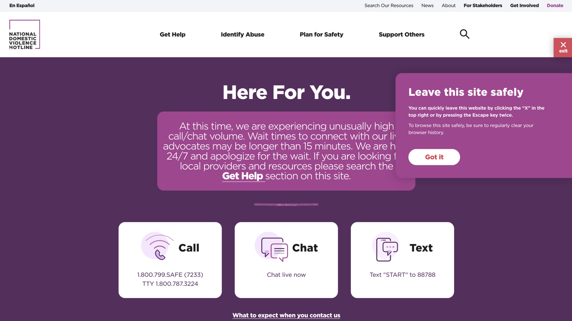
More recently, we’ve seen personalization become more user-specific and inclusive. With safety in mind, the National Domestic Violence Hotline places a floating close button that closes the browser tab and removes the page from your history. The user may also exit the site by pressing the escape key on their keyboard twice.
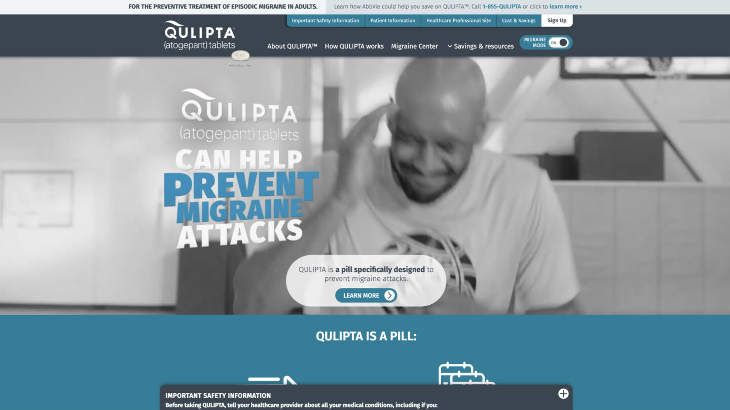
Another aspect of the personalization trend you will start to see more is new modes that move beyond the now common “dark mode” or “night shift” patterns which darken the design to reduce eye fatigue. You will see examples like Quilpta, which has a “migraine mode” that changes the website from full-color and vibrant to a soothing, cool color palette with black and white videos and photos.
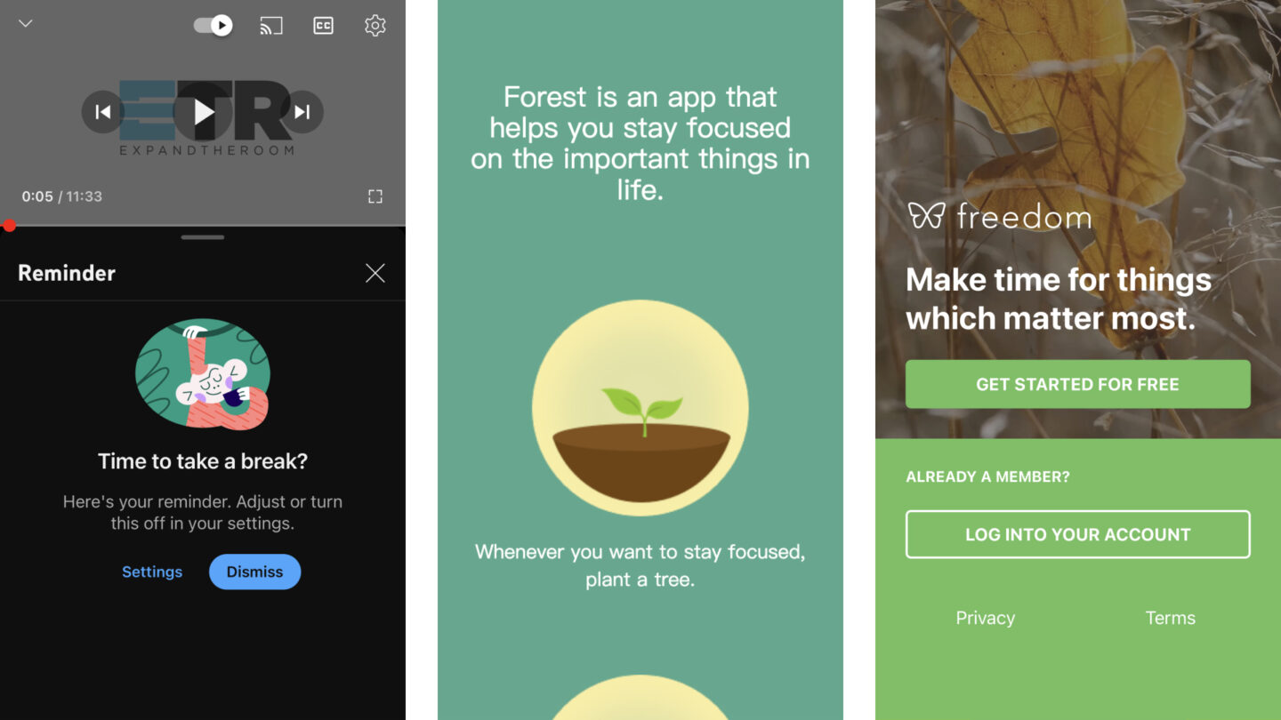
A healthier relationship to digital experiences
Many apps and services are now more conscious of their users’ screen time and present them with reminders to take a break from scrolling or streaming. Focus timers and app blockers offer users a way to take control of their digital well-being. More and more, users will come to expect the ability to monitor and customize their experiences with digital products.
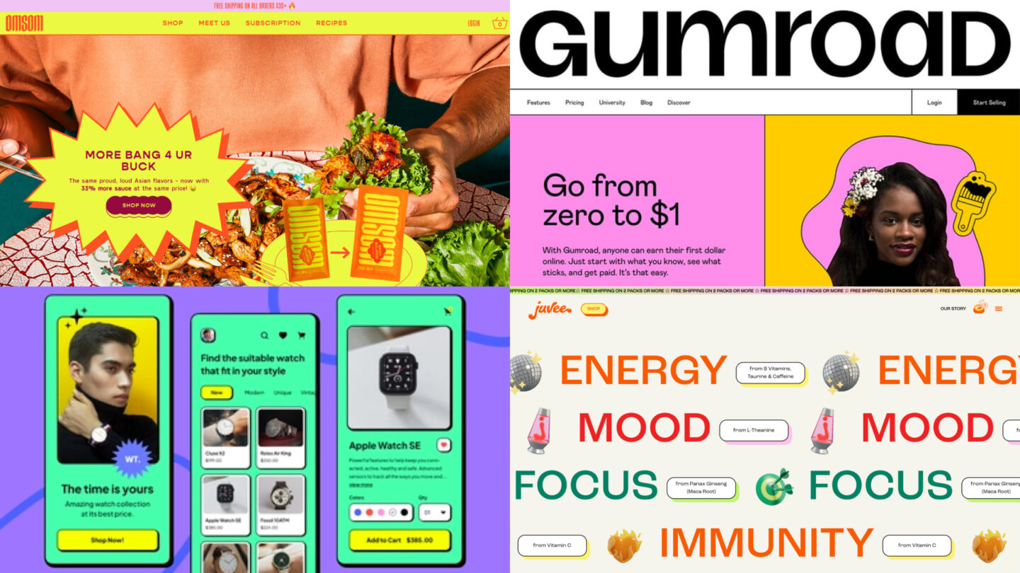
Breaking the mold
While not brand new, we’re going to continue to see the influence of a design trend called neo-brutalism, which is characterized by self-aware emphasization of elements like grids and shadows, retro graphics, and vibrant color. This style is striking and conveys a sense of nostalgia, levity, and boldness. Favored by start-ups and web apps, this style can be quite effective when paired with strong imagery and customer-focused copy.
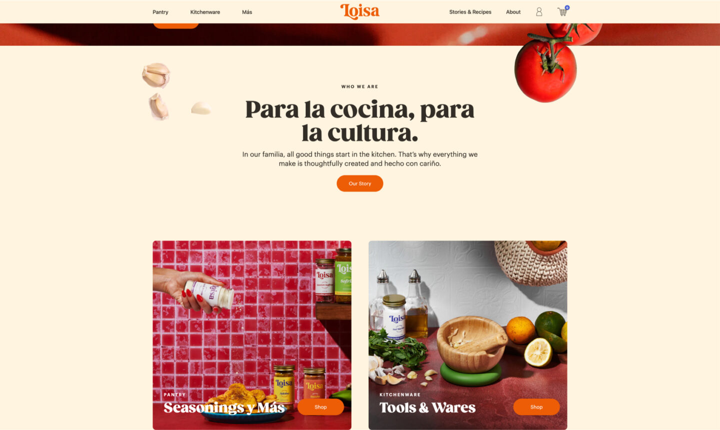
Vintage vibes
In 2023, we’ll continue to see designs that feel vintage or retro. Favored by food and wellness brands, these designs use fonts that recall the ’70s and ’80s paired with natural color palettes and retro-tinged photography. Web design can feel overly rigid and sterile, so brands are leveraging retro fonts and visuals to convey that their brand harkens back to a more authentic time.
Simplicity
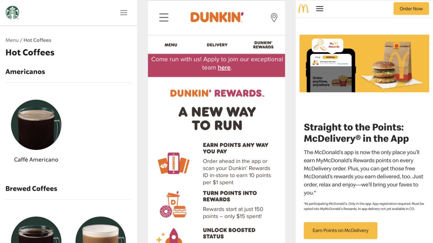
Brands are currently rebooting their logos and identities to be more simple and plainspoken. By reducing visual elements and leaning on their core essence, brands hope to feel more authentic and less corporate. We’re seeing this plainspoken and simple look applied across a brand’s visual ecosystem, from the logo to the website to stores, as in the case of Starbucks, Dunkin’, and McDonald’s.
Bold type
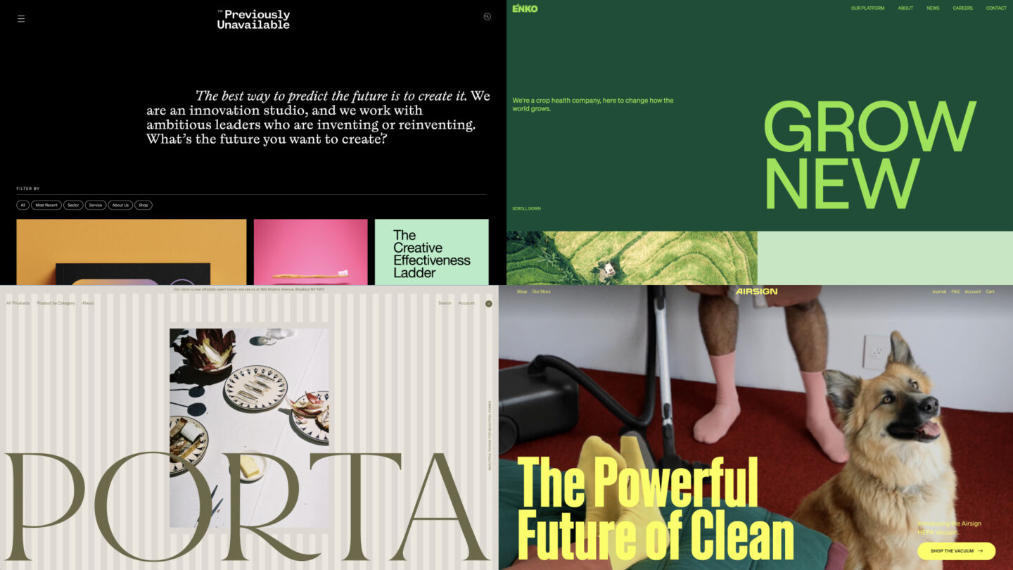
As the trend of simplicity continues, designers are looking for ways to put a new spin on conventional design. One solution is to put billboard-sized, unique fonts front and center on the homepage. Bold type never goes out of style, and UI designers are taking type to another level with sparse designs that rely on the visual punch of a strong headline set in an eye-catching typeface.
Sustainability
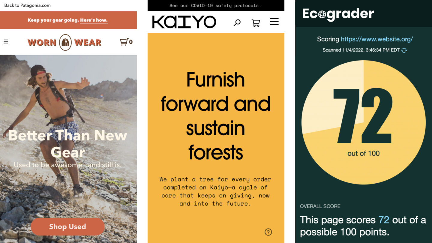
Many organizations are addressing the existential threat of the climate crisis by seeking to reduce the environmental impact of their business, including their website. Tactics like reduced page sizes and improved usability become not only performance metrics but also solutions to reduce a website’s carbon emissions.
Continued focus on accessibility and inclusivity
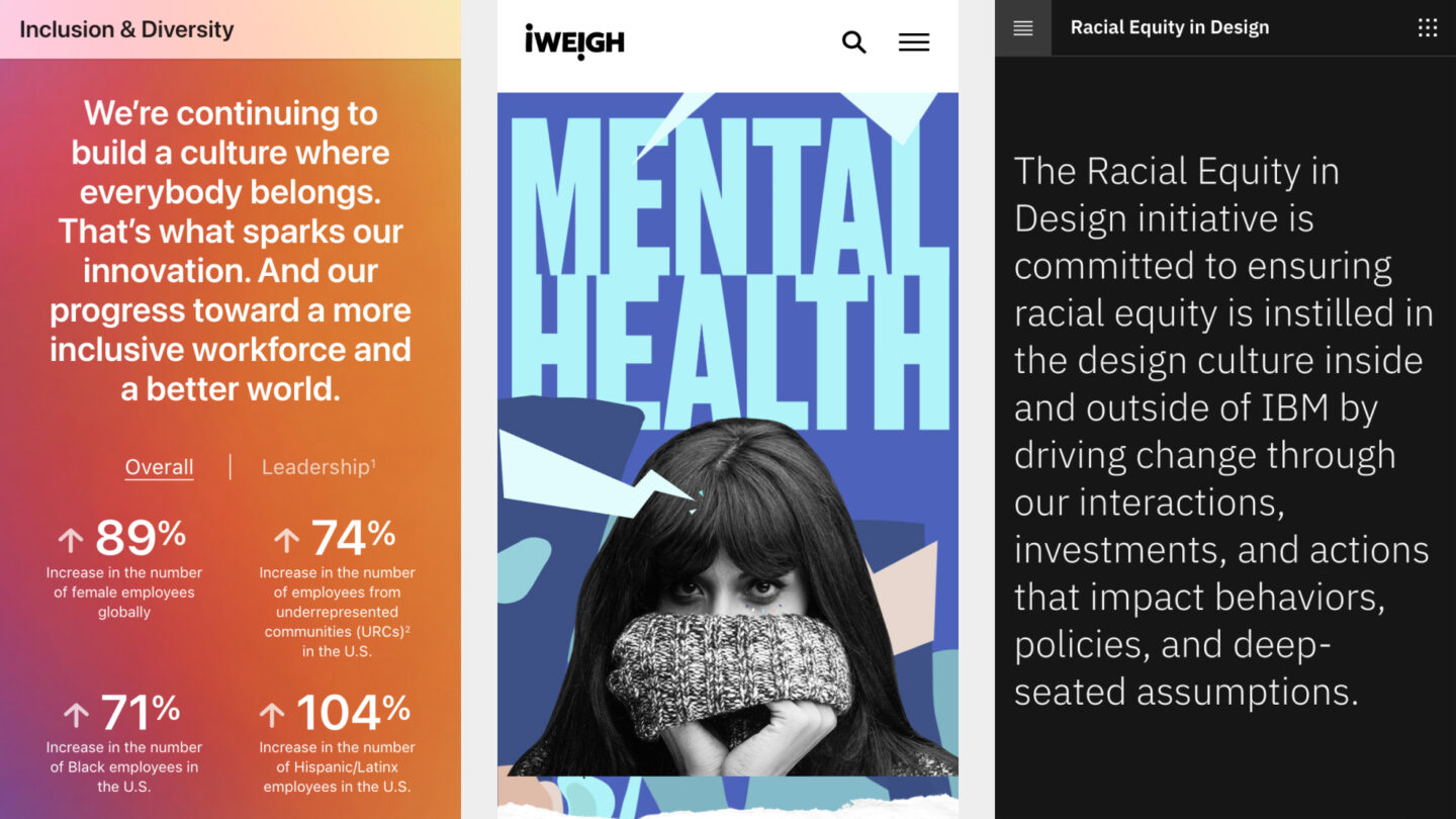
In 2023, we’ll continue to see brands and organizations amplify diverse voices, build inclusive communities and workforces, and push for equity in their industries. New media companies like I Weigh are leading the way in publishing, while companies like IBM have launched initiatives to drive change within their culture and society as a whole.
That wraps up our list of design trends to watch in 2023. Thanks for reading and see you next year. If you enjoyed this post, be sure to check out the articles linked below.
More Insights
How to Be Confident In Approving Your Website’s Visual Design
So here you are, just through the discovery phase of your website. Assuming you’ve defined clear goals of the project, done the proper research, and have a solid game plan to get there, it’s time to start creating. Whether you’ve hired a freelance designer or an agency, eventually there will be that moment when you’re

How Much Does a Website Cost?
A website costs exactly the same as a house or a car or a horse. The reality is that website design and development costs can range significantly depending on your requirements and expectations. Off-the-shelf website costs Let’s start at square one (pun intended). On a high level, if you use off-the-shelf software like Squarespace and


