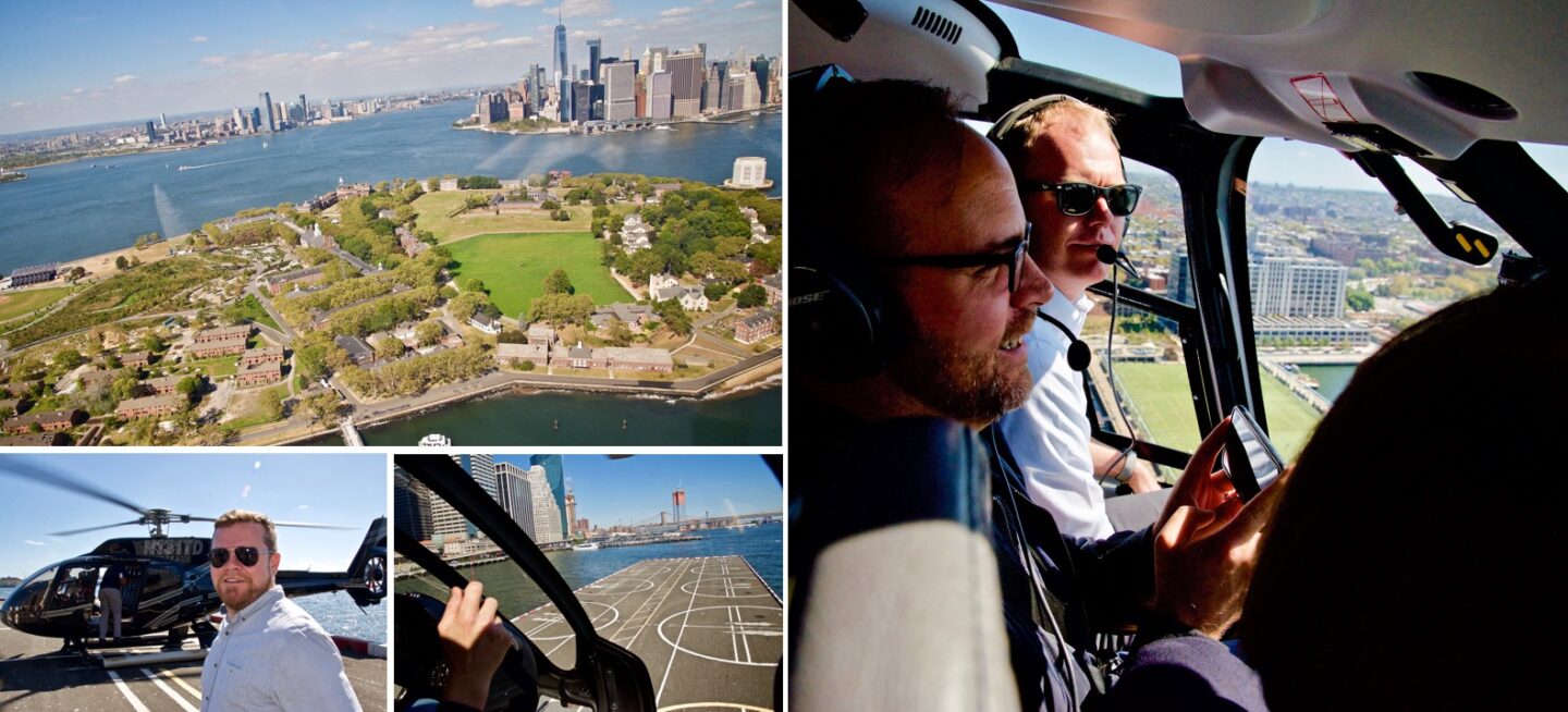
In a fiercely competitive tourism industry, HeliNY needed to stand out against the competition. ExpandTheRoom worked with HeliNY to increase conversions, update and expand their brand, and reinvent their website, streamlining the booking process for both customers and the people working behind the scenes.
Paid Social Campaign Boost
As temperatures cool down in the city so does helicopter tourism — the winter months typically bring in less conversions. We worked with HeliNY to give their bookings a boost during the off-season by launching paid social campaigns across social media channels.
With a research-focused approach we ran several different campaigns, analyzing and optimizing along the way to get things just right. The result was a return on conversions easily surpassing the investment, as well as an opportunity for us to learn a lot about HeliNY’s audience and the kind of content that resonates best.
Creating a flexible brand system
To get an understanding of the existing HeliNY brand and where they wanted it to go, we made sure to get a number of different perspectives. We talked to various internal stakeholders, traveled to local hotels to understand how they choose what experiences to promote, and spoke with customers at the heliport to better understand how the brand was being received by end users.
We learned of HeliNY’s offerings outside of tourism — charters and maintenance — that didn’t seem to have a space of their own, as well as the confusion between their colloquial, adopted name “HeliNY” and their official name “Helicopter Flight Services”.
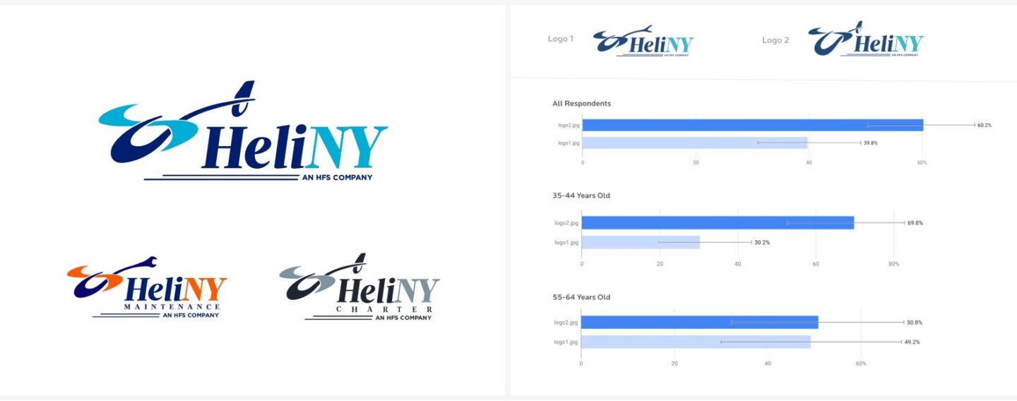
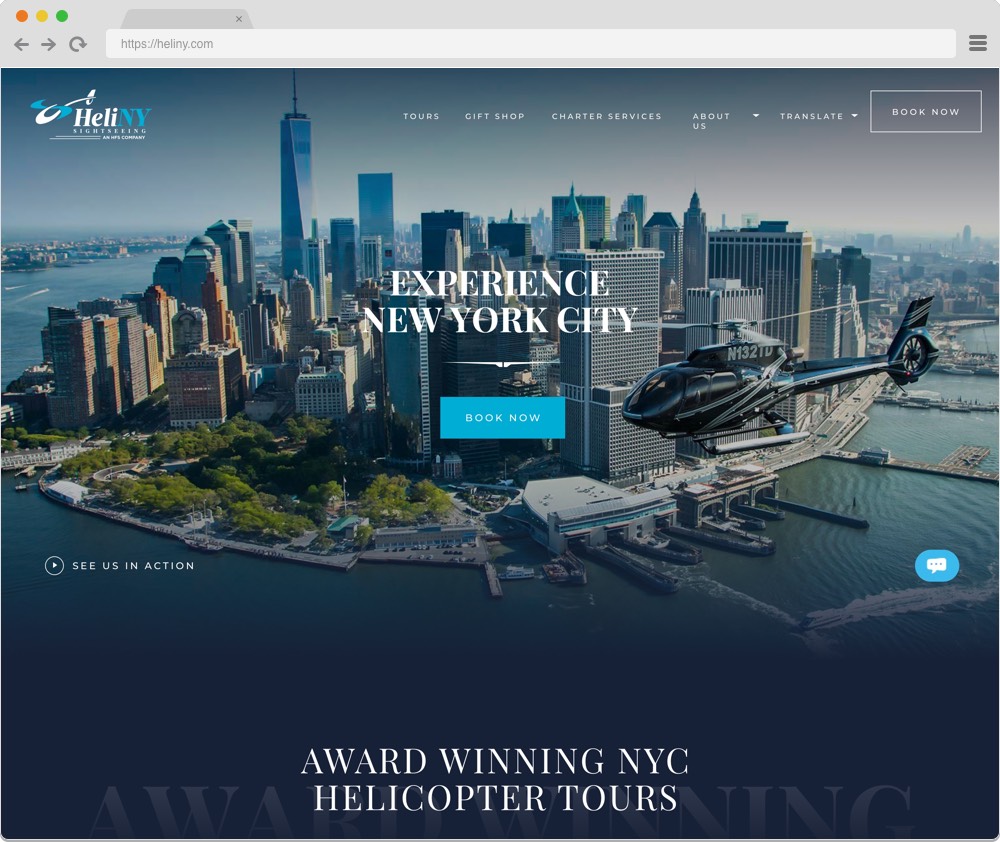
We collaboratively came to a solution — create a flexible brand system that accounts for the company’s expanding service offerings and the possibility of moving to markets outside of New York. From there we fine-tuned, tested, and iterated to update the existing brand, conducting frequent surveys to gauge their audience’s preferences. The result was not one logo but a collection, all under the umbrella of the “HFS Company” parent brand.
Improving the website based on user data
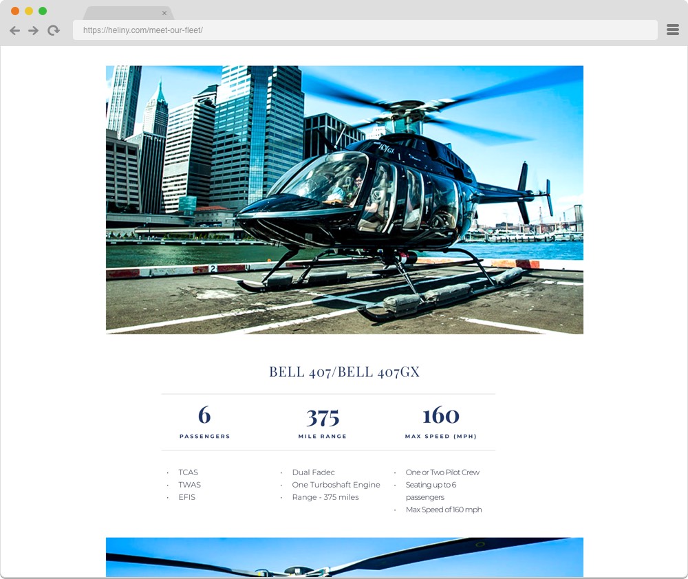
Armed with the knowledge from our Discovery phase, we set out to design a first class experience on Heliny.com. To continue gaining insights from end users, we set up micro surveys — small, unobtrusive, one-question surveys that sought to understand what information was missing from the site and what was confusing people.
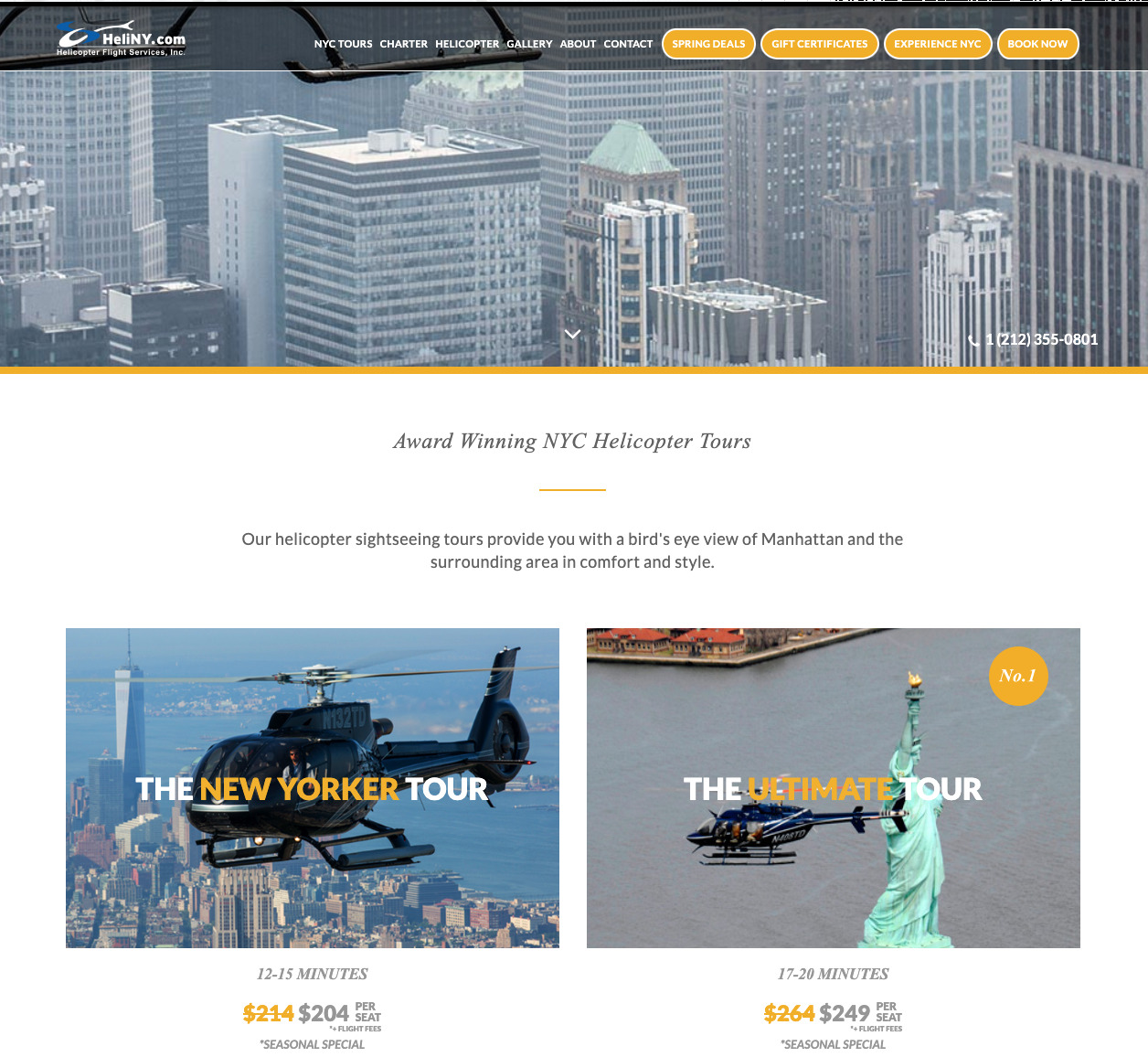
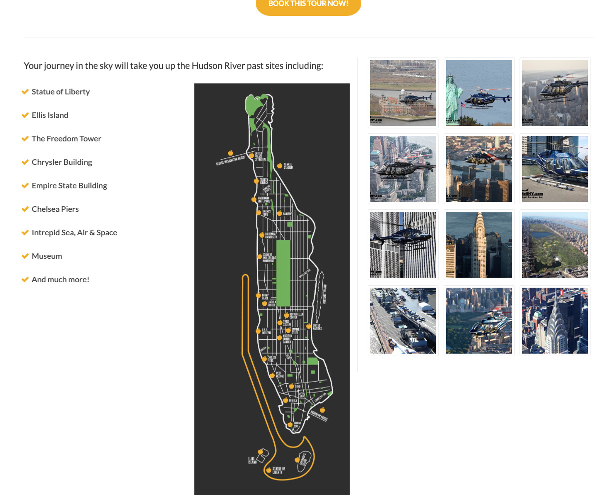
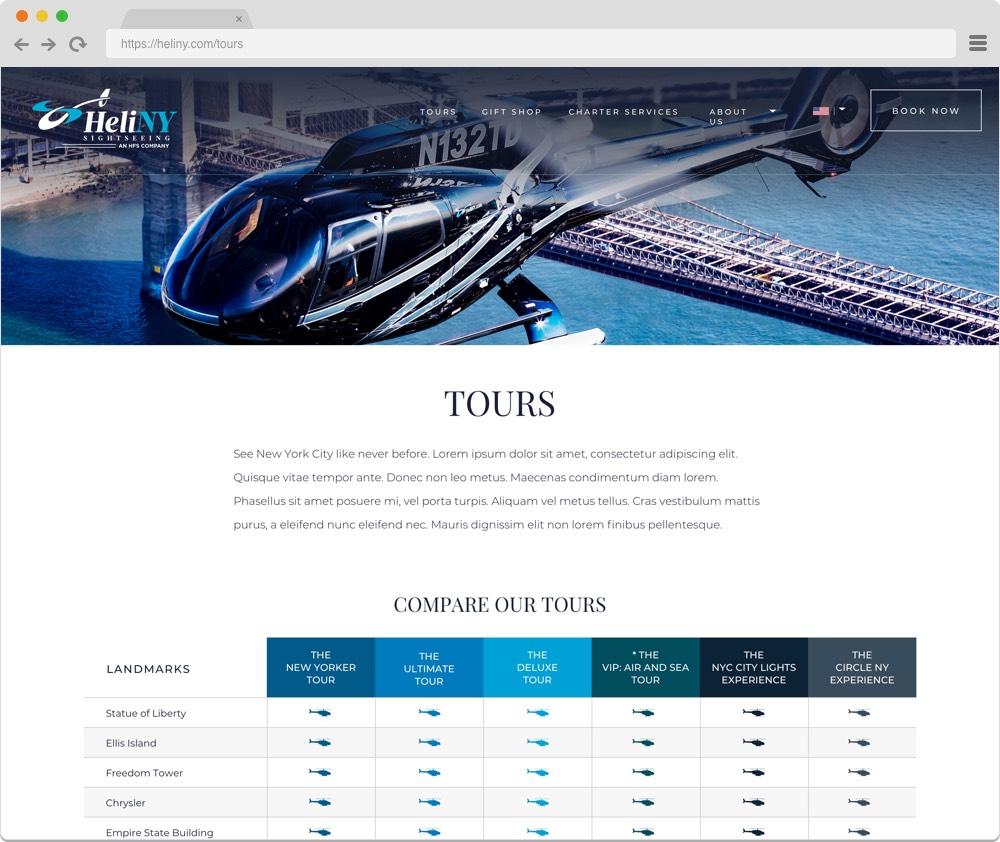
We heard from users about confusion between tour offerings so we designed an easy to read comparison chart. We heard from international tourists that they weren’t always sure where or what some of New York City’s landmarks were and if they would see them — so we designed beautiful and informative interactive maps. Listening to users and solving their problems is what we do!
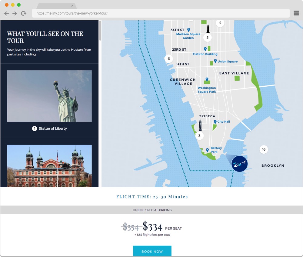
Better booking for both customers and employees
A big win on this project was the opportunity to greatly improve the website’s booking process. In talking to users and stakeholders we learned that the frontend booking form was hard to use for customers and that the backend involved a lot of unnecessary and time consuming work for employees. Utilizing our knowledge of usability best practices we redesigned the booking flow on the frontend. On the backend, we integrated their system with Salesforce to streamline data collection and processing.
Redesign Results
In addition to a sense of satisfaction all around from a job well done, thanks to our micro surveys, we were able to measure quantifiable results that the redesign brought about. Here are just some of those numbers.
The work we did for HeliNY has been featured in the Nielsen Norman Group report, UX Metrics and ROI.

An Ongoing Partnership
After a successful launch, we continue to partner with HeliNY to bring their brand to life across multiple platforms.
Now who wants to book a helicopter ride?
Thinking about a project like this one?
Consider working with a digital agency partner. We ensure your website’s UX and content accurately represent your brand and meet your user’s needs.
We’d love to learn more about your needs and share our process on how we help organizations navigate digital initiatives just like this one.


More Success Stories
Visiting Nurse Service of New York
Consolidating three websites into a single experience conveying VNS Health’s compassion, expertise, and impressive breadth of services
Invest Puerto Rico
ETR helped Invest Puerto Rico relaunch their website as a focal point for the group’s global marketing, communications, and lead-generation activities
