Project Goals & Challenges
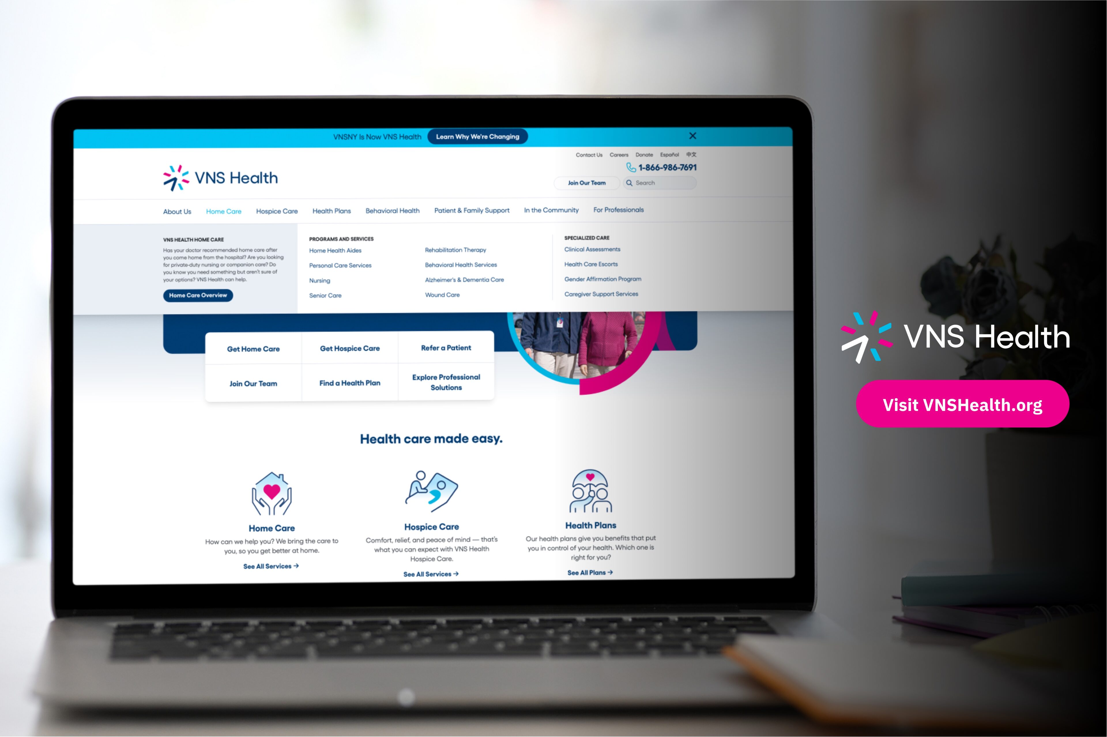
We’ve been fortunate to have a very long-running client-agency relationship, so this redesign project actually built upon work ETR did for VNSNY back in 2016 when we helped them bring three separate websites into one, including extensive navigation research and implementation. This time around, the organization completely rebranded as VNS Health and they restructured their business offering. This website redesign project had several unique goals and challenges, some of which are outlined below:
- Goal: Website needed to embrace & reflect a shift in organizational priorities
The new website needed to align from a user experience perspective with the organization’s renewed focus on the customer. In addition, the content also needed to be completely overhauled. This was no small feat due to the large volume of content and the evolution of the overall messaging strategy and site architecture. - Challenge: Multiple agencies needed to be aligned & work in concert
To be successful, we needed to be in sync with multiple agencies and stakeholder teams throughout the organization. Two of the teams we worked closest with regarding the website were the Tronvig branding team (who provided us with new brand guidelines that our team absorbed and then applied to the website) and the CareContent team (who assisted with website content strategy and wrote over 100 pages of content for the new website). - Challenge: Hard deadline for launch on a high-profile project
Since the website launch was tied to a rebrand rollout that included print and digital advertising campaigns, social media changes, employee uniform updates, and more, the launch date was etched in stone.
Approach & Solution
Establishing a Strategic Foundation
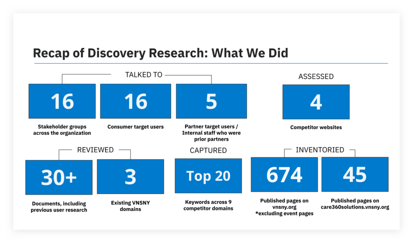
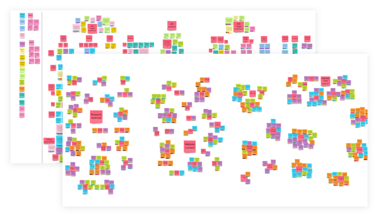
Following our Purpose-Driven Design process, we began with the Strategy phase of the project in August 2021. This phase lasted about two-and-a-half months and included a significant amount of research. Research activities included stakeholder interviews, user interviews, competitor website UX analysis, audits of Google Analytics and existing website content, and also drew on previous research we had completed with the client over the years. Our UX research team absorbed and unpacked all of this information using the affinity mapping technique in a Miro Board, which we constantly referred to throughout the course of the project.
Identify Key Target Audiences
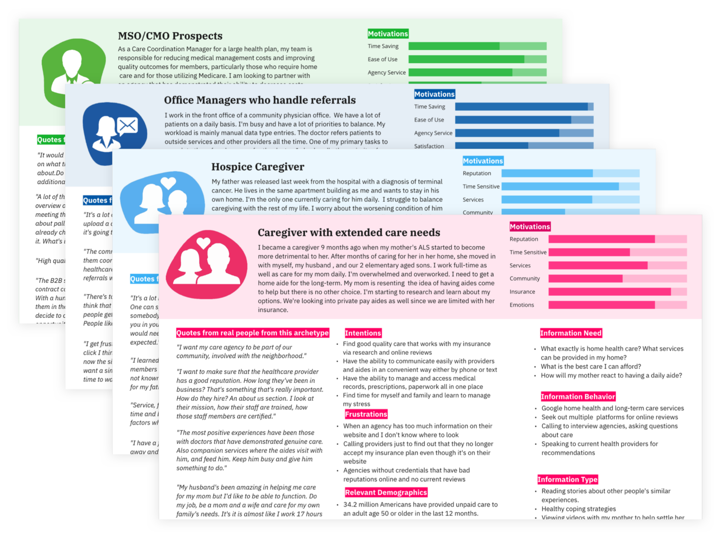
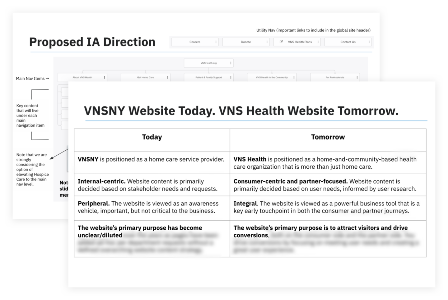
Through research, we validated that the primary website audience is family caregivers—an important north star for all strategic decisions related to information architecture and content development. Research also helped to prioritize VNS Health’s secondary and tertiary audiences. We ultimately identified four key audiences for the website, and summarized our insights around those audiences by creating User Archetypes for each of them.
Key Discovery Readout
We packaged up our research insights and corresponding strategic recommendations for the website’s overall UX and information architecture into a Discovery Readout deck. Also included as part of this deliverable was a detailed set of functional requirements that we identified to be within scope for the project.
Coordinated Implementation—UX, Content, Visual Design, and Development
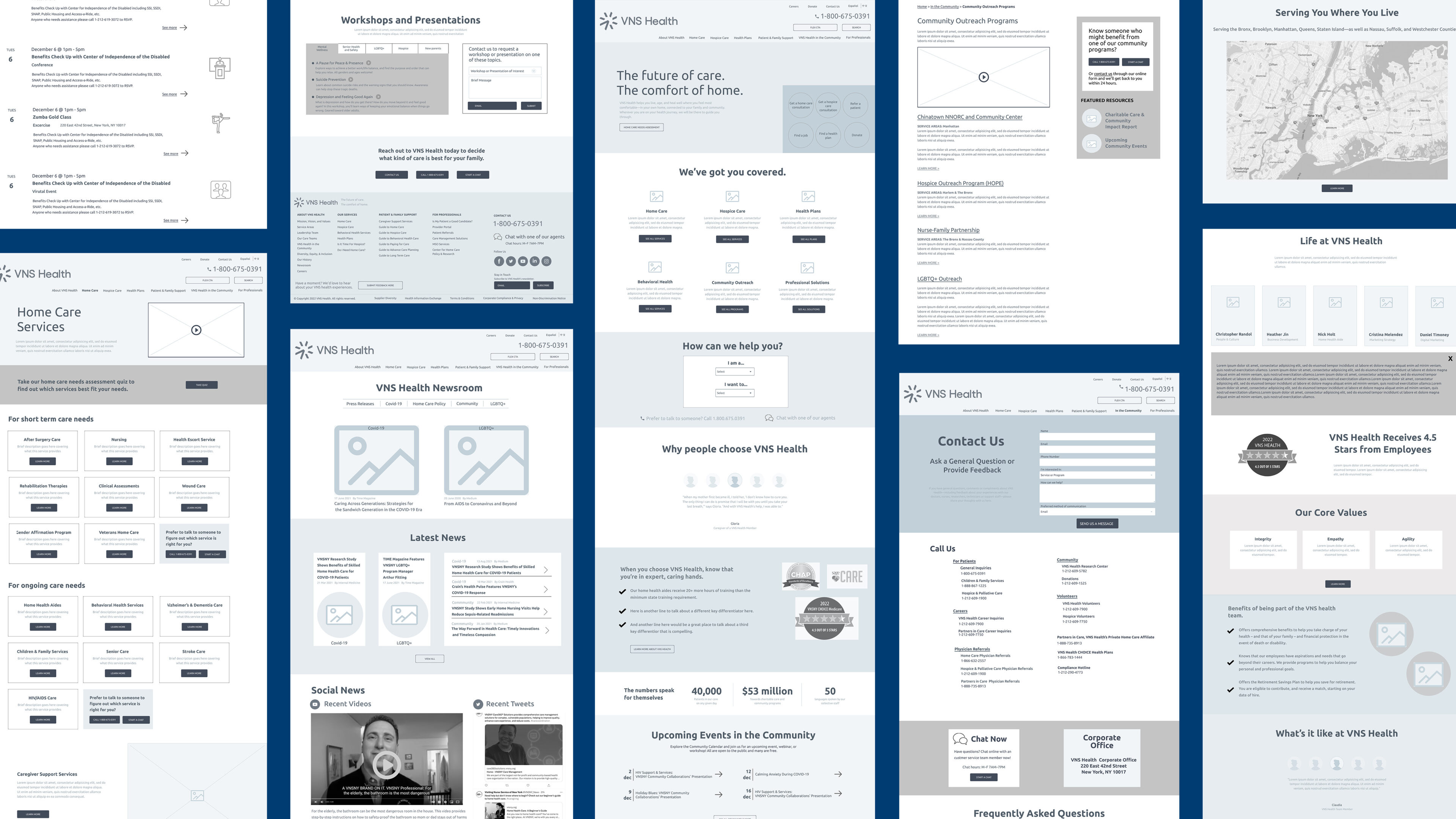
Armed with our research and strategic direction, we headed into the Implementation phase. We worked through more than 20 wireframes that leveraged 42 custom WordPress Gutenberg blocks and 15 modified blocks.
While we at ETR were working on wireframes, VNS Health’s content development partner, CareContent, was working on copywriting (90% of the site’s content was getting completely overhauled/rewritten). We had weekly status meetings to align on progress and reconcile any discrepancies that arose between copy and wireframe layouts.
We ultimately decided as a team to put draft copy directly into our wireframes for many pages to ensure that we were planning for the UI to handle the correct amount of content. Doing this also helped us catch any gaps where we had a planned content section in the wireframe but no copy currently written for it (or vice versa, where there was a planned piece of copy but no place for it in the wireframe).
Incorporating a New Vibrant Brand
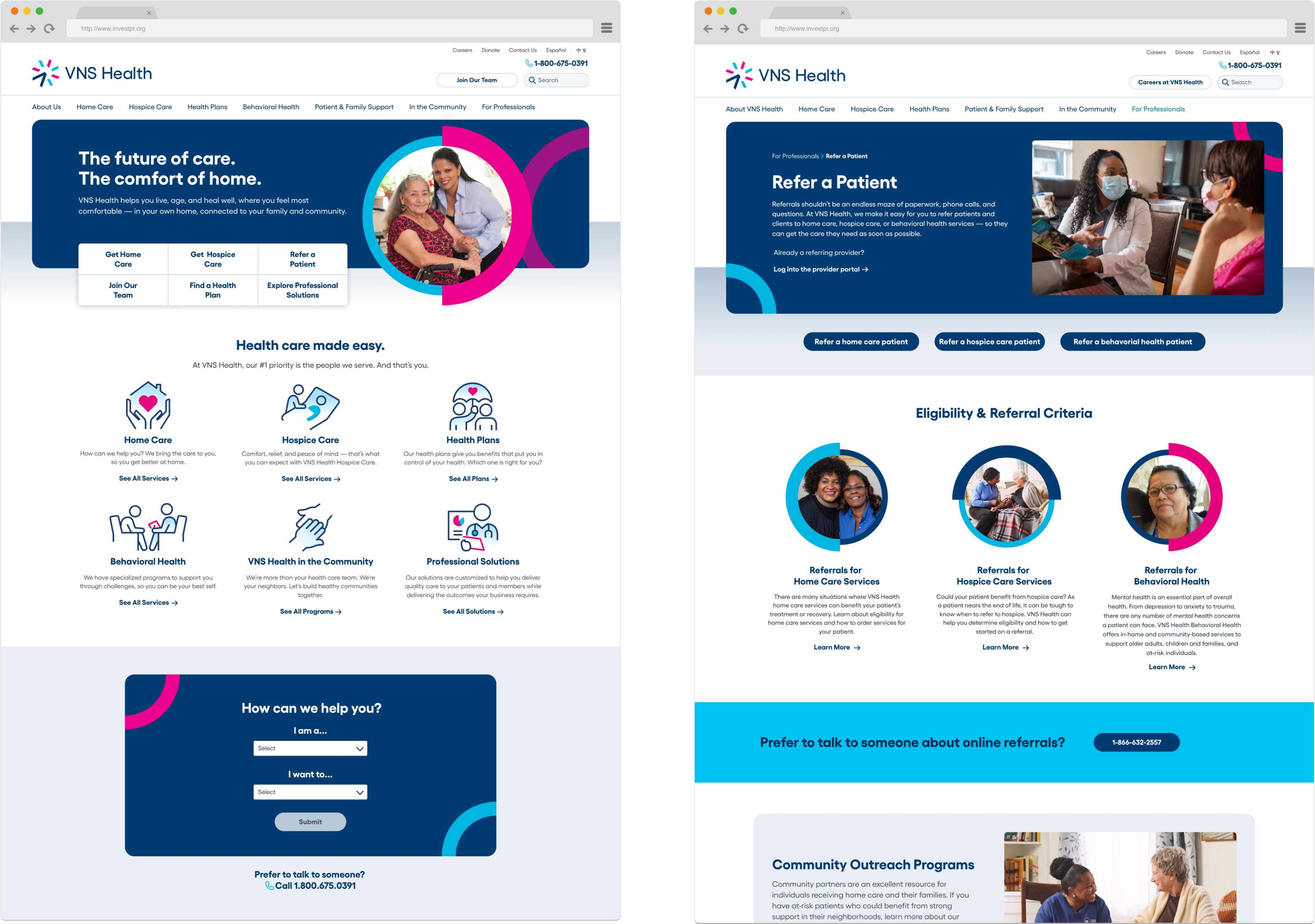
The biggest challenge of the visual design phase was taking a set of brand guidelines and figuring out their ideal digital application. We needed to keep true to the spirit of the guidelines without overcomplicating development related to key brand elements like overlapping circles. (It’s surprisingly tricky to set rules for this type of element in a CMS setting.)

In addition to converting the site from fixed-template WordPress to the block-based functionality of WordPress Gutenberg, we also used this as an opportunity to implement GA4, the new version of Google Analytics that all companies will be compelled to adopt starting in Summer 2023. Read our recent article to learn more about the benefits of getting GA4 implemented and set up sooner rather than later.
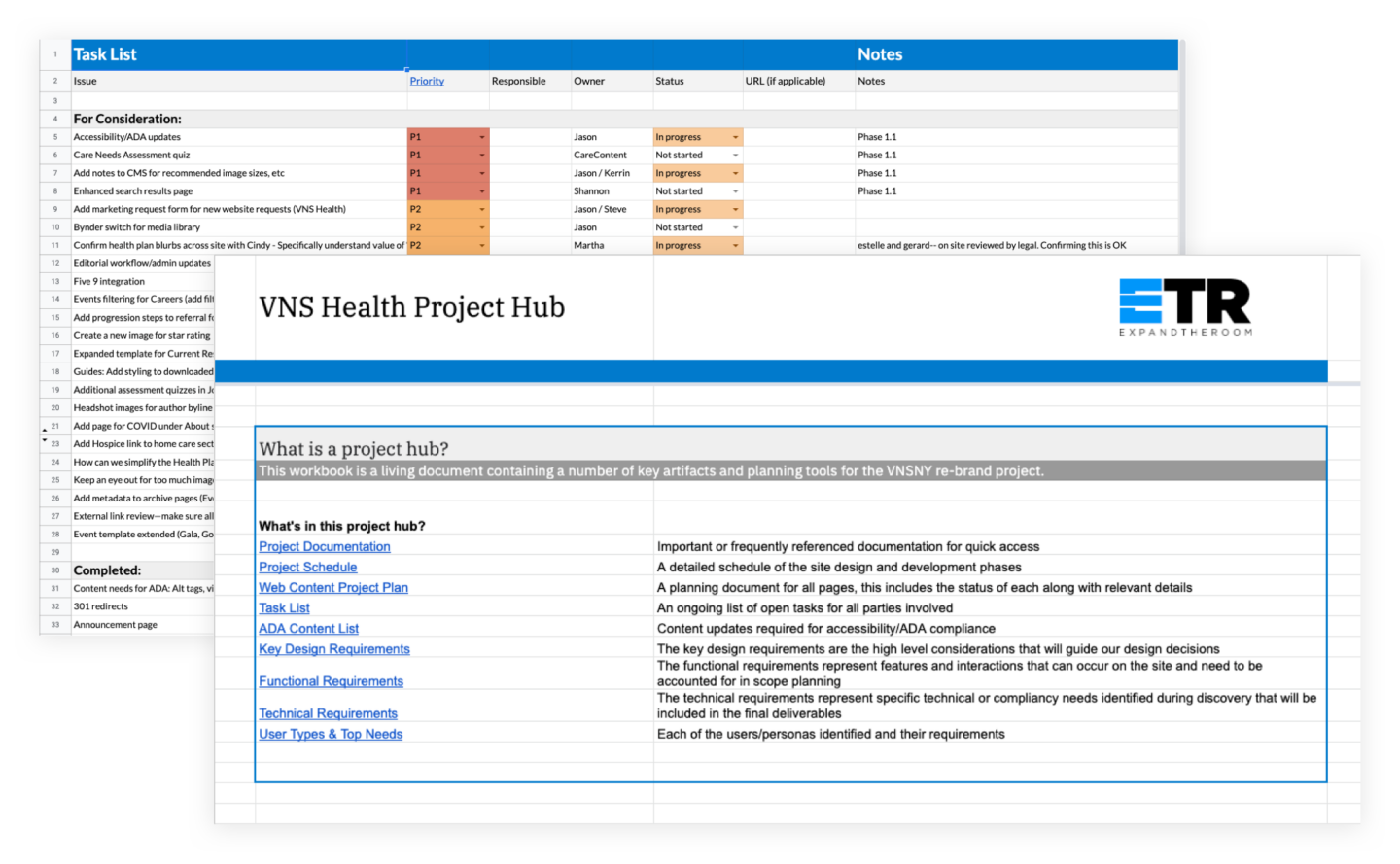
It cannot be overstated how important project management was on this project. With so many concurrent tracks, it was critical to keep everything coordinated and in motion throughout the Implementation phase. We decided early on that coordinating multiple teams would require a “single source of truth” for important documentation. The goal was to avoid important documents or reference links from being lost in emails or Google Drive folder.
Learning from past experiences, we introduced a project hub document that was used successfully in the past to organize all important documents, links to designs and wireframes, and other critical pieces. Keeping this organized made finding information as simple as saying “it’s in the hub!”
Project management tools were also utilized, of course, and our platform of choice is Asana. With the numerous parts and pieces to the website plan, keeping a detailed yet functional set of tickets allowed multiple team members to work in tandem efficiently.
Results: A Successful Website Launched On-Time and On-Budget as Part of a Larger Rebrand Rollout
The VNSHealth.org website was launched on-time and on-budget on May 18, 2022. As of this case study publishing date, we’re a few months out post-launch and still evaluating, so stay tuned for more results over the coming months. What we are seeing so far is positive:
- Increase in total online referral forms submitted by professionals
- Improvement in perception that the “website is easy to use”
- Improvement in overall content findability as measured by pre-and-post launch navigation usability testing
- High engagement with a new self-selection feature that was added to the home page
- Organic traffic has remained steady, with just a slight decline from the previous month before launch. Given that we cut so much content, we view this as positive and an indicator that we made the right decisions
Thinking about a new project?
Consider working with a digital agency partner. We ensure your website’s UX and content accurately represent your brand and meet your user’s needs.
We’d love to learn more about your needs and share our process on how we help organizations navigate digital initiatives just like this one.

