Visiting Nurse Service of New York
The Visiting Nurse Service of New York, the largest not-for-profit home healthcare agency in the nation, invited ETR to take on the challenge of making a complex topic simple.
Healthcare can be daunting. The options aren’t always clear, and emotions tend to run high when caring for loved ones. How do you take a complex topic and make it simple, friendly, and comforting?
The Visiting Nurse Service of New York, the largest not-for-profit home healthcare agency in the nation, invited ETR to take on this challenge. Our goal was to consolidate three websites’ worth of information into a single experience that conveyed VNSNY’s compassion, expertise, and impressive breadth of services.
Problem: A Fragmented Online Experience
When we began working with VNSNY, their digital presence was fragmented, outdated, and difficult to maintain. Their three separate websites — home care and hospice, private home care, and for professionals — were non-responsive, frequently contained duplicative content, were not optimized for SEO, and buried important information. With these hurdles identified, we dove right into the work.
Approach: Discover, Strategize, Define
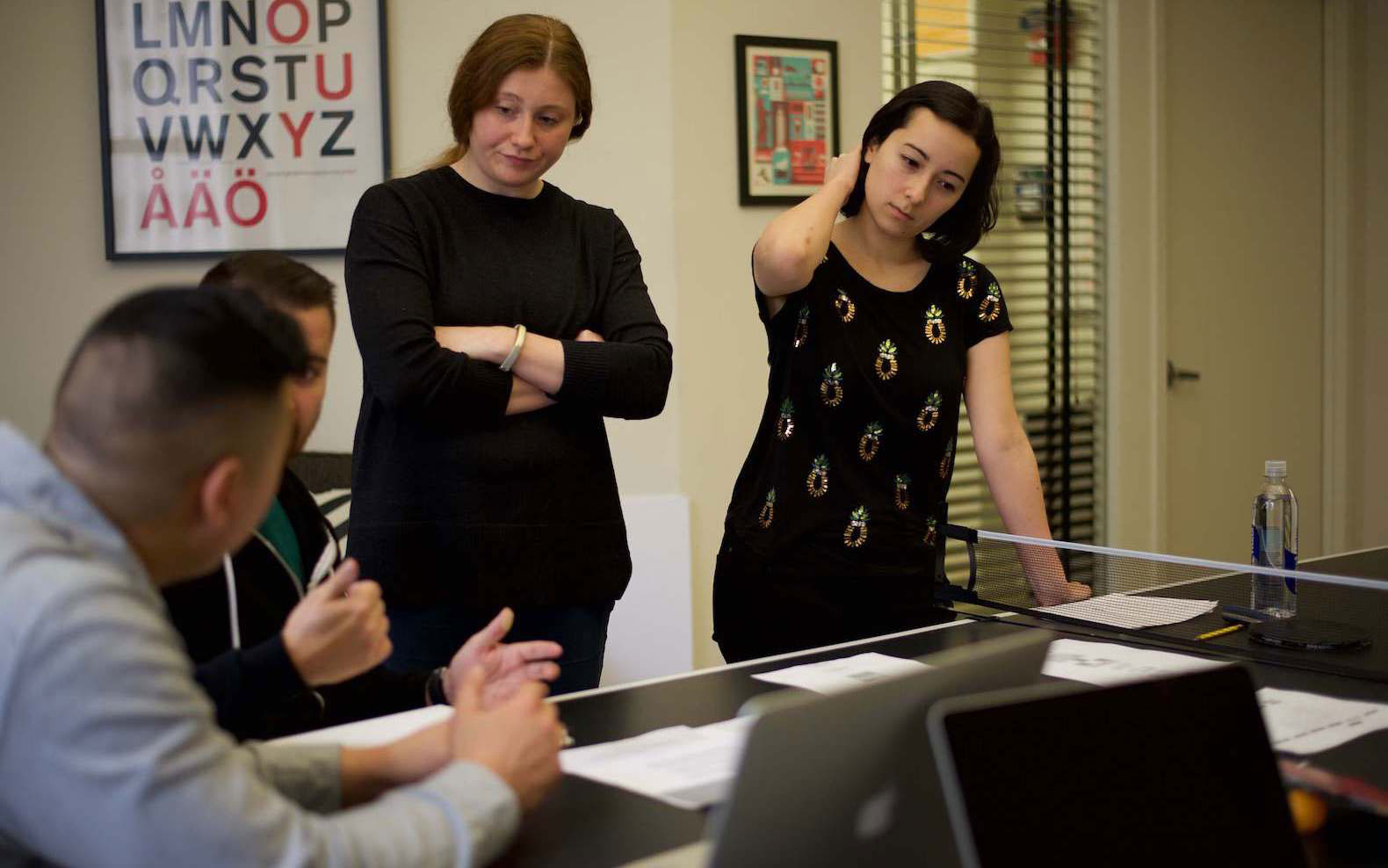
Stakeholder and User Interviews
Discovery is key to ETR’s Purpose-Driven Design process, which is reflected in our first three design principles: Real Value is Discovered, Usefulness Depends on Empathy, and Collaboration Requires Learning. With these principles at the forefront of our minds, we embarked on a month-long discovery process to gain a deep understanding of VNSNY’s stakeholders, customers, and patients, interviewing over 60 people throughout the organization. Most of the interviews we did were in small groups of 3-5 people, and we recorded every interview so that anyone who was unable to attend in person could catch up via video later. In addition to internal stakeholders, we interviewed caregivers and customers to get an understanding of their experiences with VNSNY — particularly their interactions with the website. Of course, a key part of the discovery phase is to also familiarize ourselves with the organization by thoroughly reviewing the existing websites and corresponding web analytics, any existing documentation pertinent to the project, and relevant marketing/research materials.
Through stakeholder and user interviews, we learned a whole lot about VNSNY’s mission and purpose, the way it delivers on that promise, and the impact the organization’s work has on the NYC community. We also learned about the gaps in the process, the missed connections, and the opportunities for improvement. Oh, and of course we learned a whole lot about home health care in general.
Competitive Analysis
In keeping with our Purpose-Driven Design principle that real value is discovered, ETR performed a high-level competitive analysis of top NY home care providers to identify best practices and to surface opportunities for VNSNY to outperform their competition. In addition to the set of competitors requested by VNSNY, we included an additional “home care disruptor” in our analysis since we had noticed a trend of emerging home health care startups. By looking at a disruptor, we were able to provide new insights to VNSNY about how startups are simplifying the home health care experience. Our biggest takeaway? The disruptor’s clear focus on meeting user needs with helpful information and innovative technology.
Compared to the larger, more traditional healthcare competitors we looked at, the disruptor was far and away ahead of the pack in terms of delivering a good user experience. If VNSNY could eliminate all of the unessential information from their site, showcase their services in a clearer way, and focus on modernizing their design and technology, they had an opportunity to not only catch up to their competition, but to leapfrog them.
Discovery Insights
The comprehensive discovery process set a solid, research-driven foundation for the work ahead. Overall, we felt confident that combining these sites would help VNSNY in several ways:
- Give more visibility to the underrepresented private care offering
- Eliminate a significant amount of duplicate content across multiple domains
- Reduce the burden on the (small) digital content team of maintaining three separate sites
In addition to identifying these benefits for VNSNY as an organization, we also had amassed a list of specific actionable insights about trouble spots for the site’s users. These ranged from way out-of-scope problems (future work) to the lowest of low-hanging fruits (quick wins). With a deeper understanding of the problems at hand, it was now time to move from the abstract to the concrete—to get a detailed view of where we were now and to get specific clarity on where to go next. Developing a clear content and SEO strategy was a critical next step.
Content Strategy and SEO
After presenting our discovery insights, we began developing a new content strategy for VNSNY. This effort included identifying key user types by developing personas and mapping out their complete journeys through the site. We also performed a thorough content audit of the content across all three sites, conducted a content gap analysis, and developed voice and tone writing guidelines for the web. One of the goals of this content strategy work was to identify ways to better set expectations for caregivers and patients on what to expect with homecare services, which was a key insight we learned from discovery. This video we produced for VNSNY is a direct outcome of those efforts:
In tandem with content strategy, we conducted an SEO audit of the existing sites. An SEO audit typically consists of gathering baseline performance, technical, and on-page data from the current site and evaluating in order to identify areas for improvement. Regarding baseline performance data, one of the most important things you need to do is identify your top pages in terms of organic search traffic and backlinks. On a site with thousands of pages, it is critical to prioritize your top content. Through the technical audit, we identified some issues around canonicalization—which were compounding VNSNY’s duplicate content issue and potentially impacting their search ranking ability—that we corrected as part of the site build effort. During the on-page audit we reviewed a handful of key pages and pointed out areas of opportunity for SEO improvement to consider during the design phase.
Finally, we conducted preliminary keyword research to find out what keywords were already performing well (to maintain) and potential keywords to consider targeting on the new site (missed/new opportunities). Keyword research is not only useful for SEO reasons. It’s also valuable for inspiring new content ideas based on the information users are searching for most frequently.
Our content and search term insights informed a new site architecture and helped VNSNY determine what content to cut, keep, and revise. With a strategy in place, we proceeded confidently into design and development.THE SOLUTION
Solution: A Single, Unified Site
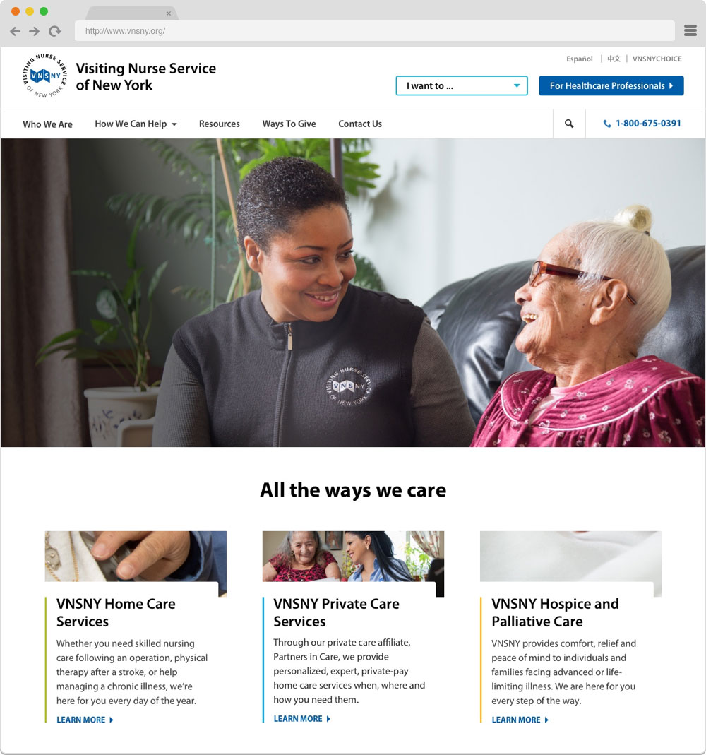
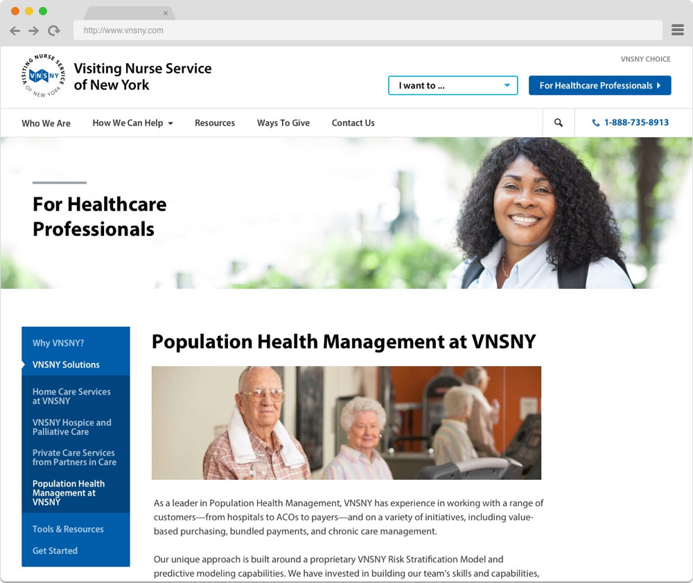
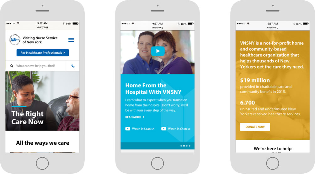
In the end, we decided to design and build one brand-new VNSNY website to replace the three websites with which we began. This new site involved significant content cuts and navigation restructuring, a complete refresh of the visual design, and was built responsively in WordPress—a true interdisciplinary team effort between ETR and VNSNY.
In case you’re interested, we made the decision to build this site in WordPress for a couple key reasons:
- WordPress is incredibly well-documented and scalable—allowing for additional improvements down the road.
- Content editors who work in the editorial/publishing space are often already familiar with the WordPress CMS, which aids onboarding and workflow.
Results: A Resounding Success
We launched the site with resounding success. When we did a post-launch SEO audit, we confirmed that no traffic was lost in the relaunch process. In fact, traffic was starting to increase—even after we streamlined three sites into one and cut over 50% of the content along the way.
And the story doesn’t end there. We have an ongoing relationship with VNSNY to develop new, relevant content that meets their users’ needs. We are currently working with VNSNY to produce a series of animated videos to introduce potential patients to the benefits of home health care and what it entails. This effort stems back to what we learned during discovery, that setting expectations early goes a long way in fostering patients’ and caregivers’ trust.
We are firm believers that you can always get better. Our first launch got us most of the way there. Now we are focused on continuously improving the VNSNY experience.
An Ongoing Partnership with VNSNY
At ETR, we believe the work isn’t over after a product is shipped. We’re committed to being a trusted partner our clients can rely on to optimize and grow their business. We continue to work with VNSNY on a variety of projects. Notably, we launched the new VNSNYChoice.org, the health plan branch of VNSNY.
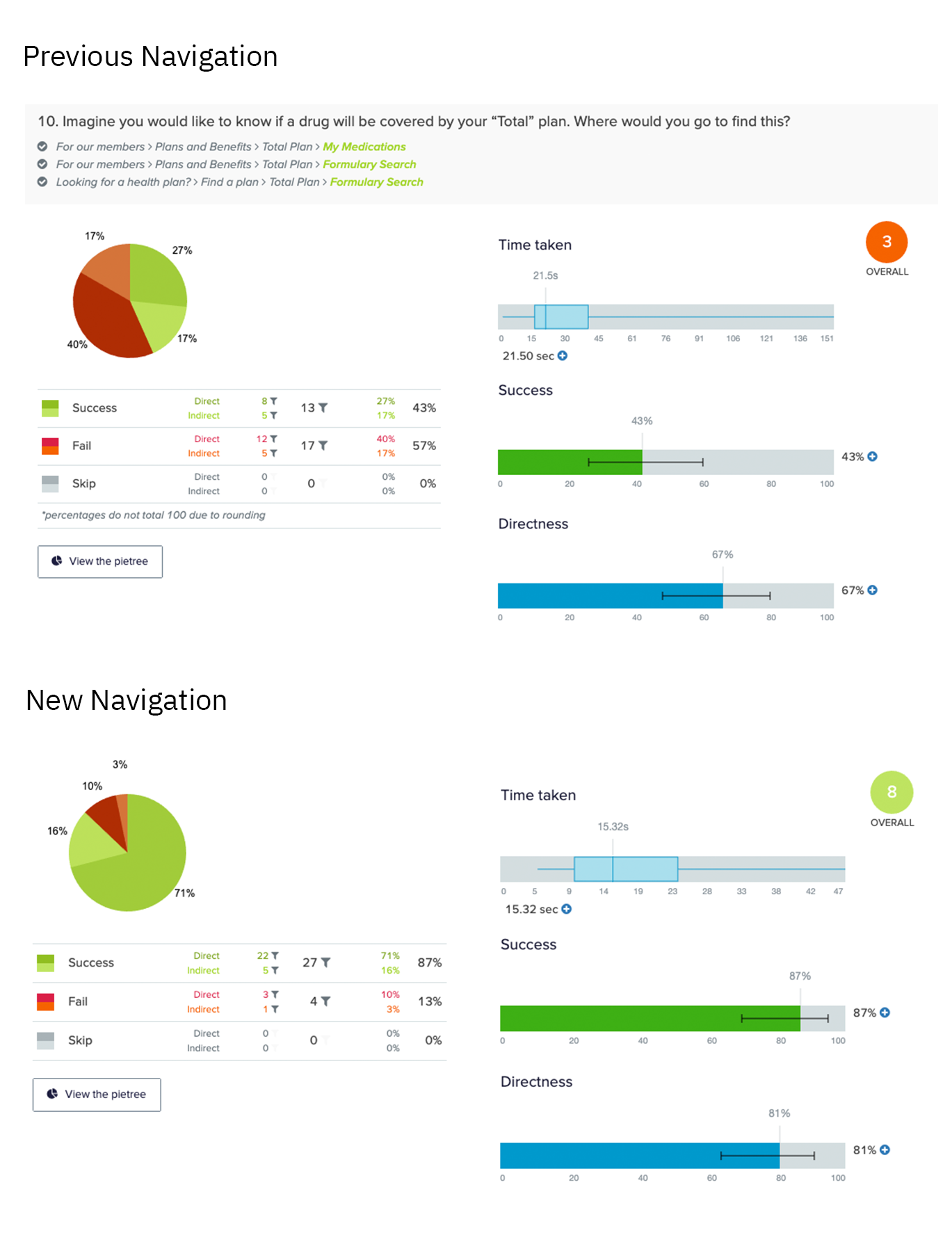
CHOICE was in need of a brand overhaul to be better connected to its parent organization. The information architecture had become bloated, making it difficult for members and health care professionals to find the information they needed. As part of our discovery, we tested the existing navigation compared to our proposed version and made several iterations based on user feedback, ultimately resulting in users being able to find what they needed from VNSNY CHOICE faster and easier. We saw a 27.4% increase in average success rate in our navigation testing, and after the site launch views of key pages rose by over 70%.
We also were able to make several improvements to VNSNY CHOICE’s Search Engine Optimization. It was a goal of CHOICE to optimize their SEO in order to bring in more traffic from search to key health plan pages and their “Living Well” articles. Year over year we increased organic search traffic by 23% and CHOICE’s average position on the search results page by 30%. We decreased page load time by 12%, a factor both important in SEO rankings as well as a quality user experience. We expect this numbers to continue to rise with additional post-launch enhancements and ongoing content strategy work
ETR now looks forward to working on the continuous improvement of the VNSNY user experience and innovating on new ideas alongside their team.
Thinking about a project like this one?
Consider working with a digital agency partner. We ensure your website’s UX and content accurately represent your brand and meet your user’s needs.
We’d love to learn more about your needs and share our process on how we help organizations navigate digital initiatives just like this one.


More Success Stories
Billion Oyster Project
A new brand identity and website for Billion Oyster Project, whose mission is to reintroduce the oyster population in NY Harbor
HeliNY
ETR worked with HeliNY to streamline the booking process for both customers and the people working behind the scenes
