SITA
A web-based flight search and reservation system that can be re-branded for use with multiple airlines
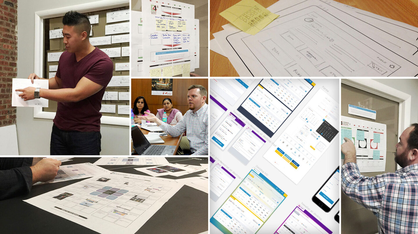
Solving for Yesterday, Today, Tomorrow, and Beyond
Developing innovative solutions for complex problems is what we do, but sometimes the solutions we uncover extend beyond the problems we were asked to solve. How do we help a client internalize not only a solution to the problem in front of them but an entirely new way of design thinking?
SITA is one of the world’s first and oldest travel IT companies, providing a variety of products and services to over 400 airlines and affiliates across the globe. We were thrilled when they came to us and our Atlanta partners, aspirent, looking for help with the next generation of SITA Horizon, their flagship web-based flight search and reservation system.
A Tricky Product for a Tricky Organization in a Tricky Industry
As one of the first ever teleconnected industries, commercial aviation as a whole comes with a myriad of inherent challenges.
- Legacy systems – The industry has clearly maintained legacy backend systems beyond their practical usability.
- Rules – All processes are governed by complex business requirements based on countless international rules and regulations.
- Tight margins – Fierce competition in the industry and razor-thin profit margins required us to consider innovative ways to generate revenue.
Additionally, because of its history, status, and legacy customer base, SITA faced a number of challenges unique in their industry:
- Multinational scale – Due to their many partners and products, the process included 34 direct stakeholders across 6 time zones—all with the ability to pull the brake handle.
- Legacy design methods – Because SITA has such a long history, many of their products were initially launched before the widespread uptake of User-Centered Design practices. As a result, their existing interfaces presented a wide range of usability issues resulting from years of bolting new features and functionality onto these legacy designs. SITA was eager to learn and adopt the user-centered, iterative cycle – hypothesize → build → test → analyze → design → repeat… We were more than ready to help!
Finally, there were challenges unique to the Horizon product line:
- Shifting development practices – As with most of their products up to this point, SITA developed and released Horizon using a classic Waterfall methodology. This practice came with some baked-in shortcomings that created significant problems for SITA and their customers:
- An inherent lack of flexibility resulted in a product that failed to meet many of their customer’s needs.
- An inherent inability to quickly iterate made it difficult and time consuming to release updates and kept customers waiting.
SITA was ready to adopt an Agile methodology, and this project was to be their initial run.
- Flexible platform – A single platform had to serve both customers and ticketing agents, meeting the unique needs of both groups:
- Customers needed a frictionless, simple user experience, period. That experience had to address a wide range of use-cases and abstract a massively complex business process.
- Agents needed to be able to conduct hundreds of bookings daily and quickly accommodate highly complex edge cases.
- Branding and localization – SITA has 130 airline customers on 6 continents, each with their own branding, language, cultural norms, and accessibility requirements.
- Our color scheme would be required to work across the full color wheel.
- Localization efforts would require icons, microcopy, and messaging that could translate across dozens of cultures and languages.
- AA standard accessibility compliance was essential.
- Particular attention had to be paid to performance within a wide range of hardware, software and internet connectivity and bandwidth conditions.
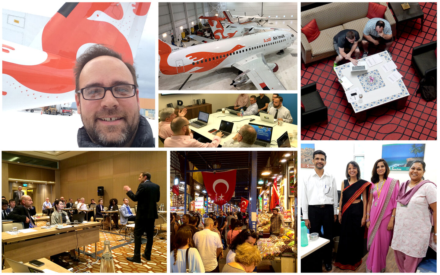
A Global Solution Requires Globetrotting
To begin wrapping our heads around such complex systems with so many unique challenges, we initiated a massive discovery effort involving 8 weeks of stakeholder interviews (we talked to nearly 40 stakeholders), heuristic analysis, competitive analysis, user research, and “Airlines 101” sessions, resulting in a 210-page report.
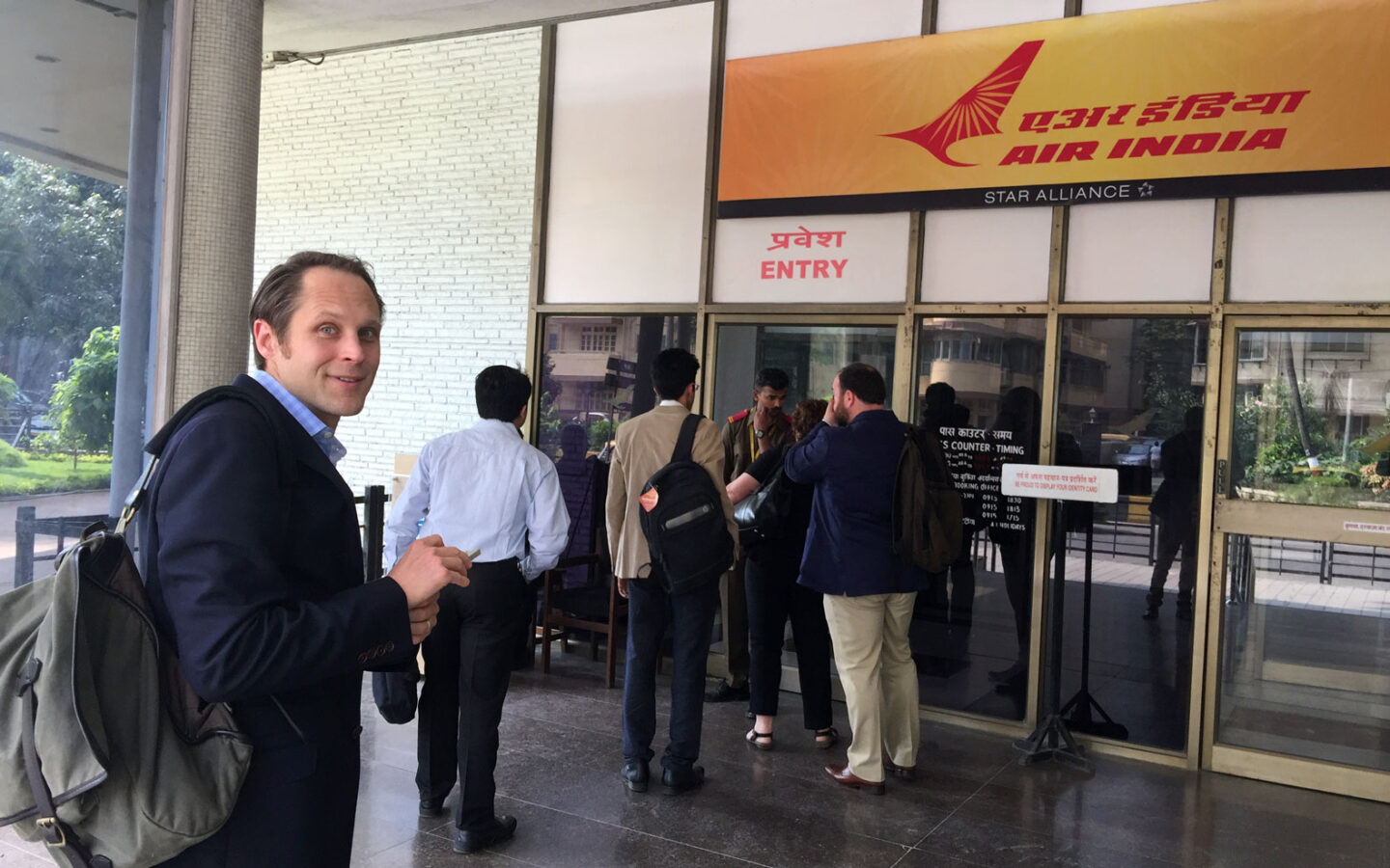
After that, we hit the road to conduct extensive field research, ideation workshops and usability tests with ticketing agents and airline stakeholders in the US, Canada and India. Additionally, we created a usability lab at SITA’s annual Horizon Working Group summit in Istanbul, Turkey. This gave us direct access to representatives from over 20 of SITA’s airline customers – all in one room!
After completing and analyzing our field research, we realized SITA needed us to do more than just design their new flight search and booking experience. They needed a flexible, modular design system that could ensure quality and consistency while also accommodating the brand identities of their many global customers. They also needed that system to be extendible and forward looking so they could use it to build new products and services long after we were gone.
Finally, they needed the whole thing to be wrapped in a philosophical framework rooted in the core values and goals of their organization. This framework had to provide guidance on not only how to use their new design system, but why.
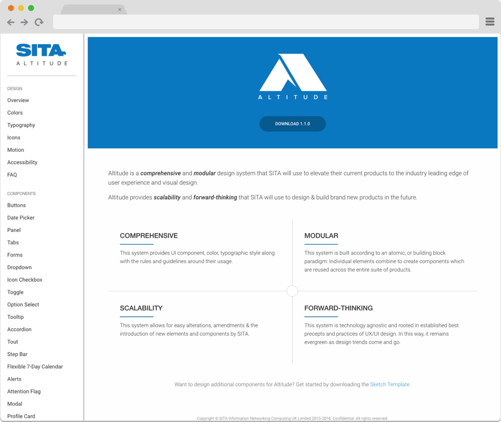
A Design System with 35,000 Ft. View
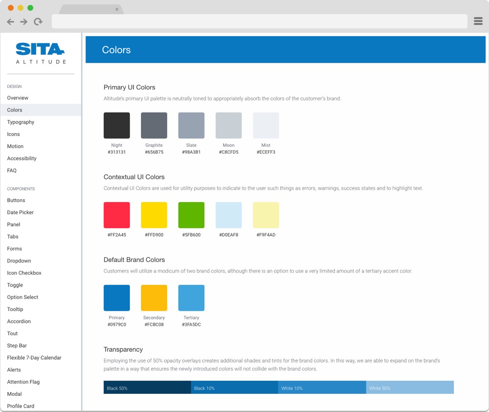
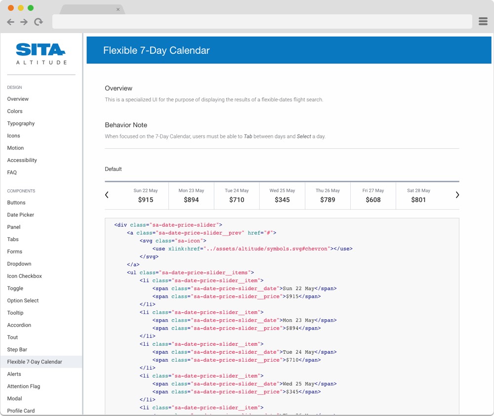
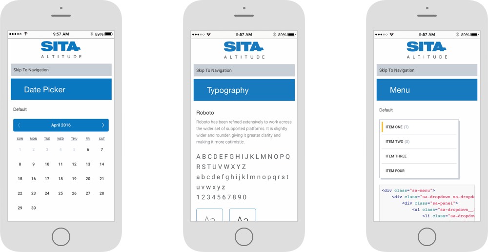
After working through both our initial challenges as well as new challenges revealed through the Discovery process, we offered SITA a solution in the form of Altitude: a modular, scalable design system and pattern library.
Altitude includes the following features:
- “Why-To” guidance illustrating design principles in practice, user-centered design best practices, error handling, and messaging.
- “How-To” guidance including the usage of colors, type, icons, layout grid, and UI elements
- HTML, CSS, and JS markup for all commonly used UI components
Altitude was designed to offer SITA team members everything they needed to apply the principles of user-centered design to the design system ETR developed for Horizon. This allowed SITA to bring the design process in-house and continue to update Horizon themselves even after ETR finished our work on the project.
Altitude also laid the groundwork for the application of the Horizon design system to the many other products SITA offers their airline customers, ultimately allowing the creation of a cohesive design system to be applied across the full suite of SITA products.
Setting a New Course – Forward
SITA immediately adopted, and continues to evolve Altitude, along with its design principles company-wide. They have begun the process of onboarding their customers to the newly design Horizon platforms, starting with Rwandair, Drukair, and Air Creebec.
We at ETR excel at creating and implementing full design systems. In addition to the work we’ve done with SITA, we’ve created robust designs systems for great companies like Time Inc., The American Kennel Club, and Remedy Health Media, to name a few.
You might also enjoy learning more about our approach to managing a massive set of project deliverables across scores of stakeholders all over the globe: One Tool to Rule Them All: A Look Back on Our Year-Long Quest to Deliver a Massive Design Project Solely on UXPin.
Thinking about a project like this one?
Consider working with a digital agency partner. We ensure your website’s UX and content accurately represent your brand and meet your user’s needs.
We’d love to learn more about your needs and share our process on how we help organizations navigate digital initiatives just like this one.

