Royal Caribbean
ETR worked with Royal Caribbean to solve a common yet confounding problem of the cruise line industry: how to get passengers on board more efficiently.
AT A GLANCE
Working collaboratively with Royal Caribbean and their partners, we created an application that allows passengers to check-in from anywhere (airport, hotel, shuttle etc.) up to 2 days in advance. Not only does this app reduce costs for Royal Caribbean but also drastically improves the customer’s experience and their affinity for the Royal Caribbean brand.
Problem: Just Get Me On Board
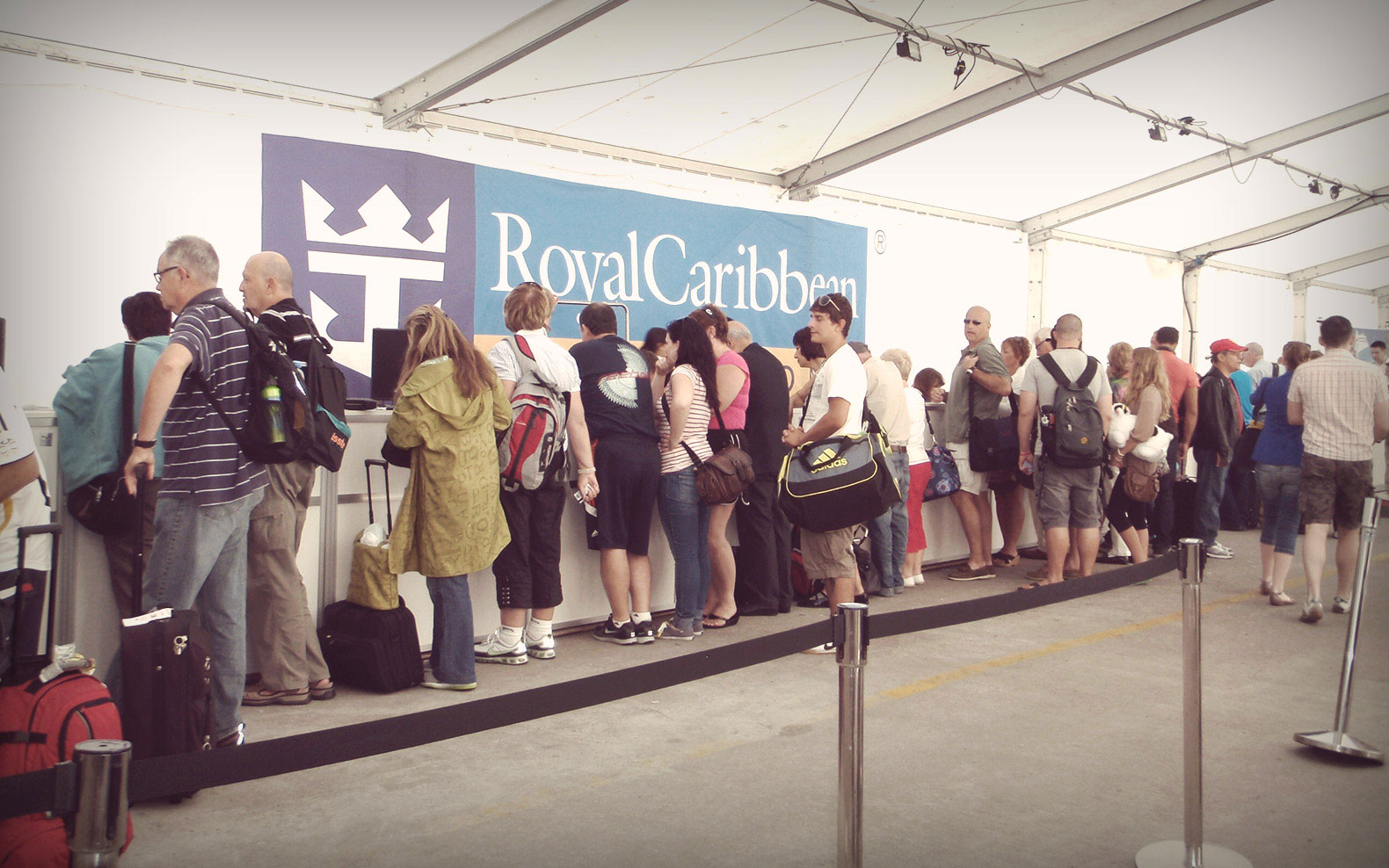
Focusing on their customers, Royal Caribbean decided the check-in process had to be streamlined and significantly sped up. Passengers are eager to get aboard and start their long awaited and much deserved vacations, so why make them stand in line any longer than needed? The old process called for multiple queues, lots of manual steps, pen and paper etc. All those extra steps take time and time is money as it’s expensive to keep a ship in port.
Our Approach: To Miami, If We Must
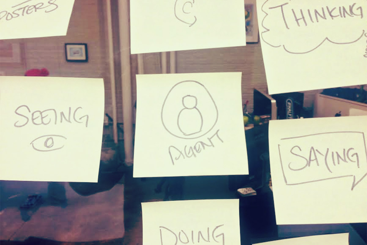
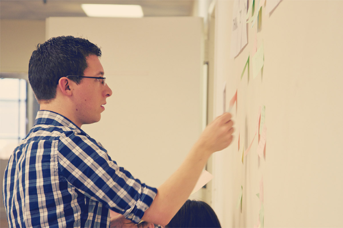
Before we could start to solve we needed to fully understand and respect the problem. We needed details on the desires and frustrations of both passengers and pier agents. And to do this effectively, we needed to be on the ground. So we bravely left New York City in the dead of winter to do a few weeks of field research in Miami, FL. Our team spent time in ports, interviewing customers and internal stakeholders, defining use cases and technology restrictions. We mapped backend logistics and 3rd party dependencies, took a deep-dive into the ideal UX, and went through a LOT of sticky notes.
Prototype Early And Often
Early on in our process we decided we needed to employ rapid prototyping to help familiarize stakeholders and end-users with the product, reduce training time and increase adoption. We pushed ourselves to make sure our own thinking remained flexible throughout the entire project. Initially, we planned to build in iOS, but working with our partners at Aspirent quickly realized a Microsoft Surface Tablet was a better technology choice due to the need for extremely long battery times and ability to connect multiple peripherals (scanners, printers etc.)
Solution: More Than Just A Check-In App
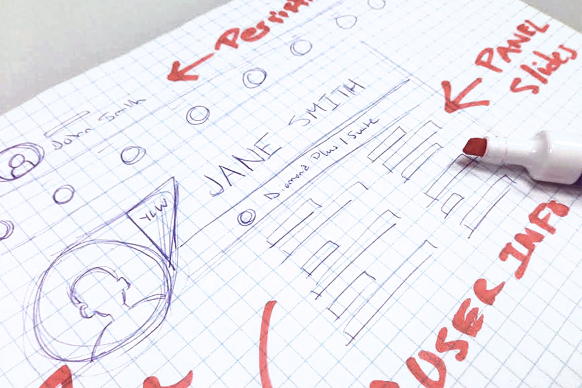
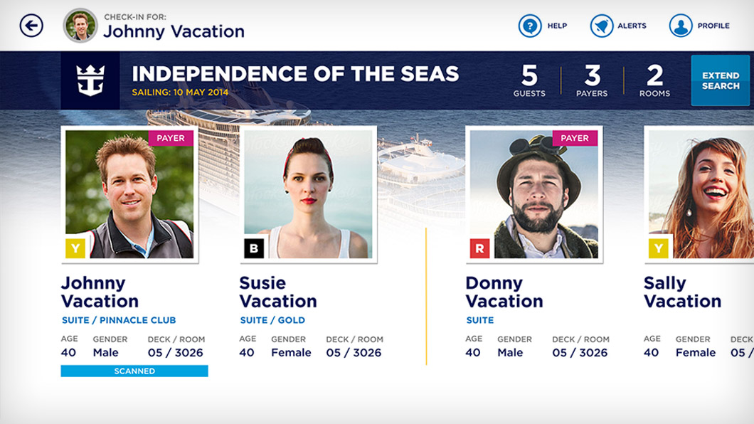
We studied the way people traveled and made the app adaptive to those behaviors. The intuitive, smart interface armed the agents with technology able to recognize groups, communicate in multiple languages, and easily escalate special requests or issues to supervisors. Suddenly, the embarkation process became a lot more manageable. The long-lines and manual processes were replaced by a sleek tablet app. The intuitive design made training a breeze and allowed the same pier agents to be up and running on the new system in a matter of minutes.
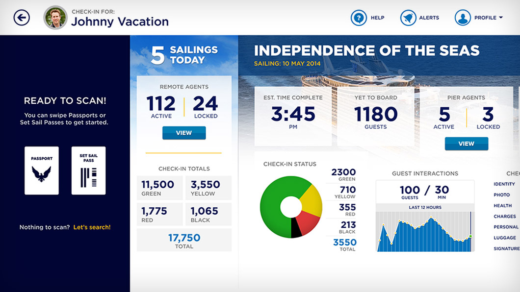
We designed the application to serve three different levels of access and corresponding functionality. This allowed us to keep the design super-clean without having to sacrifice the ability for advanced functionality when the situation and user’s permissions called for it. We also separated analytics reporting into three different groups to allow each user type quick and easy access to the data that mattered most to their job function.
Results: Smoother Sailing
We saw the power of this application on the very first sailing. This app affected all the passengers not just the ones using it to check-in. With so many customers being checked-in in advance, the remaining lines, wait times and headaches at the port were effectively cut in half.
In the end everyone wins; happier employees are making happier customers who are creating happier memories of their vacations and the Royal Caribbean brand.
Thinking about a project like this one?
Consider working with a digital agency partner. We ensure your website’s UX and content accurately represent your brand and meet your user’s needs.
We’d love to learn more about your needs and share our process on how we help organizations navigate digital initiatives just like this one.

