NYRR RUNCENTER
Getting interactive with runners and a Webby nomination, too.
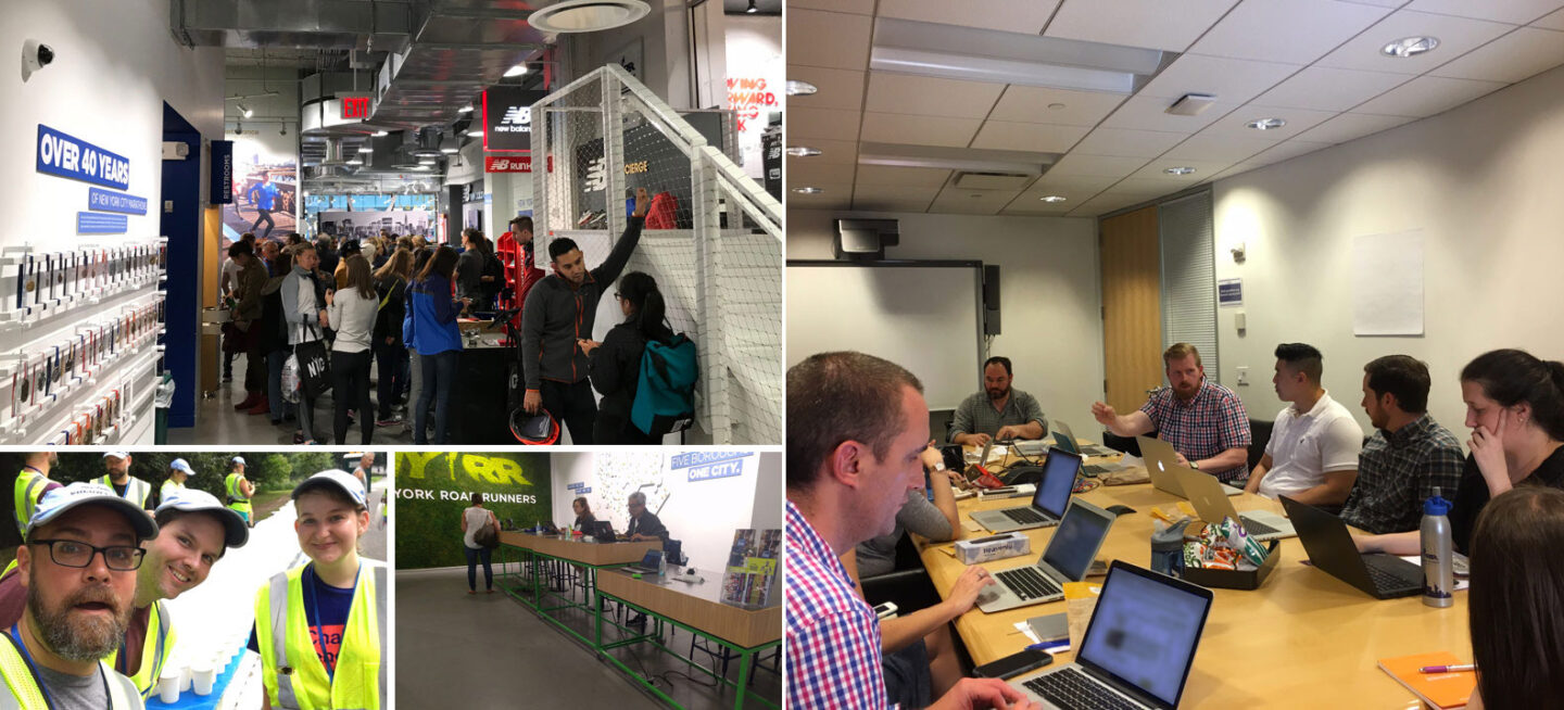
The mission statement of New York Road Runners is to Help and Inspire People Through Running, and that statement is proven nowhere more powerfully than at the NYRR RUNCENTER featuring the New Balance Run Hub. Located near Columbus Circle in NYC and filled with medals, ribbons, photos, and other wonderful artifacts of the rich history of NYRR, the NYRR RUNCENTER has grown to serve many functions: branded space, information hub, race event processing, and training center.
However, the interactive touchscreens located throughout the space could not keep pace with the rapidly shifting and expanding functions of the space. Those touchscreen experiences were not optimized for runner engagement. Additionally, the technology powering the touchscreens limited the scalability of content production.
Getting the Right Concept
Recognizing that the solution was more than just replacing interactive touchscreen content, ETR worked with NYRR team stakeholders to understand New York Road Runners and its mission and members. We worked on concepts for the screens that would engage runners no matter the functional role the NYRR RUNCENTER was serving.
The concepts would have to be in line with NYRR’s mission while also increasing engagement and interactivity. They would have to be flexible enough to adapt to the needs of heavy traffic bib pickup days and large media events, while also providing opportunities for coaching sessions and more personal and meaningful engagement on lower traffic days. Finally, the concepts would need to be built using technology that was easy to use and update.
An Easy User Experience Masked A Very Complicated Backend
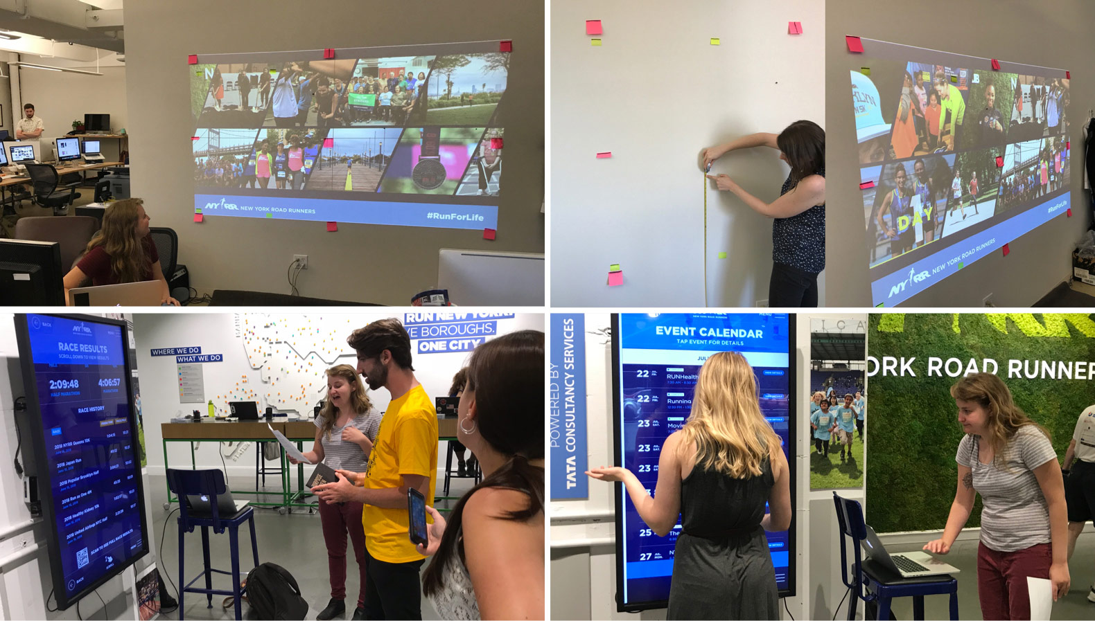
Since the screen experiences would exist in physical spaces, we conducted extensive testing to determine the optimal height for screen placement, and then checked our designs using to-scale projected images.
New York Road Runners is a big supporter of wheelchair racing, so we took great care to ensure that all interactive screen experiences were designed to be maximally accessible for all NYRR RUNCENTER visitors, placing all interactive elements within a defined area of accessibility that is reachable by users in wheelchairs.
The New NYRR RUNCENTER
After working through all the concepts, the result was a more optimized RUNCENTER with screens that contribute to an immersive and engaging experience throughout the space.
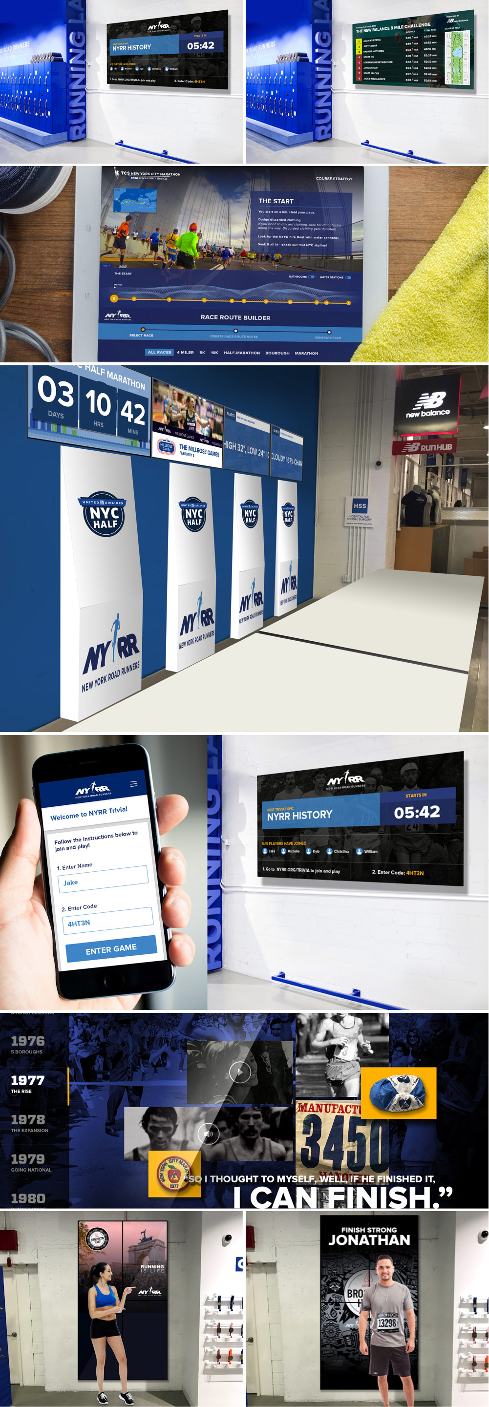
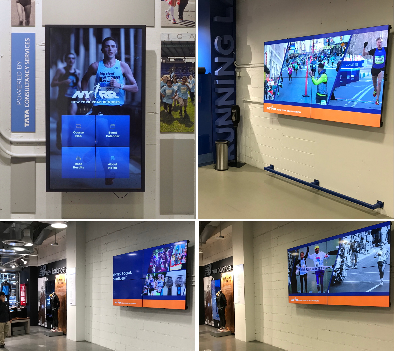
A Digital Concierge greets visitors as they enter the space, providing touchscreen opportunities to learn about NYRR and the RUNCENTER, view upcoming events, study racing route maps, and look up personal racing stats. Further into the space are two multi-screen Media Walls that display branded content, videos, and social feeds. Either Media Wall may be switched to an instructor mode, allowing running coaches to mirror Event Maps and Running Routes from their device onto the large multi-screen lockup for display to larger running groups.
For large media events or other high-traffic periods, the Digital Concierge can be easily programmed to display wayfinding information and the Media Walls can be converted to a Presentation Mode, allowing both Media Walls and a large projected image to simultaneously display videos, presentations, and other content across the entire NYRR RUNCENTER.
We were proud to design and develop interactive touchscreen experiences in the NYRR RUNCENTER as engaging, flexible, and scalable as the space in which they are located.
Beyond the NYRR RUNCENTER
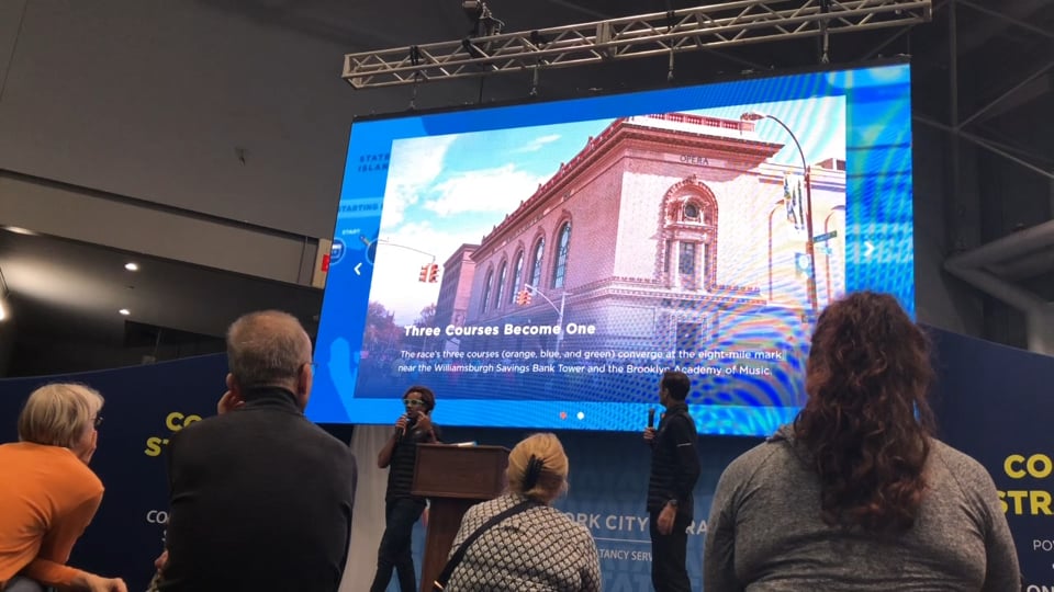
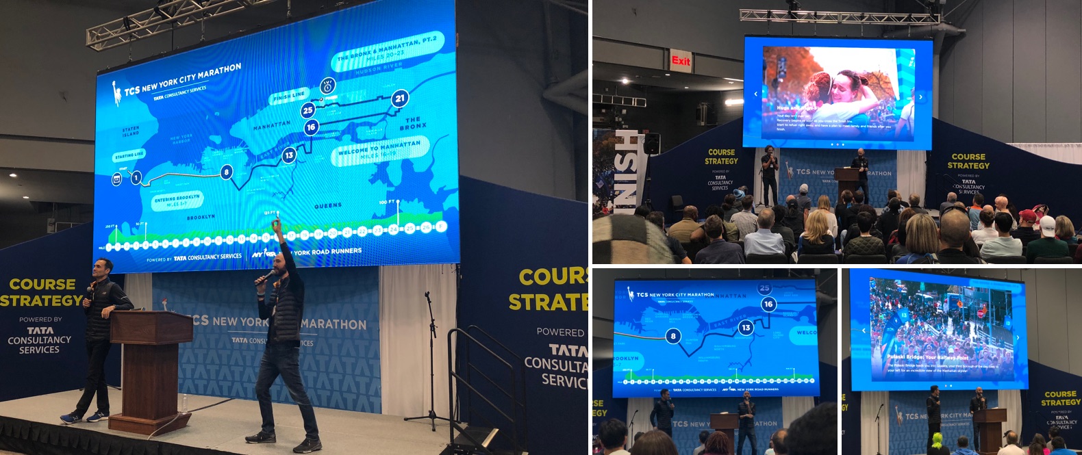
Our attempt to increase engagement, flexibility, and scalability didn’t end in the NYRR RUNCENTER. NYRR also asked us to take a look at the Course Strategy presentations coaches give before the TCS New York City Marathon. The existing Course Strategy tool was a presentation coaches displayed on jumbotron screens at convention centers to walk crowds of runners through what they might expect on their upcoming race.
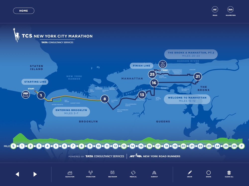
We created a new Course Strategy Application that allowed coaches to interactively take runners through the course, providing elevation, videos, 3D perspectives, and mile-by-mile data including medical and hydration stations. We built the application with an easy-to-use CMS allowing for the scalable creation of new Course Strategy presentations for other marquee races with greatly reduced content production effort.
Thinking about a project like this one?
Consider working with a digital agency partner. We ensure your website’s UX and content accurately represent your brand and meet your user’s needs.
We’d love to learn more about your needs and share our process on how we help organizations navigate digital initiatives just like this one.


