Giving Veterinarians a Community-Focused Knowledge Hub
Veterinarians, practice managers, and vet med students have a lot on their plates. We helped evolve a digital space for them to learn, communicate, find support, and grow.
CLIENT
Clinician’s Brief
SERVICES LEVERAGED
- User Research
- Usability Testing
- Information Architecture
- Wireframing
- Concept prioritization
- Visual Design
- Custom Development
Project goals and challenges
Clinician’s Brief has long been a go-to resource for small animal veterinarians looking for guidance in their practices, dating back to the days when it was mainly a print journal. But the team behind Clinician’s Brief wanted the website to evolve to be a place where its audience can connect and grow online — they wanted the site to be a place where vets could go to communicate with one another, to keep their education up-to-date, and read the perspectives from other clinicians they admired on topics from clinical skills to mental health and burnout.
Additionally, the team needed to strengthen the connection between Clinician’s Brief and the other products offered by their parent company, VetMedux, particularly Plumb’s, another household name that few vets knew was connected. ExpandTheRoom was tasked with making this vision a reality.
Approach and solution
From the start we approached our process as a collaboration with the Clinician’s Brief team, beginning with a group Context and Framing workshop session to iron out crucial details such as high level goals and success metrics of the project, key differentiators, users needs, and potential roadblocks.
Researching user needs and frustrations
Shortly after kickoff, we began conducting an audit of the existing website and running user interviews with existing Clinician’s Brief users. In the interviews, we asked about user habits, goals, and frustrations to understand their perspectives, and then we had them use the website to complete common tasks while we noted any roadblocks and usability issues. This, combined with stakeholder interviews, gave us a treasure trove of notes and ideas on how to improve the site going forward. We reconvened as a team, including the client team, and did some affinity mapping to organize the notes and uncover insights.

Our efforts resulted in seven insights meant to guide the project moving forward, including improving search and education capabilities, strengthening the connection between Clinician’s Brief and Plumb’s, and putting a greater emphasis on the social and community aspects of vet medicine.
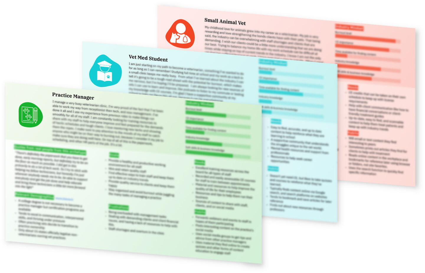
We also developed three archetypes representing the different users of the site, meant to summarize our research in an easy to digest format that would keep user goals, needs, and frustrations top of mind for everyone involved.

With our strategy defined, we moved into the implementation phase. This involved many hours and conversations crafting wireframes, information architecture models, art direction, and visual design to get everything just right. Our goal was to keep the brand users knew and loved, but to elevate the design and make navigating their vast library of content easier.
Prioritizing ideas based on effort and impact
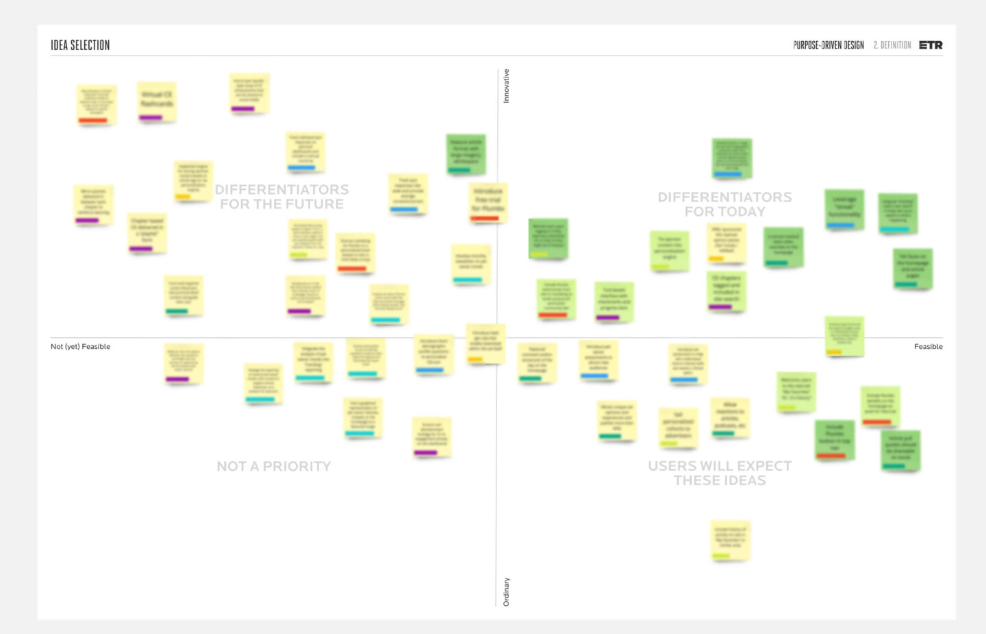
It was an important goal of the Clinician’s Brief team to make their site more engaging and differentiated from competitors out there, and they had a lot of “blue sky” ideas on how they could potentially make this happen. We’ve written previously of the importance of blue sky ideation, so we were excited to have many ideas to work with, but the next step was to bring them into reality with another workshop, the Effort/Impact matrix. Here, we mapped all of the ideas that the team had based on their feasibility and how much of a difference they would make in achieving the team’s larger goals. We were able to prioritize what needed to be included now, later, or what to pass on, successfully keeping our momentum going and deadlines on track.

Ensuring the integrity of legacy content
From a development perspective, we had to overcome the technical challenge of integrating multiple APIs for the education portion of the website while evolving a system for tracking progress and scoring across multiple courses. In addition, because there were hundreds of pieces of content migrating over from their old CMS, it was important that the new site accommodated many different types and configurations of content while maintaining or improving SEO value. Our goal was to establish an organized foundation of content, along with a consistent content model, to set the stage for forward progress.
Results
The new Clinician’s Brief website became so much more than a digital version of the journal. As soon as a veterinarian arrives on the site, the homepage greets them with up-to-date news, perspectives, and interactive content that changes daily and aims to keep them informed and connected. Users can contribute to quizzes, polls, and discussions to test their knowledge and connect to other practitioners. A vast library of continuing education resources are available to help keep their credentials up-to-date and their knowledge fresh. The content is split into the areas they care about most – clinical skills, drugs and therapeutics, client relationships, and practice life.
We achieved the goal of making a stronger connection to their sister product, Plumb’s, by implementing more effective promotion and brand messaging on the Clinician’s Brief site. Adding these forms of interactivity and constantly updating content has achieved the team’s goal of getting users to return more frequently to the site. Since launch, we’ve seen a 5.11% increase in users and an 11.7% increase in sessions per user, meaning users are coming back more. We also saw a 20% decrease in average page load time, meaning vets in a hurry are able to get crucial information faster.
The Clinician’s Brief team was very happy with the launch of the new site. We’ve already extended our services by offering research support for the Plumb’s product and look forward to future collaborations. We’re proud to have helped this essential resource for veterinarians reach more people.
“Any project’s success depends on clear objectives at the outset. When our key objectives changed early in the project, ETR’s team not only kept their composure, but participated in helping us define and execute upon a unified set of goals. Our site launched on time and met every criteria set for the project. ETR provided acute insight, facilitated a proven process and in the end, delivered a phenomenal product for our team. We will consider ETR as a potential partner in all future projects.”
Thinking about a project like this one?
Consider working with a digital agency partner. We ensure your website’s UX and content accurately represent your brand and meet your user’s needs.
We’d love to learn more about your needs and share our process on how we help organizations navigate digital initiatives just like this one.

