How to Choose the Right Typeface for Your Website

If you design and build websites, you probably feel confident using typefaces. However, when it comes to choosing typefaces, you may have trouble knowing where to look and what to look for.
As Associate Design Director at ExpandTheRoom, I design digital products for a variety of brands, from small non-profits to large publishing companies. Part of my role is ensuring we choose appropriate typefaces for our projects. Based on my experience, here are five factors to consider when choosing typefaces for your website or product.
1. Understand the brand and audience.
When you begin a project, it’s important to fully understand your brand and audience. At ETR, we ask our clients questions like: what are your brand attributes? How do you differ from the competition? What value do you provide your audience? What are your visitors primary and secondary reasons for visiting your site? This information will lay the groundwork for informed type decisions.
Your typeface choices are part of an overall approach aligned with your brand and goals. Typefaces communicate your brand’s personality, helping your visitors know they’ve come to the right place.
Connect typefaces to brand attributes
Here are three groups of typefaces conveying three different brand attributes: sophisticated, trustworthy, and friendly. Notice how many kinds of typefaces can represent one personality trait.
Sophisticated Typefaces
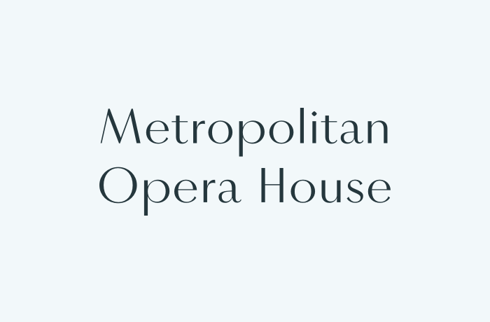
Vinter (Frode Bo Helland, Sindre Bremnes)
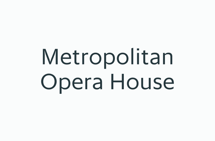
Sanomat Sans Text (Miguel Reyes, Christian Schwartz, Vincent Chan)
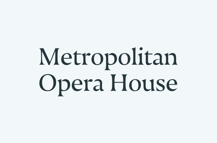
Nocturno (Nikola Djurek)
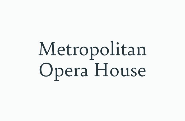
Bely (Roxane Gataud)
Trustworthy Typefaces

Ebony (Veronika Burian, José Scaglione)

Synthese (Jean-Baptiste Levée, Gilles Poplin)

Brando (Mike Abbink)

Abelard (Barbara Bigosińska)
Friendly Typefaces
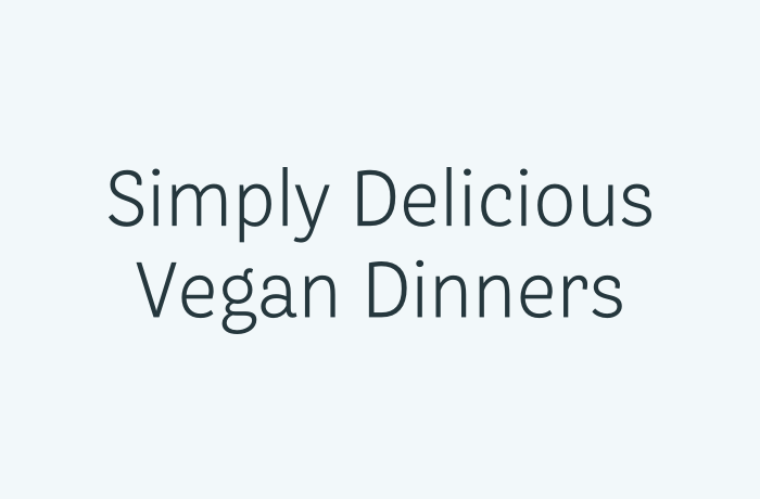
Bligh (Luisa Baeta)
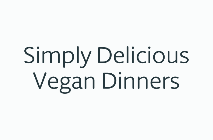
Berlingske Round (Jonas Hecksher)
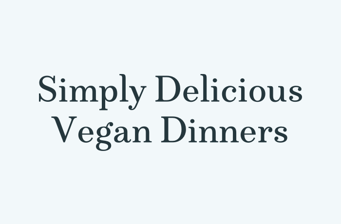
Marcia (Victoria Rushton)
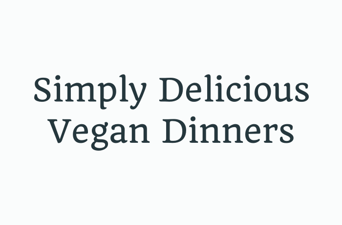
Quando (Joana Correia)
How do you know what attributes typefaces represent?
One way is to examine how type is used in the wild. For example, if you need a typeface for a news site to feel approachable and credible, look to how other news sites are using type. Here are two amazingly helpful resources:
- Fonts In Use (an extensive archive of typographic design in different industries and formats)
- Typewolf (a daily blog covering type usage on the web)
2. Consider your content and how it will be read.
In addition to brand and audience, typography needs to be appropriate for your most prevalent content—whether it’s articles, videos, images, products, listicles, or cat pictures.
Try it out
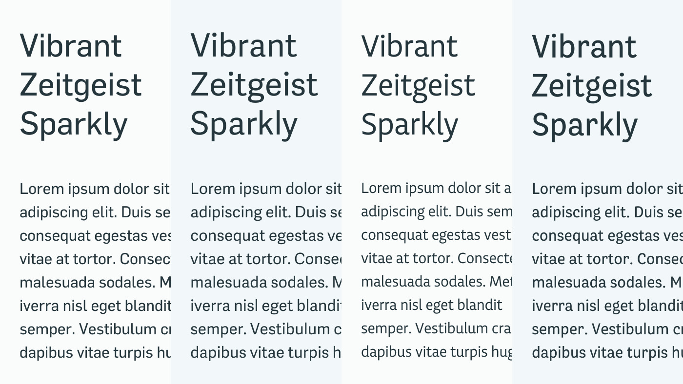
Flama (Mário Feliciano), Adelle Sans (Veronika Burian, José Scaglione), Echo (Ross Milne), Bligh (Luisa Baeta)
You can’t get a complete sense of how a typeface will perform without trying it in context. This reveals a typeface’s unique qualities and how well it supports the content. Luckily, there are many helpful tools and tactics:
- Use fonts in desktop apps and on your website with Fontstand, SkyFonts, or Typekit.
- Make Element collages. Dan Mall’s idea is to begin designing a site by making arrangements of fully-designed interface elements. Outside the context of a comp, element collages allow you to quickly try different ideas.
- Make HTML/CSS prototypes. Here’s an example prototype on Codepen using Google Fonts. Typecast is an app made for prototyping webfonts.
- Try fonts on your site with FontSwapper and WebFonter.
- Download free trials from Dalton Maag, Grilli Type, Indian Type Foundry, Production Type, Typotheque, and Webtype.
How does content influence type?
Here’s a real-world example. Say you’re designing a new recipe website. Your target demographic is a busy parent planning meals for their family. They browse for recipes on a mobile device while on the go. Through conversations with the client, you’ve also learned that the brand embodies the joy of cooking and that the art direction calls for elegance and simplicity.
With this information, you can establish three guideposts:
- How the content will be read. Visitors are browsing quickly. Primarily on mobile, they are scanning recipes, which are made of lists and media: ingredients, instructions, images, and videos.
- A clear hierarchy will guide visitors to the right recipe. Headings, buttons, navigation, and lists are opportunities to explore different typographic treatments: borders, capitalization, color, icons, and different fonts.
- Brand attributes. In order to be on-brand, the typefaces should feel elegant, joyful, and simple.
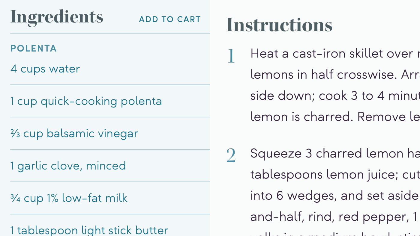
Kepler (Robert Slimbach) and Sofia (Olivier Gourvat)
After trying out different typefaces, you pick two: Sofia, a joyful sans and Kepler, an elegant serif. Sofia is simpler and used for frequent elements (buttons, ingredients, instructions, navigation). Kepler is more ornate and gives headings some personality. Appropriate typefaces used in meaningful ways make the overall design functional and on-brand.
3. Solve for your project’s unique challenges.
Each typeface has specific features to solve unique design challenges. Some typefaces are better suited for your project than others. Here are a few bells and whistles to look for before committing to a typeface: superfamilies, optical sizes, a range of widths and weights, language support, and font features.
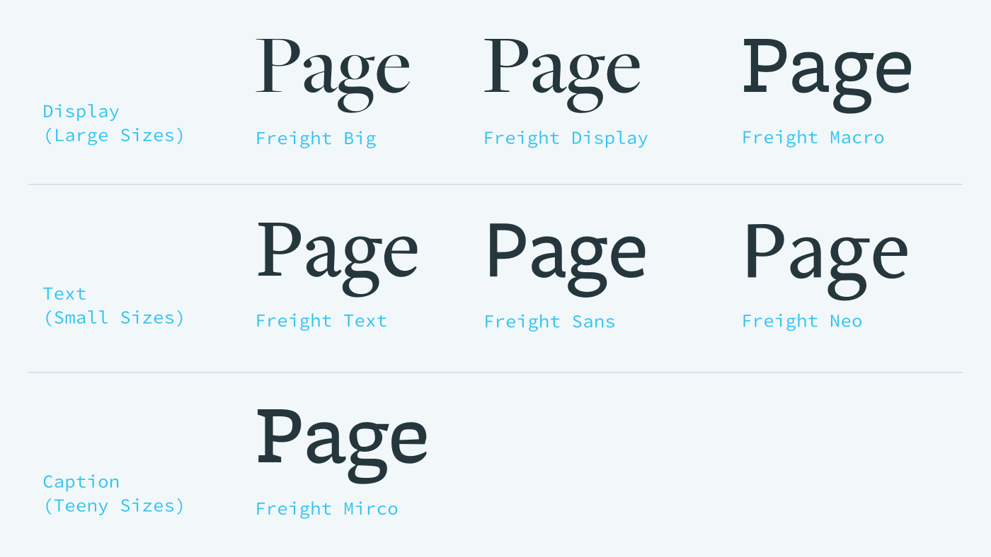
Freight (Joshua Darden) superfamily
Superfamilies
A collection of typefaces from different genres is called a “superfamily.” Freight (Joshua Darden), shown above, has a sans, serif, and slab serif. Typefaces in superfamilies are designed to be used together, but can be used separately.
Optical Sizes
Some families have size-specific styles or “optical sizes”, each optimized for rendering text at a certain size. In the above example, Freight has several options for headings, body copy, and captions.
Text typefaces are designed to be comfortably read in long blocks of body copy, while display typefaces are intended to catch readers’ attention in headings.
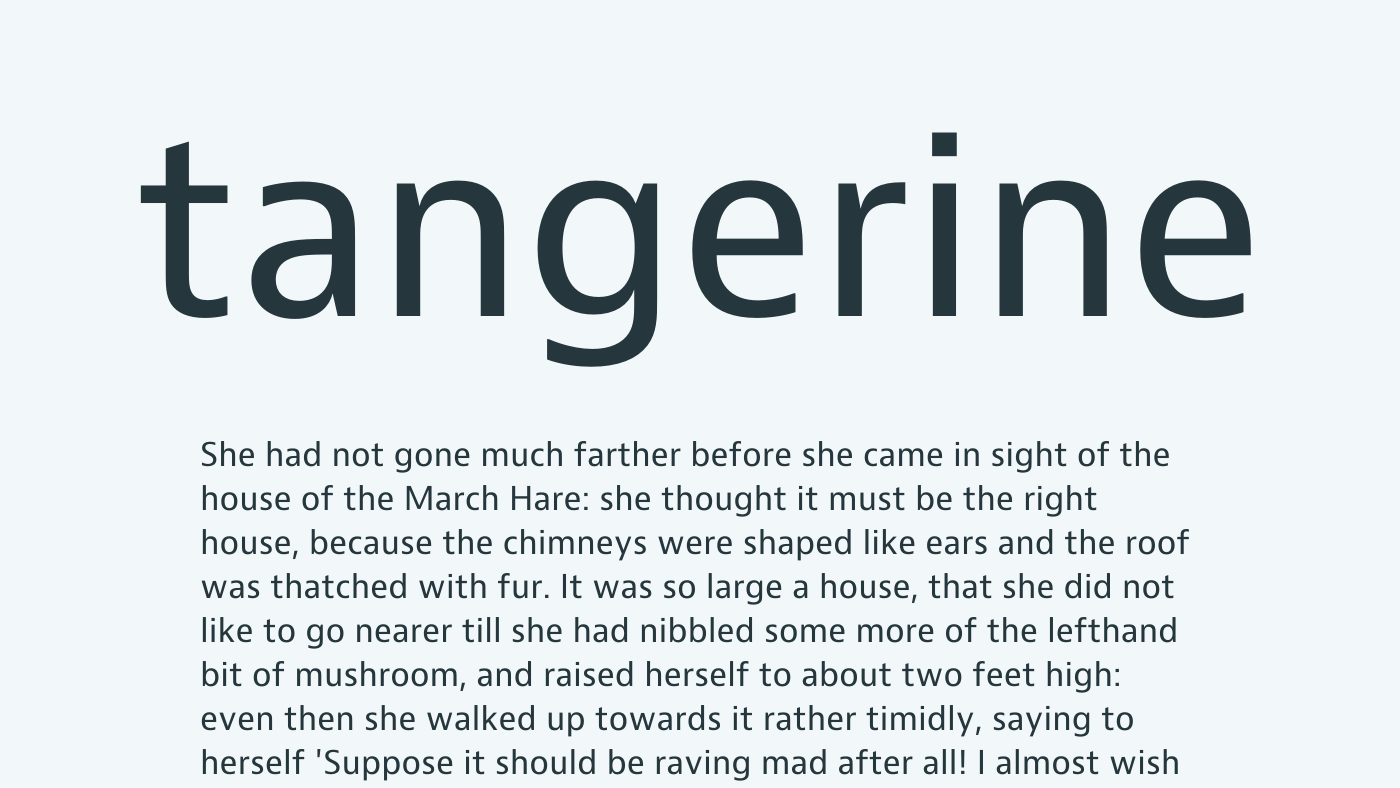
A text typeface with contrasting forms and large apertures (the openings in letters a, g, e), making it ideal for long reading at small sizes. JAF Bernino Sans (Tim Ahrens, Shoko Mugikura).
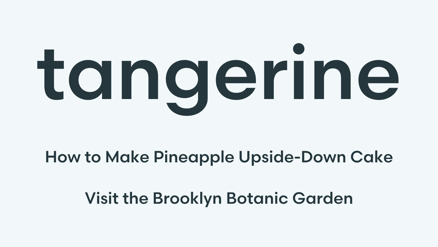
A display typeface with similar, geometric forms and small apertures (on the g and e), making it ideal for headings and short text. Scandia (Eric Olsen).
Comparing the above typefaces, you’ll notice differences that make each appropriate in specific settings. JAF Bernino has simple, contrasting letter shapes, making it an excellent text typeface, legible at small sizes. Scandia has a bit more personality and similar letter shapes, making it better suited for display and short labels for navigation and buttons.
It’s useful to be aware of conventions of size-specificity in type design, though some typefaces can handle both text and display settings.
Check out examples of superfamilies and optical sizes on Fonts In Use.
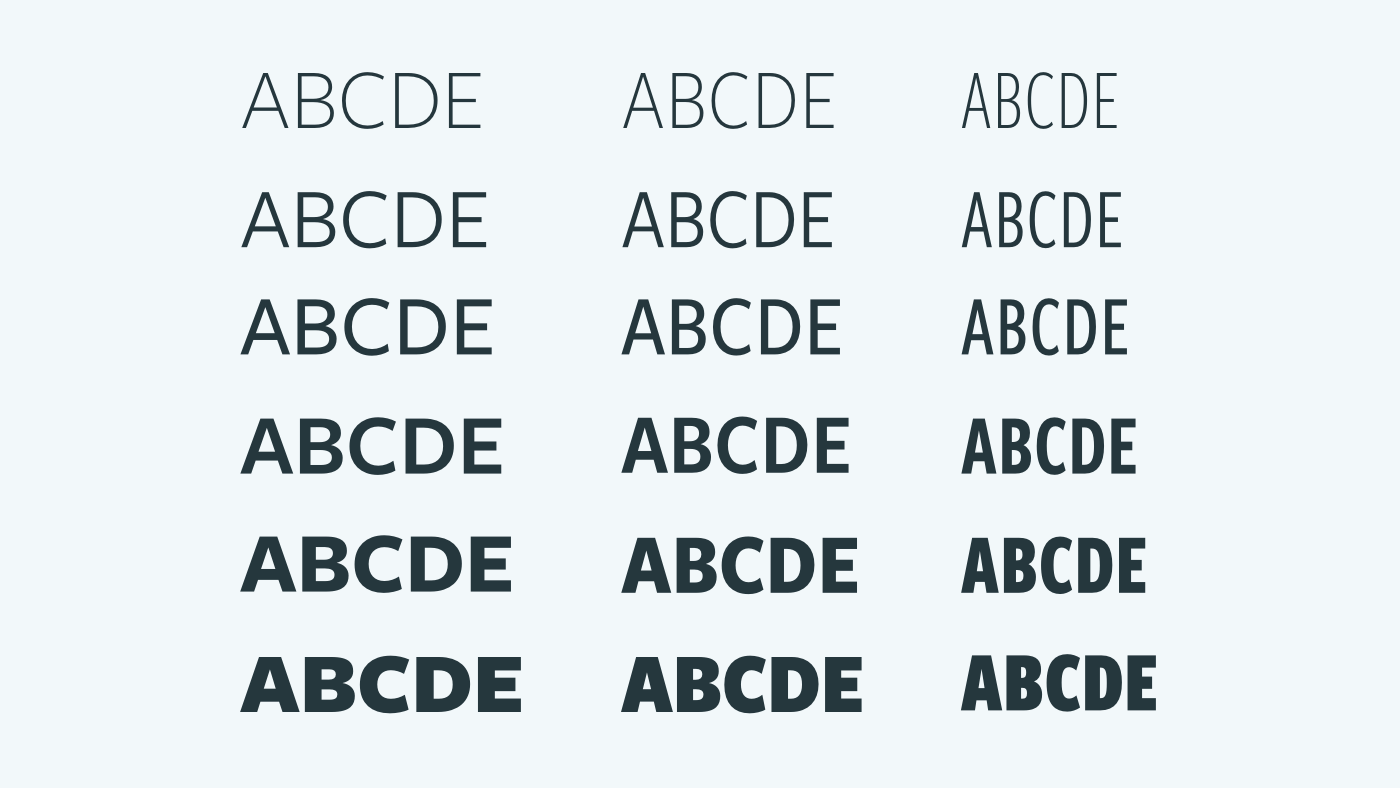
Freight Sans (Joshua Darden) has six weights at three widths.
A range of weights and widths
Text typefaces usually include at least four styles: regular, bold, regular italic, and bold italic. Larger type families can have a spectrum of weights as well as condensed and expanded widths. The styles share an underlying structure, creating contrast within a narrow range.
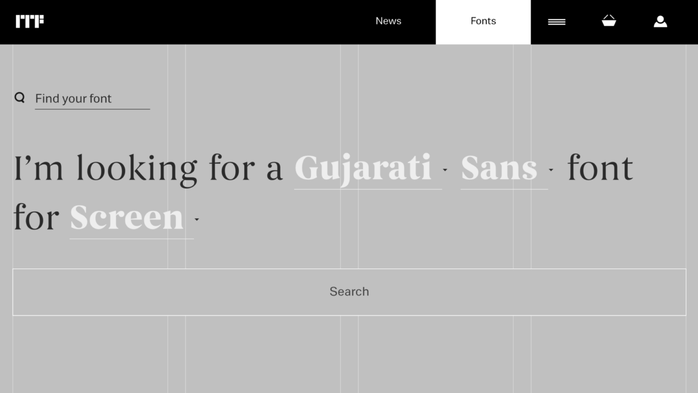
Search tool on Indian Type Foundry’s website
Language support
Typefaces support specific languages. You can check a typeface’s language support on the designer’s site or on a retailer like MyFonts. Many popular Latin-based typefaces will support Western and Central European languages. Here are a few foundries supporting non-Latin scripts: Commercial, Dalton Maag, Google Fonts, Hoefler & Co., Indian Type Foundry, Type.today, Typotheque, Typotheque Arabic, and Rosetta.
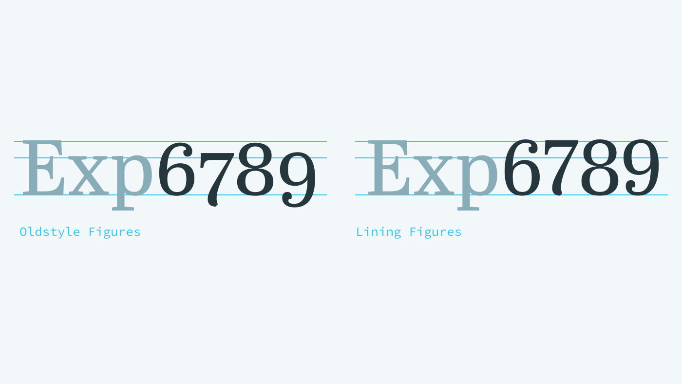
Abril Text and Display (Veronika Burian, José Scaglione)
Font features
Numerals for text and display
Numerals (or “figures”) come in different styles. Oldstyle figures blend into body copy because they ascend above the x-height and descend below the baseline, mimicking lowercase letters. Lining figures are the height of capital letters, so they work best for headings, buttons, and lists. Often, the default numerals in a typeface will be either oldstyle or lining, and alternate styles can be enabled using the CSS property “font-feature-settings.” Here are more features you can access using CSS:
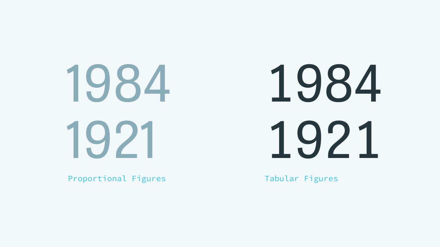
Tablet Gothic (Veronika Burian, José Scaglione)
Tabular figures are numerals with uniform widths, which are handy for infographics and tables.
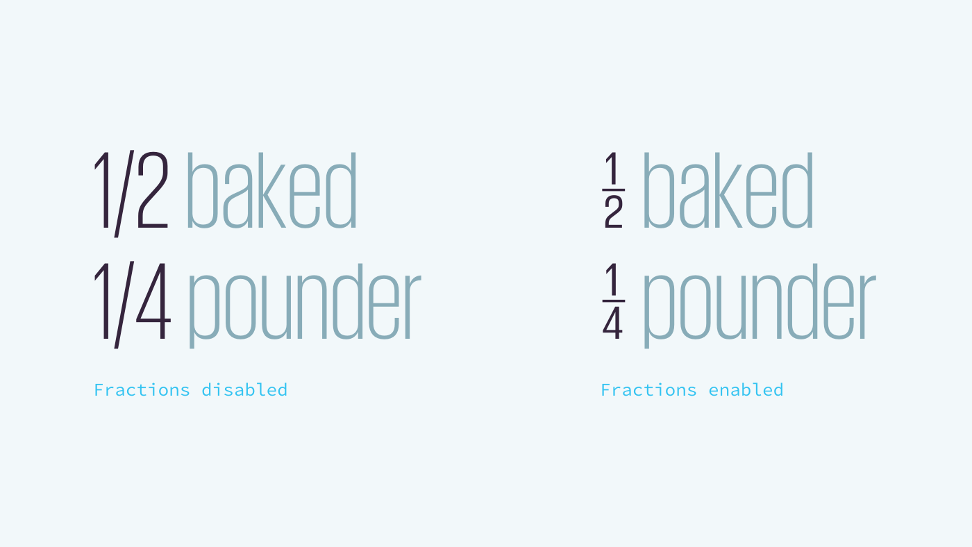
Giorgio Sans (Christian Schwartz)
Stacked fractions can be used in infographics, recipes, and tables.
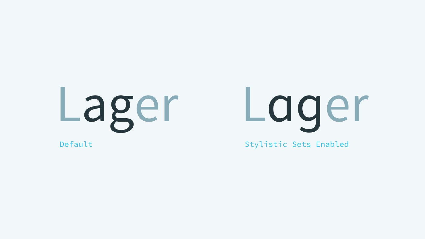
Source Sans (Paul Hunt)
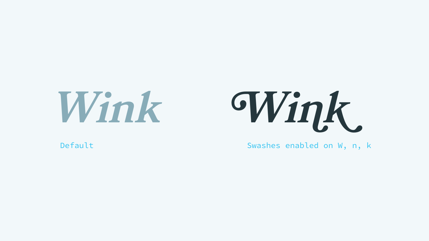
Bookmania (Mark Simonson)
Stylistic Alternates
Many fonts have alternate characters to solve a specific challenge or add stylistic flair. Source Sans (Paul Hunt) has alternate letters that create a warmer tone. Bookmania (Mark Simonson), has gestural swashes.
4. Know your budget (financial and performance).
Financial Budget
Ultimately, your typeface choices will come down to your budget. Typefaces have varying price points. The price can depend on whether you choose to host the font files or use a hosting service. As you may know, webfonts are different file formats (.woff2, .woff) than formats used on your operating system (.ttf, .otf).
Every designer or distributor has a different pricing model, though they are generally easy to understand and compare. Here are four popular models:
- Subscription fee for access to a library of hosted fonts (Typekit, Fonts.com).
- Subscription fee for single font or set of fonts (Fontstand, Hoefler & Co., Typotheque, and Webtype).
- One-time fee for self-hosted fonts. Pricing increases depending on your monthly traffic (Commercial, FontShop, GrilliType, Klim, Lineto, MyFonts, Process, Suitcase, Type Network).
- One-time fee for both webfonts and desktop fonts with no increase due to traffic (OurType).
Performance Budget
Your other budget consideration is the performance budget. Tim Kadlec describes it as follows:
A performance budget is just what it sounds like: you set a “budget” on your page and do not allow the page to exceed that. This may be a specific load time, but it is usually an easier conversation to have when you break the budget down into the number of requests or size of the page.
Make your developers and visitors happy by establishing a performance budget. If your site feels fast, it improves a visitor’s experience and overall impression of your brand. The file-size limitation forces you to make deliberate typeface choices, improving the overall consistency and quality of your design.
5. Look for fonts designed to perform well on screen.
Fonts render differently on Apple and Windows devices. To combat this, type foundries undergo a thorough process called manual hinting, greatly improving rendering on Windows. As high density pixel screens become more prevalent, hinting will become less important.
To cover your bases, check your site on a range of browsers and devices, or use BrowserStack.
A few foundries offering high-quality webfonts:
Bold Monday
Commercial
DSType
FontFont
Frere-Jones
Google Fonts
Hoefler & Co.
Indian Type Foundry
LostType
LudwigType
Monokrom
MyFonts
OkayType
Optimo
OurType
Process Type Foundry
Production Type
Rosetta
Mark Simonson
Suitcase
Typekit
Type Together
Type Network
Typofonderie
Typotheque
Webtype
Village
Graphic designer Bonnie Siegler said it best: “Your choice of typeface is as important as what you do with it.” With so many great foundries, resources, and tools out there, your options are almost endless. I hope this article provides a foundation for experimenting with new typefaces in your own work.
If you need an expert team to help evaluate, develop or bring to life your content vision, consider ExpandTheRoom.
For more type tips, check out talks and writing by Stephen Coles, Jessica Hische, Indra Kupferschmid, and Dan Mall. This article is greatly indebted to their generous contributions to design criticism and education.
More Insights
Six Design Trends You Will See in 2024
In the field of design, trends come and go. As technologies evolve and user preferences shift, design trends naturally progress and adapt. Keeping up with the latest trends helps brands stay current and resonate more with consumers as their preferences evolve. Last year, we highlighted dynamic color, personalization, and simplicity. In 2024, we envision designers

‘Tis the Season to Commit to Exceptional Experiences: UX Resolutions for 2024
With December upon us, our thoughts turn to resolutions—the ways we can be better in the year to come. For us as an agency, that means constantly raising the bar for ourselves, our clients, our communities, our industry, our families, and our friends. For our UX team, whose job it is to advocate for users,


